如何在 ggplot2 中创建残差图(带有示例)
残差图用于评估回归模型的残差是否呈正态分布以及它们是否表现出异方差性。
要在 ggplot2 中创建残差图,您可以使用以下基本语法:
 library (ggplot2)

ggplot(model, aes(x = .fitted, y = .resid)) +
  geom_point() +
  geom_hline(yintercept = 0 )
以下示例展示了如何在实践中使用此语法。
示例:在 ggplot2 中创建残差图
对于此示例,我们将使用 R 中内置的mtcars数据集:
 #view first six rows of mtcars dataset
head(mtcars)
                   mpg cyl disp hp drat wt qsec vs am gear carb
Mazda RX4 21.0 6 160 110 3.90 2.620 16.46 0 1 4 4
Mazda RX4 Wag 21.0 6 160 110 3.90 2.875 17.02 0 1 4 4
Datsun 710 22.8 4 108 93 3.85 2.320 18.61 1 1 4 1
Hornet 4 Drive 21.4 6 258 110 3.08 3.215 19.44 1 0 3 1
Hornet Sportabout 18.7 8 360 175 3.15 3.440 17.02 0 0 3 2
Valiant 18.1 6 225 105 2.76 3,460 20.22 1 0 3 1
首先,我们将使用mpg作为响应变量和qsec作为预测变量来拟合回归模型:
 #fit regression model
model <- lm(mpg ~ qsec, data=mtcars)
接下来,我们将使用以下语法在 ggplot2 中创建残差图:
 library (ggplot2)

#create residual plot
ggplot(model, aes(x = .fitted, y = .resid)) +
  geom_point() +
  geom_hline(yintercept = 0 )
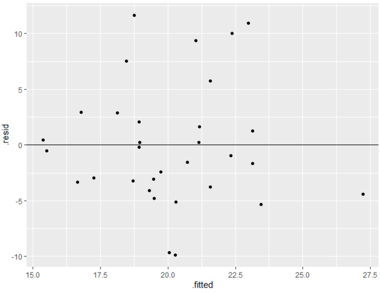
x 轴显示拟合值,y 轴显示残差。
残差似乎随机分散在零附近,没有明显的模式,表明满足同方差性假设。
换句话说,回归模型的系数应该是可靠的,我们不需要对数据进行任何转换。
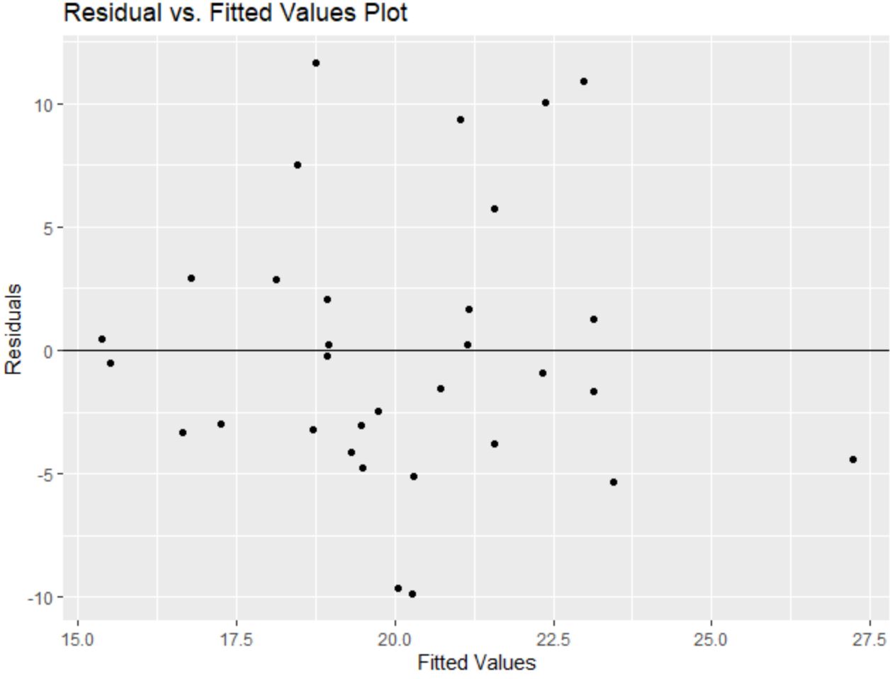
另请注意,我们可以使用labs()函数向残差图添加标题和轴标签:
 library (ggplot2)

#create residual plot with title and axis labels
ggplot(model, aes(x = .fitted, y = .resid)) +
  geom_point() +
  geom_hline(yintercept = 0 ) +
  labs(title=' Residual vs. Fitted Values Plot ', x=' Fitted Values ', y=' Residuals ')
其他资源
以下教程解释了如何在 R 中执行其他常见任务:
关于作者
本杰明·安德森博
大家好,我是本杰明,一位退休的统计学教授,后来成为 Statorials 的热心教师。 凭借在统计领域的丰富经验和专业知识,我渴望分享我的知识,通过 Statorials 增强学生的能力。了解更多