如何在 r 中创建两个变量的直方图
直方图是可视化给定变量值分布的有用方法。
要在 R 中为变量创建直方图,可以使用hist()函数。要在 R 中为两个变量创建直方图,可以使用以下语法:
 hist(variable1, col=' red ')
hist(variable2, col=' blue ', add= TRUE )
以下示例展示了如何在实践中使用此语法。
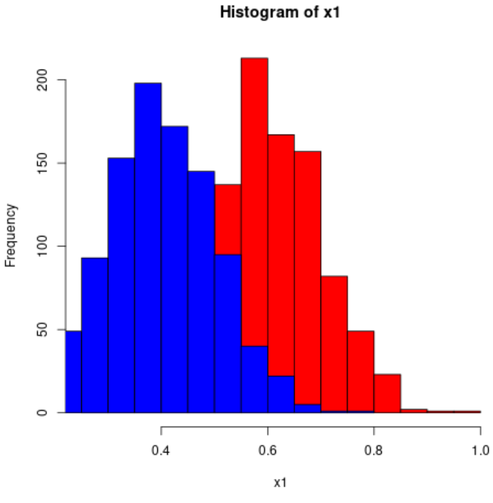
示例:在 R 中创建两个变量的直方图
以下代码展示了如何在 R 中创建两个变量的直方图:
 #make this example reproducible
set. seeds (1)

#define data
x1 = rnorm(1000, mean=0.6, sd=0.1)
x2 = rnorm(1000, mean=0.4, sd=0.1)

#plot two histograms in same graph
hist(x1, col=' red ')
hist(x2, col=' blue ', add= TRUE )
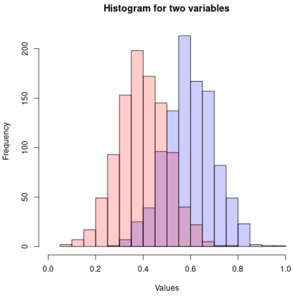
由于直方图值重叠,因此最好使用具有增加透明度的rgb()颜色:
 #make this example reproducible
set. seeds (1)

#define data
x1 = rnorm(1000, mean=0.6, sd=0.1)
x2 = rnorm(1000, mean=0.4, sd=0.1)

#plot two histograms in same graph
hist(x1, col=rgb(0,0,1,0.2), xlim=c(0, 1),
     xlab=' Values ', ylab=' Frequency ', main=' Histogram for two variables ')
hist(x2, col=rgb(1,0,0,0.2), add= TRUE )
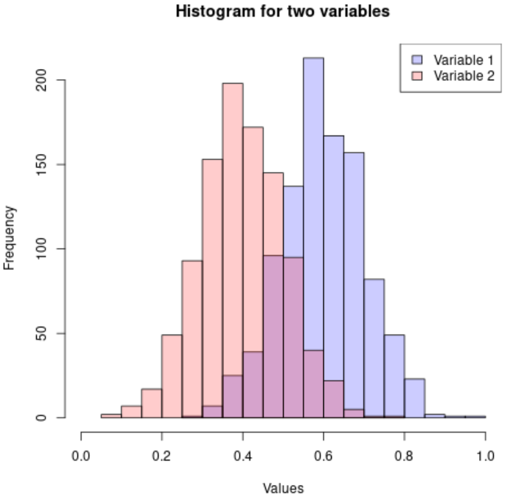
您还可以添加图例以使直方图更易于解释:
 #make this example reproducible
set. seeds (1)

#define data
x1 = rnorm(1000, mean=0.6, sd=0.1)
x2 = rnorm(1000, mean=0.4, sd=0.1)

#plot two histograms in same graph
hist(x1, col=rgb(0,0,1,0.2), xlim=c(0, 1),
     xlab=' Values ', ylab=' Frequency ', main=' Histogram for two variables ')
hist(x2, col=rgb(1,0,0,0.2), add= TRUE )

#add legend
legend(' topright ', c(' Variable 1 ', ' Variable 2 '),
       fill=c(rgb(0,0,1,0.2), rgb(1,0,0,0.2)))
您可以在此页面上找到更多 R 教程。
关于作者
本杰明·安德森博
大家好,我是本杰明,一位退休的统计学教授,后来成为 Statorials 的热心教师。 凭借在统计领域的丰富经验和专业知识,我渴望分享我的知识,通过 Statorials 增强学生的能力。了解更多