如何在 ggplot2 中创建饼图(附示例)
饼图是一种圆形图表,使用切片来表示整体的比例。
本教程介绍如何使用ggplot2数据可视化库在 R 中创建和编辑饼图。
如何创建基本饼图
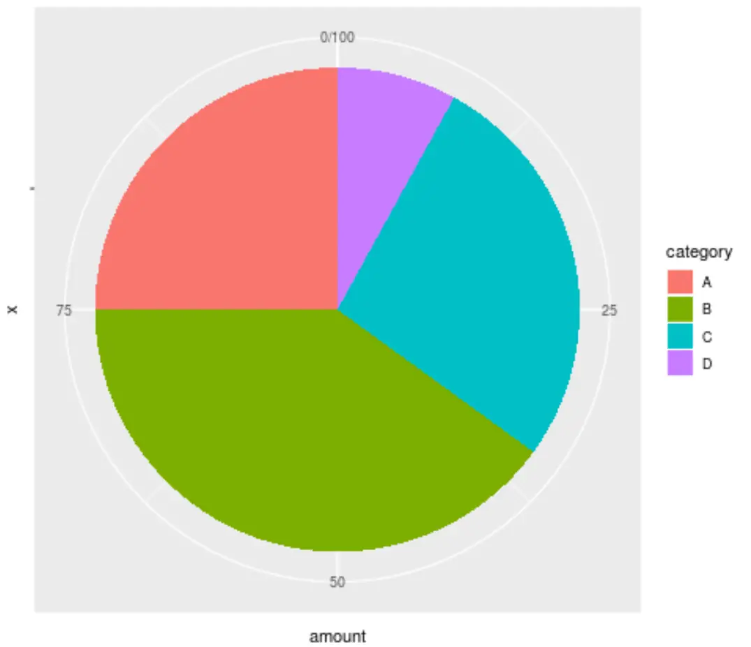
以下代码展示了如何使用 ggplot2 为数据集创建基本饼图:
 library (ggplot2)

#create data frame
data <- data.frame(" category " = c('A', 'B', 'C', 'D'),
                   " amount " = c(25, 40, 27, 8))

#create pie chart
ggplot(data, aes (x="", y=amount, fill=category)) +
  geom_bar(stat=" identity ", width= 1 ) +
  coord_polar(" y ", start= 0 )
如何更改饼图的外观
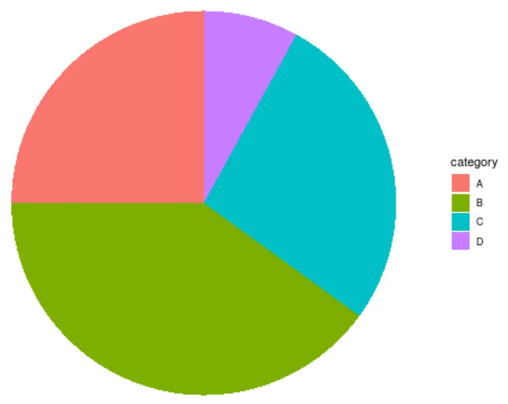
ggplot2 中的默认饼图非常难看。改善外观的最简单方法是使用theme_void() ,它会删除背景、网格和标签:
 ggplot(data, aes (x="", y=amount, fill=category)) +
  geom_bar(stat=" identity ", width= 1 ) +
  coord_polar(" y ", start= 0 ) +
  theme_void()
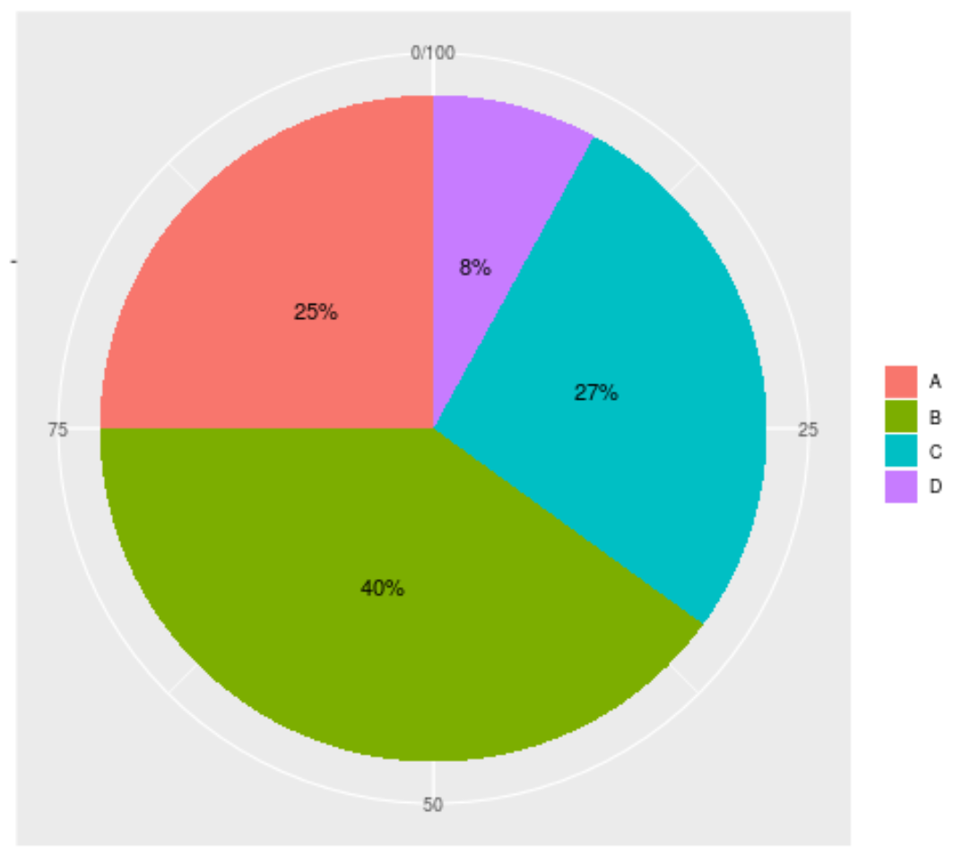
我们可以通过在切片内添加标签来进一步改善图表的外观:
 ggplot(data, aes (x="", y=amount, fill=category)) +
  geom_bar(stat=" identity ", width= 1 ) +
  coord_polar(" y ", start= 0 ) +
  geom_text( aes (label = paste0(amount, " % ")), position = position_stack(vjust= 0.5 )) +
  labs(x = NULL, y = NULL, fill = NULL)
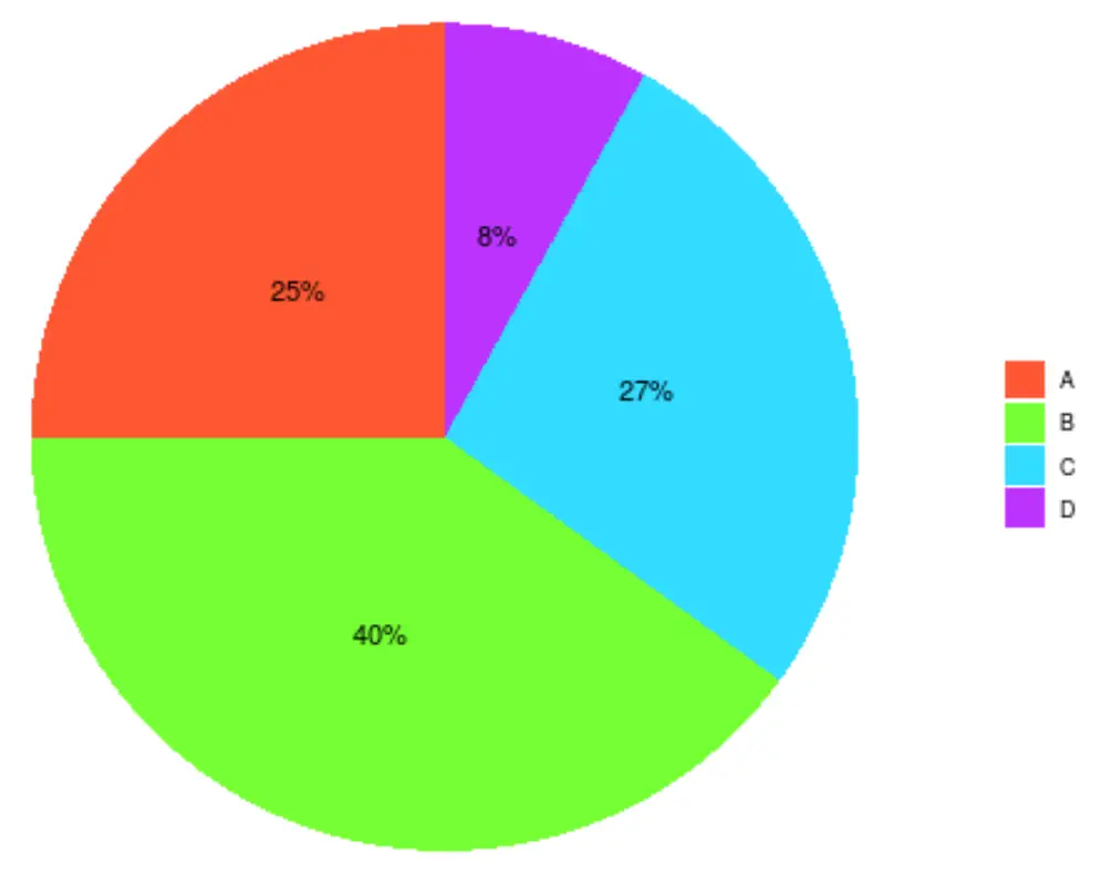
我们可以通过使用scale_fill_manual()参数指定用于切片的我们自己的十六进制颜色来进一步自定义图表:
 ggplot(data, aes (x="", y=amount, fill=category)) +
  geom_bar(stat=" identity ", width= 1 ) +
  coord_polar(" y ", start= 0 ) +
  geom_text( aes (label = paste0(amount, " % ")), position = position_stack(vjust= 0.5 )) +
  labs(x = NULL, y = NULL, fill = NULL) +
  theme_classic() +
  theme(axis.line = element_blank(),
          axis.text = element_blank(),
          axis.ticks = element_blank()) +
  scale_fill_manual(values=c(" #FF5733 ", " #75FF33 ", " #33DBFF ", " #BD33FF "))
提示:使用此十六进制颜色选择器可以查找组合在一起看起来不错的十六进制颜色代码的组合。
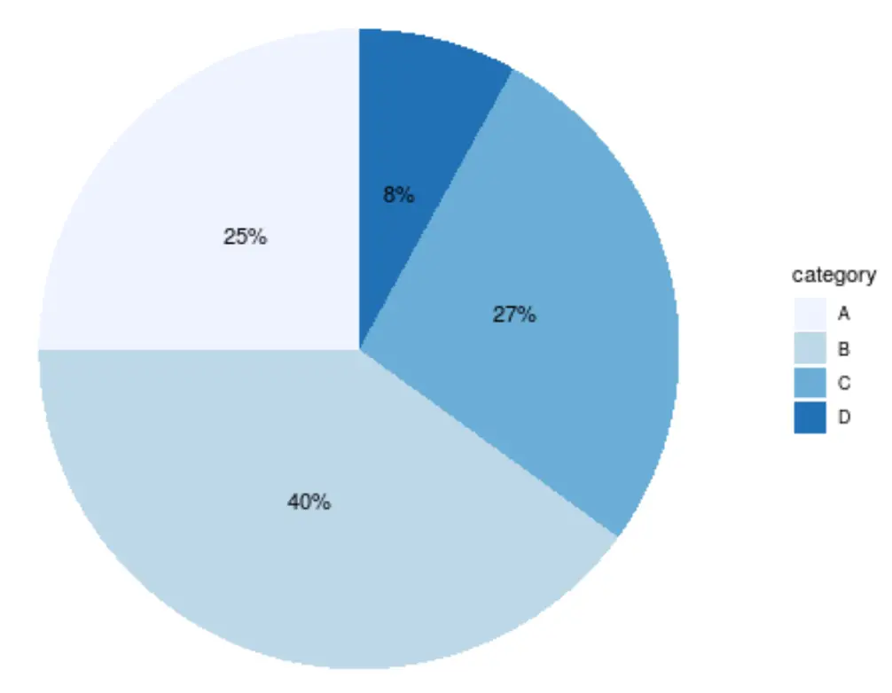
您还可以通过简单地选择酿酒商的色标之一来自定义切片颜色。例如,“蓝色”色标如下所示:
 ggplot(data, aes (x="", y=amount, fill=category)) +
  geom_bar(stat=" identity ", width= 1 ) +
  coord_polar(" y ", start= 0 ) +
  geom_text( aes (label = paste0(amount, " % ")), position = position_stack(vjust= 0.5 )) +
  labs(x = NULL, y = NULL) +
  theme_classic() +
  theme(axis.line = element_blank(),
          axis.text = element_blank(),
          axis.ticks = element_blank()) +
  scale_fill_brewer(palette=" Blues ")
其他资源
如何使用 ggplot2 在 R 中创建分组箱线图
如何使用 ggplot2 在 R 中创建热图
如何使用 ggplot2 在 R 中创建甘特图
关于作者
本杰明·安德森博
大家好,我是本杰明,一位退休的统计学教授,后来成为 Statorials 的热心教师。 凭借在统计领域的丰富经验和专业知识,我渴望分享我的知识,通过 Statorials 增强学生的能力。了解更多