Matplotlib 与 ggplot2:您应该使用哪个?
数据科学中最流行的两个数据可视化库是ggplot2和Matplotlib 。
ggplot2库用于 R 统计编程语言,而Matplotlib用于 Python。
尽管这两个库都允许您创建高度自定义的数据可视化,但与 Matplotlib 相比,ggplot2 通常允许您使用更少的代码行来完成此操作。
为了说明这一点,我们将展示如何使用这两个库创建相同类型的图表。
折线图:ggplot2 与 Matplotlib
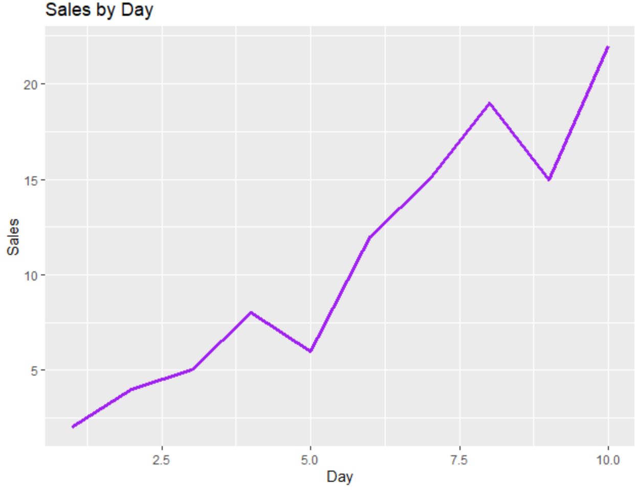
以下代码展示了如何使用ggplot2创建折线图:
 library (ggplot2)

#create data frame
df <- data. frame (day=c(1, 2, 3, 4, 5, 6, 7, 8, 9, 10),
                 sales=c(2, 4, 5, 8, 6, 12, 15, 19, 15, 22))

#create line chart
ggplot(df, aes(x=day, y=sales)) +
  geom_line(size= 1.2 , col=' purple ') +
  ggtitle(' Sales by Day ') +
  xlab(' Day ') +
  ylab(' Sales ')
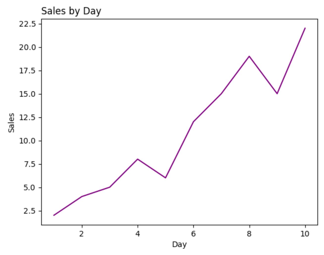
以下代码显示了如何使用Matplotlib创建相同的折线图:
 import pandas as pd
import matplotlib. pyplot as plt

#createDataFrame
df = pd. DataFrame ({' day ': [1, 2, 3, 4, 5, 6, 7, 8, 9, 10],
                   ' sales ': [2, 4, 5, 8, 6, 12, 15, 19, 15, 22]})

#create line chart
plt. plot (df. day , df. sales , color=' purple ')
plt. title (' Sales by Day ', loc=' left ')
plt. ylabel (' Sales ')
plt. xlabel (' Day ')
对于此示例,生成每个图所需的代码行数在 ggplot2 和 Matplotlib 之间大致相同。
散点图:ggplot2 与 Matplotlib
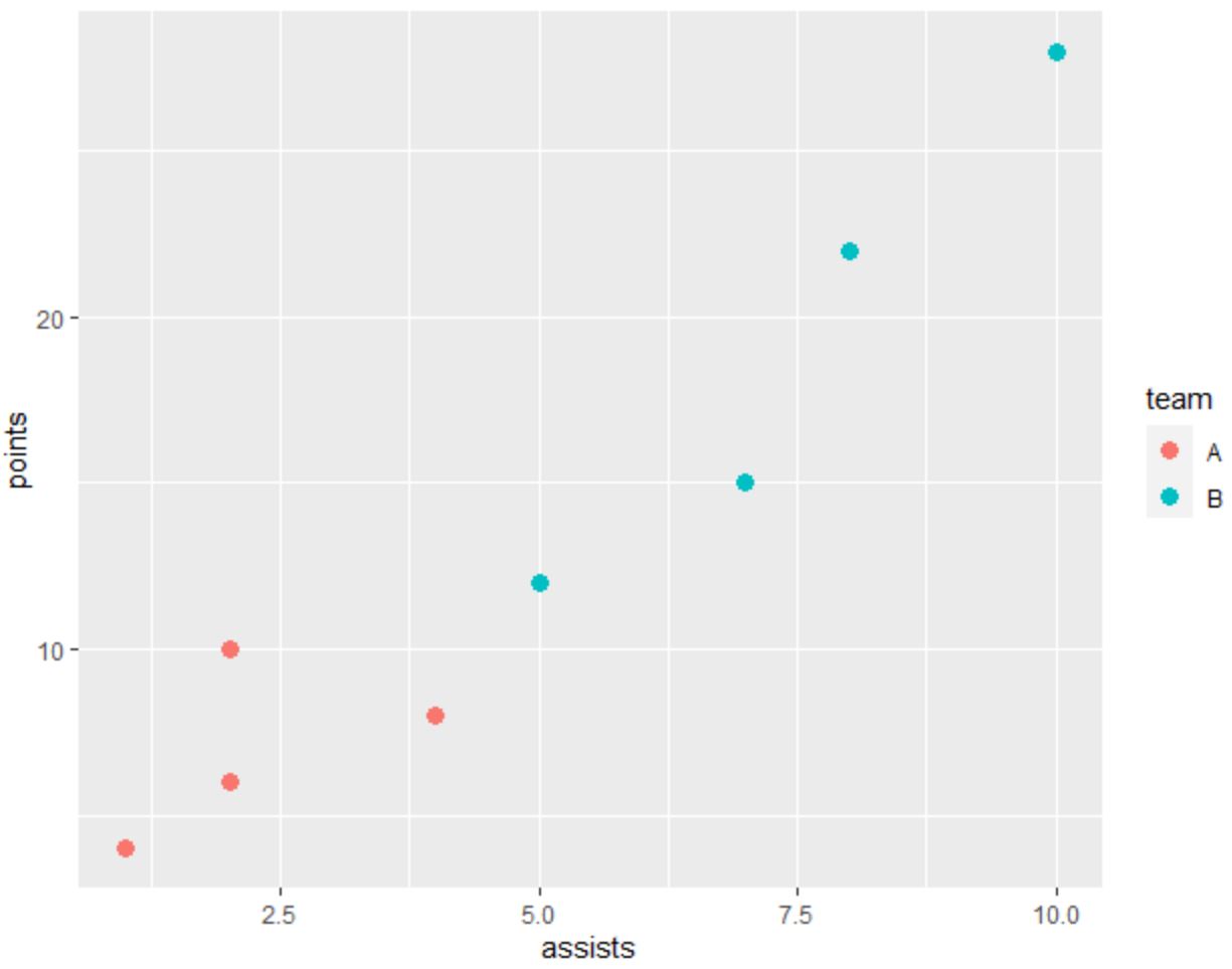
以下代码展示了如何在ggplot2中创建散点图,其中点按类别着色:
 library (ggplot2)

#create data frame
df <- data. frame (team=c('A', 'A', 'A', 'A', 'B', 'B', 'B', 'B'),
                 assists=c(1, 2, 2, 4, 5, 7, 8, 10),
                 points=c(4, 6, 10, 8, 12, 15, 22, 28))

#create scatterplot
ggplot(df, aes(x=assists, y=points)) +
  geom_point(aes(col=team), size= 3 )
以下代码显示了如何使用Matplotlib创建相同的散点图:
 import pandas as pd
import matplotlib. pyplot as plt

#createDataFrame
df = pd. DataFrame ({' team ': ['A', 'A', 'A', 'A', 'B', 'B', 'B', 'B'],
                   ' assists ': [1, 2, 2, 4, 5, 7, 8, 10],
                   ' points ': [4, 6, 10, 8, 12, 15, 22, 28]})

#define colors to use
color_list = []
for x in df[' team ']:
    if x == ' A ': color_list. append (' #F8766D ')
    else : color_list. append (' #00BFC4 ')

#create scatterplot
plt. scatter (df. assists , df. points , c=color_list)
plt. ylabel (' points ')
plt. xlabel (' assists ')
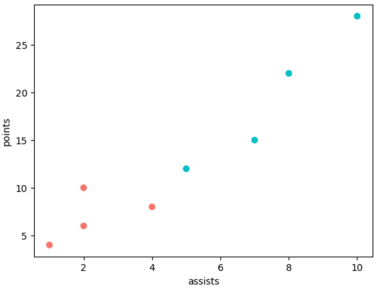
请注意,我们必须在 Matplotlib 中使用更多行代码来生成与 ggplot2 相同的绘图。
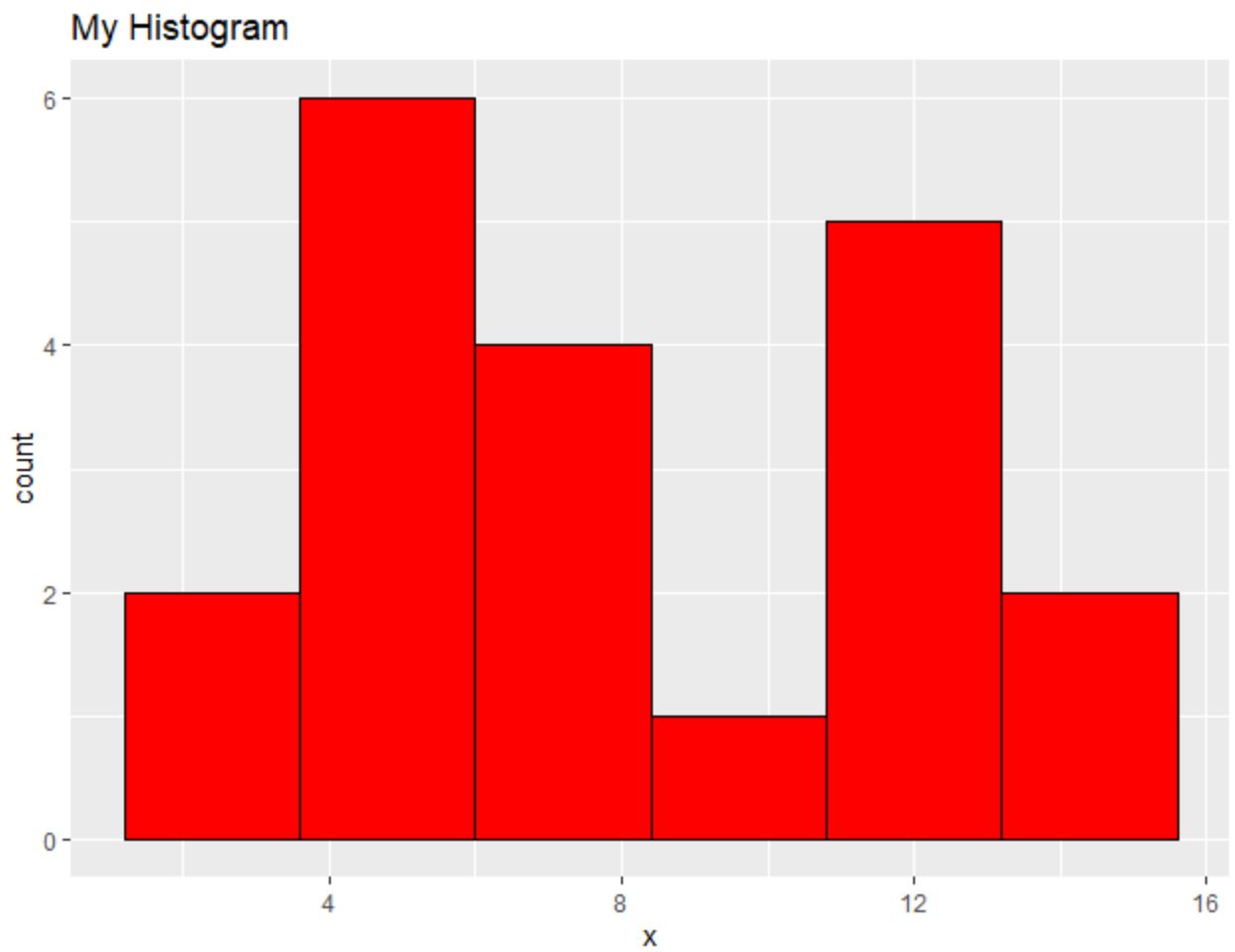
直方图:ggplot2 与 Matplotlib
以下代码显示了如何在ggplot2中创建直方图:
 library (ggplot2)

#create data frame
df <- data. frame (x=c(2, 2, 4, 4, 4, 5, 5, 6, 7, 7, 8, 8,
                     10, 11, 11, 11, 12, 13, 14, 14))

#create scatterplot
ggplot(df, aes(x=x)) +
  geom_histogram(bins= 6 , fill=' red ', color=' black ') +
  ggtitle(' My Histogram ')
以下代码展示了如何使用Matplotlib创建类似的直方图:
 import pandas as pd
import matplotlib. pyplot as plt

#createDataFrame
df = pd. DataFrame ({' x ': [2, 2, 4, 4, 4, 5, 5, 6, 7, 7, 8, 8,
                         10, 11, 11, 11, 12, 13, 14, 14]})

#create histogram
plt. hist (df[' x '], bins= 6 , color=' red ', ec=' black ')
plt. title (' My Histogram ', loc=' left ')
plt. xlabel (' x ')
plt. ylabel (' Count ')
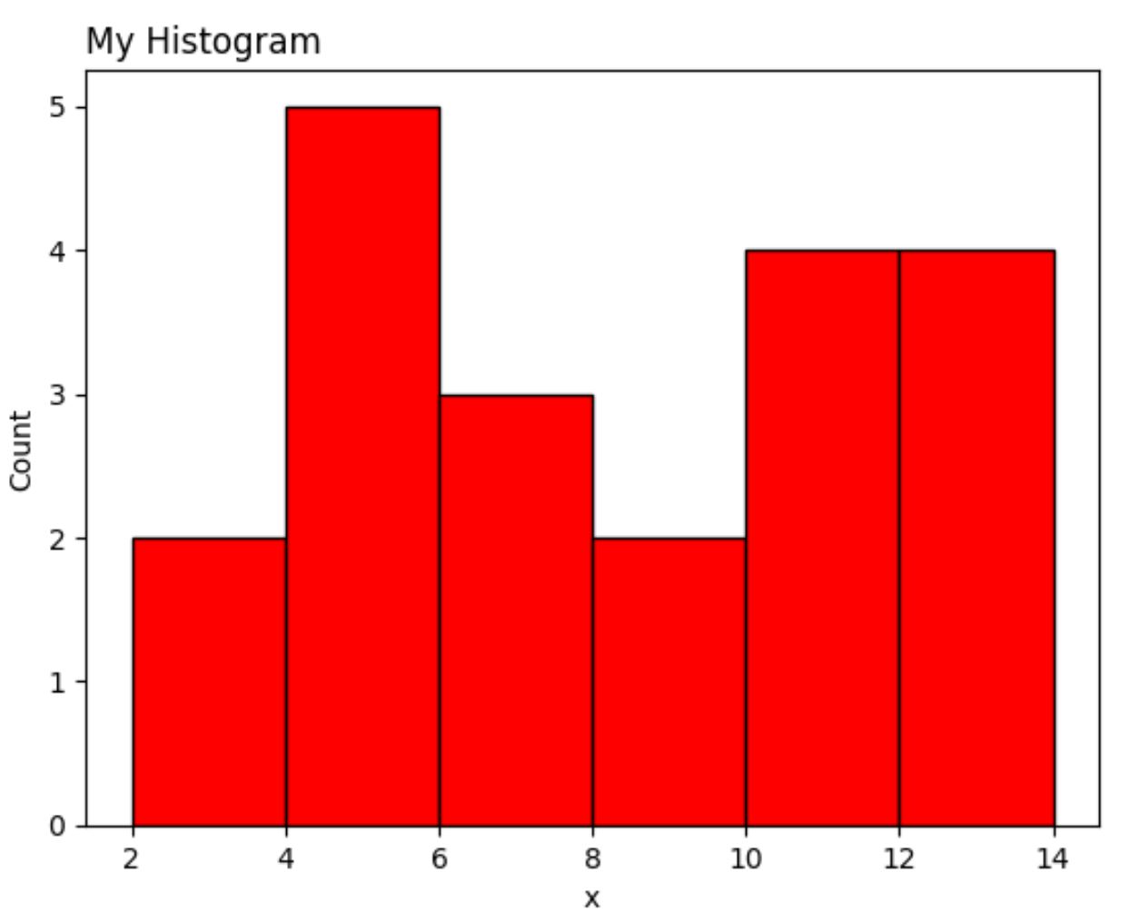
Matplotlib 版本再次需要比 ggplot2 更多的代码行。
结论
ggplot2 和 Matplotlib 允许您创建高度可定制的数据可视化,但 ggplot2 往往使用较少的代码。
通常,ggplot2 和 Matplotlib 之间的偏好仅取决于您用于数据分析的编程语言。
使用 Python 的人倾向于使用 Matplotlib,因为他们可以使用单一编程语言进行数据分析并创建数据可视化。
相反,使用 R 的人倾向于使用 ggplot2,因为它允许他们用单一编程语言完成所有数据分析和可视化。
关于作者
本杰明·安德森博
大家好,我是本杰明,一位退休的统计学教授,后来成为 Statorials 的热心教师。 凭借在统计领域的丰富经验和专业知识,我渴望分享我的知识,通过 Statorials 增强学生的能力。了解更多