如何在ggplot2中绘制平均值和标准差
通常,您可能想在 ggplot2 中按组绘制平均值和标准差。
幸运的是,使用 ggplot2 中的geom_point()和geom_errorbar()函数可以轻松做到这一点。
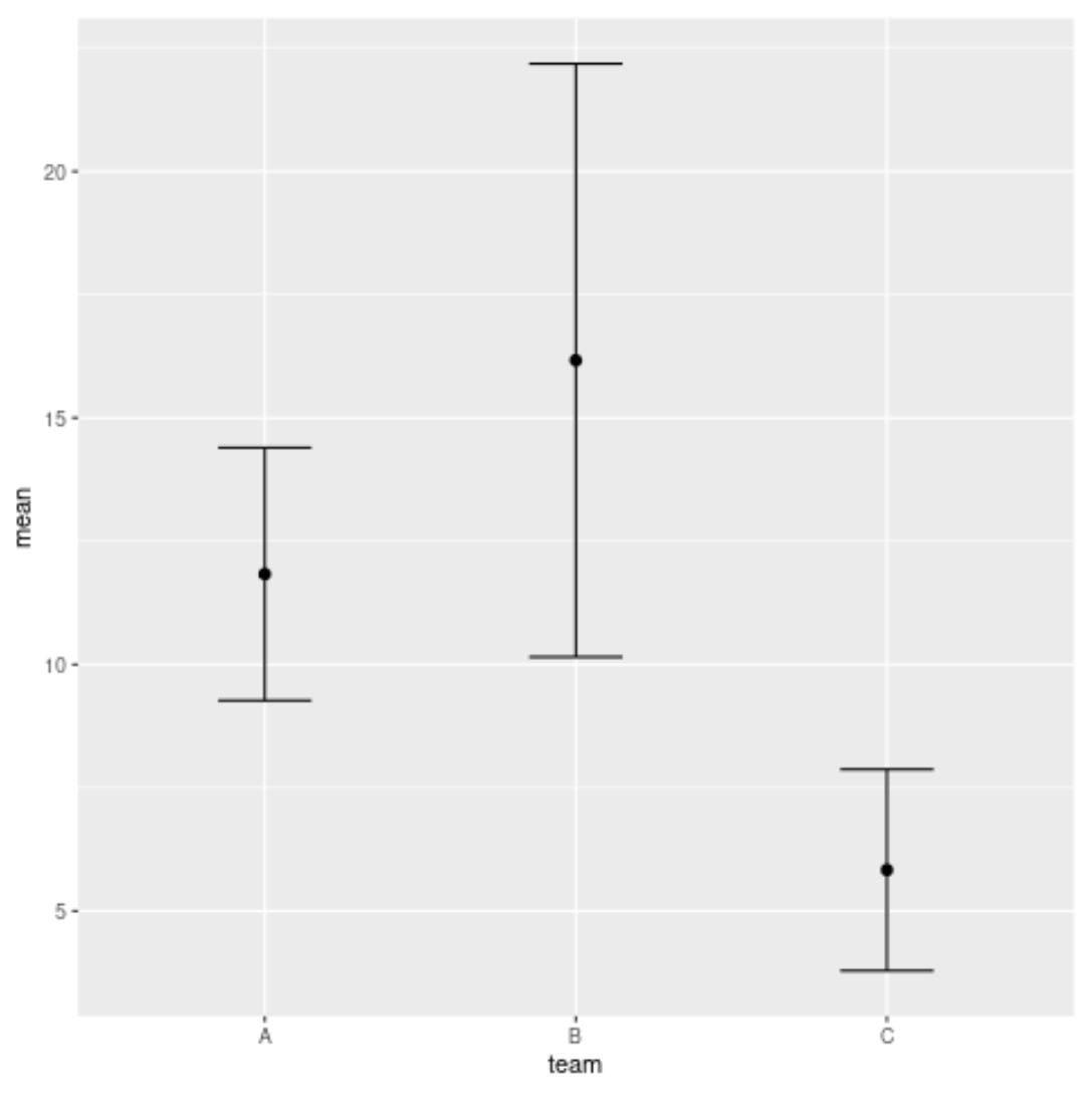
以下示例演示如何使用这些函数创建以下图表,该图表显示不同篮球队得分的平均值和标准差:
示例:在 ggplot2 中绘制平均值和标准差
假设我们在 R 中有以下数据框,其中包含有关来自三个不同球队的篮球运动员得分的信息:
 #create data frame
df <- data. frame (team=rep(c(' A ', ' B ', ' C '), each= 6 ),
                 points=c(8, 10, 12, 12, 14, 15, 10, 11, 12,
                          18, 22, 24, 3, 5, 5, 6, 7, 9))

#view head of data frame
head(df)

  team points
1 to 8
2 to 10
3 to 12
4 to 12
5 to 14
6 to 15
我们可以使用dplyr包中的函数来快速计算每支球队球员得分的平均值和标准差:
 library (dplyr)

#calculate mean and sd of points by team
df_mean_std <- df %>%
  group_by(team) %>%
  summarise_at(vars(points), list(mean=mean, sd=sd)) %>%
  as. data . frame ()

#view results
df_mean_std

  team mean sd
1 A 11.833333 2.562551
2 B 16.166667 6.013873
3 C 5.833333 2.041241
最后,我们可以使用以下ggplot2函数来可视化每支球队球员得分的平均值和标准差:
 library (ggplot2)

#plot mean and standard deviation of points by team
ggplot(df_mean_std, aes(x=team, y=mean)) +
  geom_errorbar(aes(ymin=mean-sd, ymax=mean+sd), width= .3 ) +
  geom_point(size= 2 )
生成的图表显示了每支球队球员得分的平均值和标准差。
圆圈代表平均值,每个圆圈上方和下方的条形长度代表标准差。
注意: geom_errorbar()函数中的宽度参数指定误差线的宽度。请随意更改此值以调整图中误差线的宽度。
其他资源
以下教程解释了如何在 ggplot2 中执行其他常见任务:
如何向 ggplot2 绘图添加图例
如何更改ggplot2中的字体大小
如何删除ggplot2中的图例
如何在ggplot2中旋转轴标签
关于作者
本杰明·安德森博
大家好,我是本杰明,一位退休的统计学教授,后来成为 Statorials 的热心教师。 凭借在统计领域的丰富经验和专业知识,我渴望分享我的知识,通过 Statorials 增强学生的能力。了解更多