如何在 ggplot2 箱线图中标记异常值
本教程提供了如何在 ggplot2 箱线图中标记离群值的分步示例。
第 1 步:创建数据框
首先,我们创建以下数据框,其中包含三支不同球队的 60 名不同篮球运动员的得分信息:
 #make this example reproducible
set. seeds (1)

#create data frame
df <- data. frame (team=rep(c('A', 'B', 'C'), each= 20 ),
                 player=rep(LETTERS[1:20], times= 3 ),
                 points=round(rnorm(n=60, mean=30, sd=10), 2))

#view head of data frame
head(df)

  team player points
1 AA 23.74
2AB 31.84
3 AC 21.64
4AD 45.95
5 AE 33.30
6 FY 21.80
注意:我们使用set.seed()函数来确保此示例是可重现的。
步骤 2:定义一个函数来识别异常值
在 ggplot2 中,如果观测值满足以下两个要求之一,则将其定义为异常值:
- 观测值是第一个四分位数 (Q1) 以下四分位数间距的 1.5 倍
- 观测值是第三个四分位数 (Q3) 上方四分位数间距的 1.5 倍。
我们可以在 R 中创建以下函数,如果观测值满足这两个要求之一,则将其标记为异常值:
 find_outlier <- function (x) {
  return (x < quantile(x, .25) - 1.5*IQR(x) | x > quantile(x, .75) + 1.5*IQR(x))
}
相关:如何解释四分位数范围
步骤 3:在 ggplot2 的箱线图中标记离群值
然后我们可以使用以下代码来标记 ggplot2 箱线图中的异常值:
 library (ggplot2)
library (dplyr)

#add new column to data frame that indicates if each observation is an outlier
df <- df %>%
        group_by(team) %>%
        mutate(outlier = ifelse(find_outlier(points), points, NA))

#create box plot of points by team and label outliers
ggplot(df, aes(x=team, y=points)) +
  geom_boxplot() +
  geom_text(aes(label=outlier), na. rm = TRUE , hjust= -.5 )
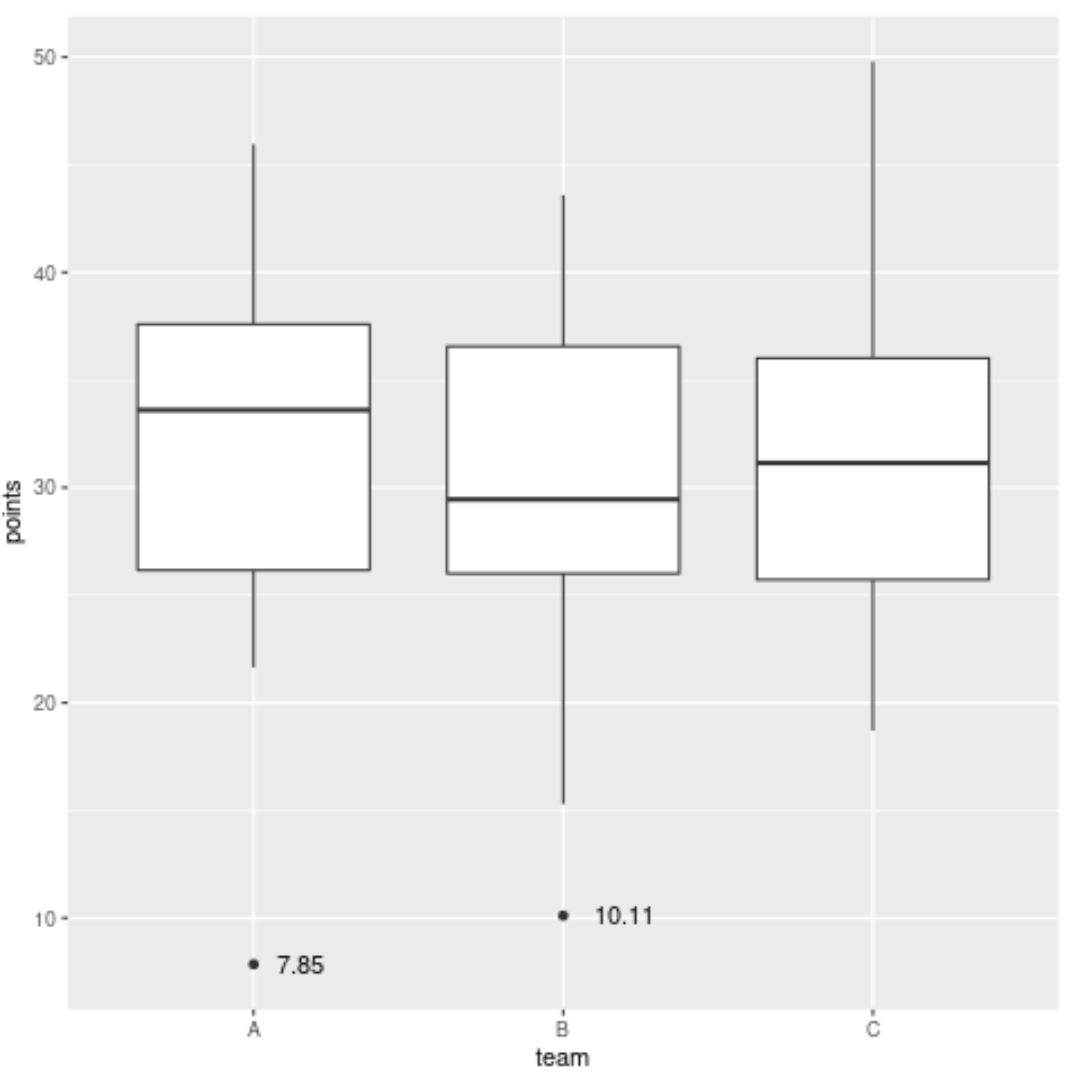
请注意,图中标记了两个异常值。
第一个异常值是 A 队得分7.85分的选手,另一个异常值是 B 队得分10.11分的选手。
请注意,我们还可以使用不同的变量来标记这些异常值。
例如,我们可以在mutate()函数中交换玩家的点,以根据玩家的名字标记异常值:
 library (ggplot2)
library (dplyr)

#add new column to data frame that indicates if each observation is an outlier
df <- df %>%
        group_by(team) %>%
        mutate(outlier = ifelse(find_outlier(points), player, NA))

#create box plot of points by team and label outliers
ggplot(df, aes(x=team, y=points)) +
  geom_boxplot() +
  geom_text(aes(label=outlier), na. rm = TRUE , hjust= -.5 )
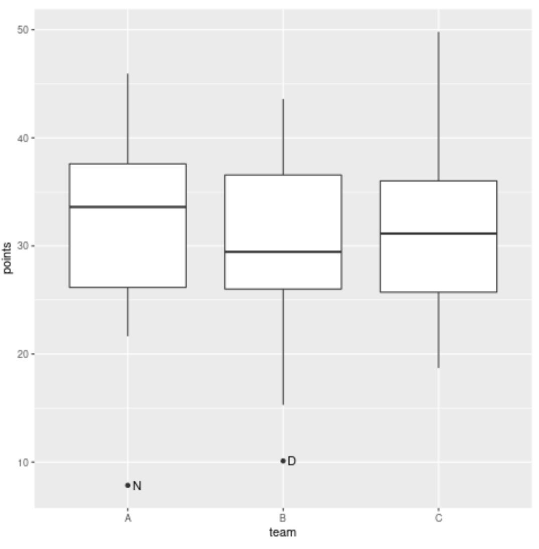
A 队的异常值现在具有标签N ,B 队的异常值现在具有标签D ,因为它们代表得分异常值的球员的姓名。
注意: geom_text()中的hjust参数用于将标签水平向右推,使其不与绘图点重叠。
其他资源
以下教程解释了如何在 ggplot2 中执行其他常见任务:
关于作者
本杰明·安德森博
大家好,我是本杰明,一位退休的统计学教授,后来成为 Statorials 的热心教师。 凭借在统计领域的丰富经验和专业知识,我渴望分享我的知识,通过 Statorials 增强学生的能力。了解更多