如何在 r 中创建堆叠条形图(带有示例)
堆积条形图是一种图表,它显示由另一个变量堆积的不同变量的数量。
本教程介绍如何使用ggplot2数据可视化库在 R 中创建堆叠条形图。
条形图堆叠在 ggplot2 中
假设我们有以下数据框,显示九名篮球运动员每场比赛的平均得分:
 #create data frame
df <- data.frame(team= rep (c(' A ', ' B ', ' C '), each =3),
                 position= rep (c(' Guard ', ' Forward ', ' Center '), times =3),
                 dots=c(14, 8, 8, 16, 3, 7, 17, 22, 26))

#view data frame
df

  team position points
1 A Guard 14
2 A Forward 8
3 A Center 8
4 B Guard 16
5 B Forward 3
6 B Center 7
7 C Guard 17
8 C Forward 22
9C Center 26
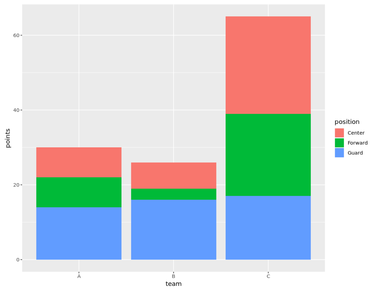
我们可以使用以下代码创建一个堆积条形图,显示每个球员的得分,按球队和位置堆积:
 library (ggplot2)

ggplot(df, aes (fill=position, y=points, x=team)) +
  geom_bar(position=' stack ', stat=' identity ')
自定义堆叠条形图
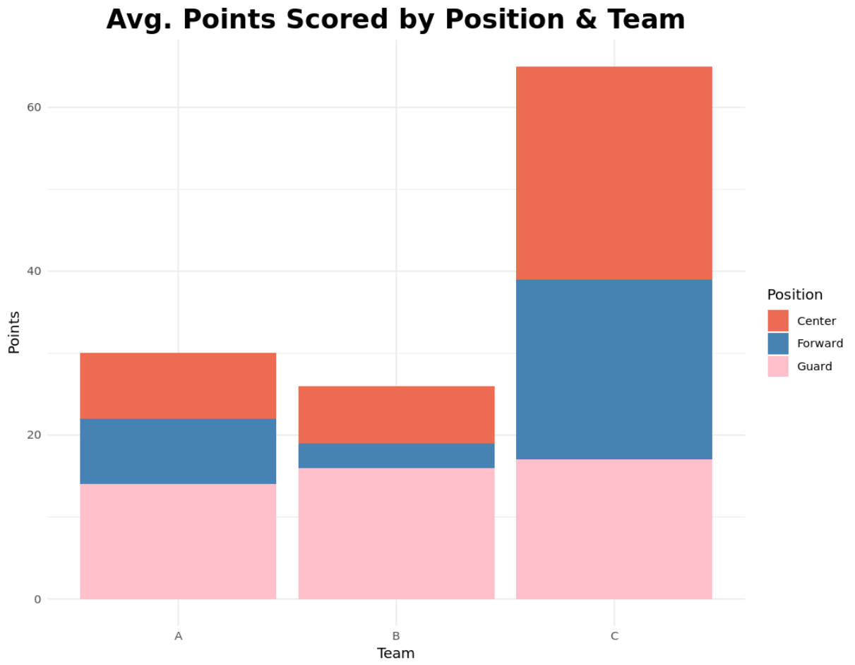
我们还可以自定义堆叠条形图的标题、轴标签、主题和颜色,以使其具有我们想要的外观:
 library (ggplot2)

ggplot(df, aes (fill=position, y=points, x=team)) +
  geom_bar(position=' stack ', stat=' identity ') +
  theme_minimal() +
  labs(x=' Team ', y=' Points ', title=' Avg. Points Scored by Position & Team ') +
  theme(plot.title = element_text (hjust=0.5, size=20, face=' bold ')) +
  scale_fill_manual(' Position ', values=c(' coral2 ', ' steelblue ', ' pink '))
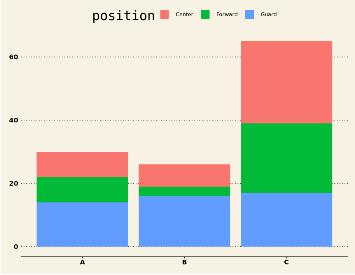
我们还可以使用ggthemes库中的预定义主题之一进一步自定义外观。例如,我们可以使用此库中的《华尔街日报》主题:
 install.packages ('ggthemes')

library (ggplot2)
library (ggthemes)

ggplot(df, aes (fill=position, y=points, x=team)) +
  geom_bar(position=' stack ', stat=' identity ') +
  theme_wsj()
有关更多主题,请参阅我们的最佳 ggplot2 主题完整指南。
其他资源
关于作者
本杰明·安德森博
大家好,我是本杰明,一位退休的统计学教授,后来成为 Statorials 的热心教师。 凭借在统计领域的丰富经验和专业知识,我渴望分享我的知识,通过 Statorials 增强学生的能力。了解更多