如何在 r 中创建双向表(附示例)
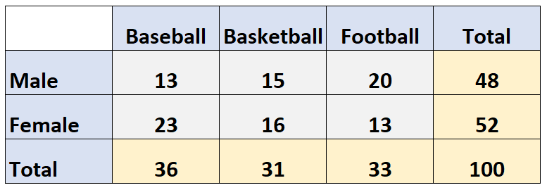
双向表是一种显示两个分类变量的频率的表。
例如,下面的双向表显示了一项调查结果,该调查询问了 100 个人他们喜欢哪种运动:棒球、篮球或足球。
行显示受访者的性别,列表示他们选择的运动:
本教程提供了在 R 中创建和使用双向数组的几个示例。
示例 1:从头开始创建复式表
以下代码演示了如何使用as.table()函数从头开始创建复式表:
 #create matrix
data <- matrix(c(13, 23, 15, 16, 20, 13), ncol= 3 )

#specify row and column names of matrix
rownames(data) <- c('Male', 'Female')
colnames(data) <- c('Baseball', 'Basketball', 'Football')

#convert matrix to table
data <- as. table (data)

#display table
data

       Baseball Basketball Soccer
Male 13 15 20
Female 23 16 13
示例 2:根据数据创建双向表
以下代码显示如何从数据框创建双向表:
 #create data frame
df <- data. frame (sport=c(' Base ', ' Base ', ' Bask ', ' Foot ', ' Foot '),
                 gender=c(' Male ', ' Female ', ' Male ', ' Male ', ' Female '))

#view data frame
df

#create two way table from data frame
data <- table(df$gender, df$sport)

#display two way table
data

         Base Basketball
  Female 1 0 1
  Male 1 1 1
示例 3:计算复式记账表的保证金总和
以下代码展示了如何使用margin.table()函数计算双向表的保证金总和:
 #create matrix of data
data <- matrix(c(13, 15, 20, 23, 16, 13), ncol=3)
rownames(data) <- c(' Male ', ' Female ')
colnames(data) <- c(' Baseball ', ' Basketball ', ' Football ')

#find sum of genders
margin. table (data, margin=1)

  Male Female
    49 51

#find sum of sports

margin. table (data, margin=2)

Baseball Basketball Soccer
        28 43 29
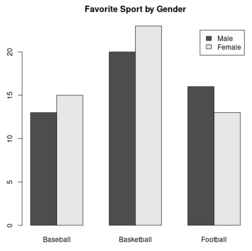
示例 4:可视化双向表的频率
在双向表中可视化频率的一种方法是创建条形图:
barplot(data, legend= True , beside= True , main=' Favorite Sport by Gender ')
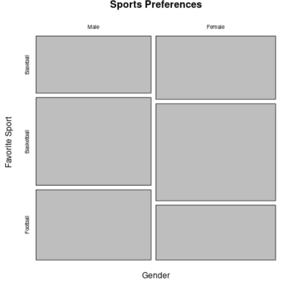
在双向表中可视化频率的另一种方法是创建平铺图:
mosaicplot(data, main=' Sports Preferences ', xlab=' Gender ', ylab=' Favorite Sport ')
您可以在此页面上找到更多 R 教程。
关于作者
本杰明·安德森博
大家好,我是本杰明,一位退休的统计学教授,后来成为 Statorials 的热心教师。 凭借在统计领域的丰富经验和专业知识,我渴望分享我的知识,通过 Statorials 增强学生的能力。了解更多