मैटप्लोटलिब कलरबार की स्थिति को कैसे समायोजित करें
कलर बार एक बार है जो मैटप्लोटलिब चार्ट के नीचे की ओर चलता है और चार्ट में प्रदर्शित रंगों के लिए एक किंवदंती के रूप में कार्य करता है।
Matplotlib डिफ़ॉल्ट रूप से चार्ट के दाईं ओर रंग पट्टियाँ प्रदर्शित करता है, लेकिन आप Matplotlib AxesGrid टूलकिट में फ़ंक्शन का उपयोग करके इसे आसानी से बदल सकते हैं।
यह ट्यूटोरियल व्यवहार में इन फ़ंक्शंस का उपयोग कैसे करें इसके कई उदाहरण दिखाता है।
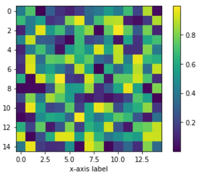
उदाहरण 1: रंग पट्टी को चार्ट के दाईं ओर रखें
निम्नलिखित कोड दिखाता है कि मैटप्लोटलिब चार्ट कैसे तैयार किया जाए और चार्ट के दाईं ओर रंग पट्टी कैसे लगाई जाए:
 import numpy as np
import matplotlib.pyplot as plt
from mpl_toolkits.axes_grid1 import make_axes_locatable

#make this example reproducible
np.random.seed(1)

#create chart
fig, ax = plt. subplots ()
im = ax. imshow (np.random.rand(15,15))
ax. set_xlabel (' x-axis label ')

#add color bar
fig. colorbar (im)

plt. show ()
उदाहरण 2: रंग पट्टी को ग्राफ़ के नीचे रखें
निम्नलिखित कोड दिखाता है कि मैटप्लोटलिब चार्ट के अंतर्गत रंग पट्टी कैसे रखें:
 import numpy as np
import matplotlib.pyplot as plt
from mpl_toolkits.axes_grid1 import make_axes_locatable

#make this example reproducible
np.random.seed(1)

#create chart
fig, ax = plt. subplots ()
im = ax. imshow (np.random.rand(15,15))
ax. set_xlabel (' x-axis label ')

#add color bar below chart
divider = make_axes_locatable (ax)
cax = divider. new_vertical (size=' 5% ', pad=0.6, pack_start= True )
fig. add_axes (cax)
fig. colorbar (im, cax=cax, orientation=' horizontal ')

plt. show ()
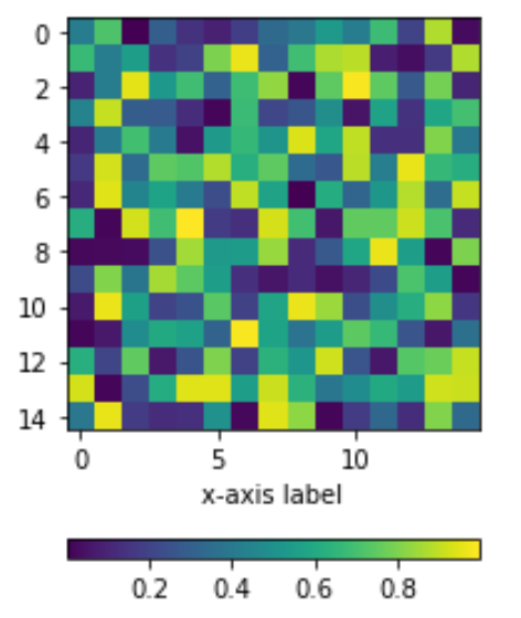
ध्यान दें कि पैड तर्क चार्ट के एक्स-अक्ष और रंग पट्टी के बीच एक पैडिंग बनाता है। पैड मान जितना अधिक होगा, रंग पट्टी x-अक्ष से उतनी ही दूर होगी।
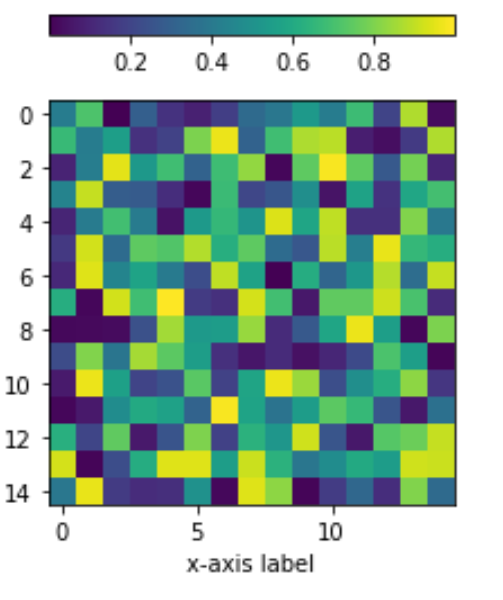
उदाहरण 3: रंग पट्टी को चार्ट के ऊपर रखें
निम्नलिखित कोड दिखाता है कि मैटप्लोटलिब चार्ट के ऊपर रंग पट्टी कैसे लगाई जाए:
 import numpy as np
import matplotlib.pyplot as plt
from mpl_toolkits.axes_grid1 import make_axes_locatable

#make this example reproducible
np.random.seed(1)

#create chart
fig, ax = plt. subplots ()
im = ax. imshow (np.random.rand(15,15))
ax. set_xlabel (' x-axis label ')

#add color bar below chart
divider = make_axes_locatable (ax)
cax = divider. new_vertical (size=' 5% ', pad=0.4)
fig. add_axes (cax)
fig. colorbar (im, cax=cax, orientation=' horizontal ')

plt. show ()
आप यहां अधिक Matplotlib ट्यूटोरियल पा सकते हैं।
लेखक के बारे में
डॉ. बेंजामिन एंडरसन
नमस्ते, मैं बेंजामिन हूं, एक सेवानिवृत्त सांख्यिकी प्रोफेसर जो अब समर्पित Statorials शिक्षक बन गया है। सांख्यिकी के क्षेत्र में व्यापक अनुभव और विशेषज्ञता के साथ, मैं Statorials के माध्यम से छात्रों को सशक्त बनाने के लिए अपना ज्ञान साझा करने के लिए उत्सुक हूं। अधिक जाने