Ggplot2 में एक रेखीय प्रतिगमन रेखा कैसे प्लॉट करें (उदाहरण के साथ)
आप निम्नलिखित मूल सिंटैक्स का उपयोग करके फिट किए गए रैखिक प्रतिगमन मॉडल को प्लॉट करने के लिए आर विज़ुअलाइज़ेशन लाइब्रेरी ggplot2 का उपयोग कर सकते हैं:
 ggplot(data,aes(x, y)) +
  geom_point() +
  geom_smooth(method=' lm ')
निम्नलिखित उदाहरण दिखाता है कि व्यवहार में इस वाक्यविन्यास का उपयोग कैसे करें।
उदाहरण: ggplot2 में एक रेखीय प्रतिगमन रेखा आलेखित करना
मान लीजिए कि हम निम्नलिखित डेटा सेट में एक सरल रैखिक प्रतिगमन मॉडल फिट करते हैं:
 #create dataset
data <- data.frame(y=c(6, 7, 7, 9, 12, 13, 13, 15, 16, 19, 22, 23, 23, 25, 26),
                   x=c(1, 2, 2, 3, 4, 4, 5, 6, 6, 8, 9, 9, 11, 12, 12))

#fit linear regression model to dataset and view model summary
model <- lm(y~x, data=data)
summary(model)

Call:
lm(formula = y ~ x, data = data)

Residuals:
    Min 1Q Median 3Q Max
-1.4444 -0.8013 -0.2426 0.5978 2.2363

Coefficients:
            Estimate Std. Error t value Pr(>|t|)
(Intercept) 4.20041 0.56730 7.404 5.16e-06 ***
x 1.84036 0.07857 23.423 5.13e-12 ***
---
Significant. codes: 0 '***' 0.001 '**' 0.01 '*' 0.05 '.' 0.1 ' ' 1

Residual standard error: 1.091 on 13 degrees of freedom
Multiple R-squared: 0.9769, Adjusted R-squared: 0.9751
F-statistic: 548.7 on 1 and 13 DF, p-value: 5.13e-12
निम्नलिखित कोड दिखाता है कि फिट किए गए रैखिक प्रतिगमन मॉडल की कल्पना कैसे करें:
 library (ggplot2)

#create plot to visualize fitted linear regression model
ggplot(data,aes(x, y)) +
  geom_point() +
  geom_smooth(method=' lm ')
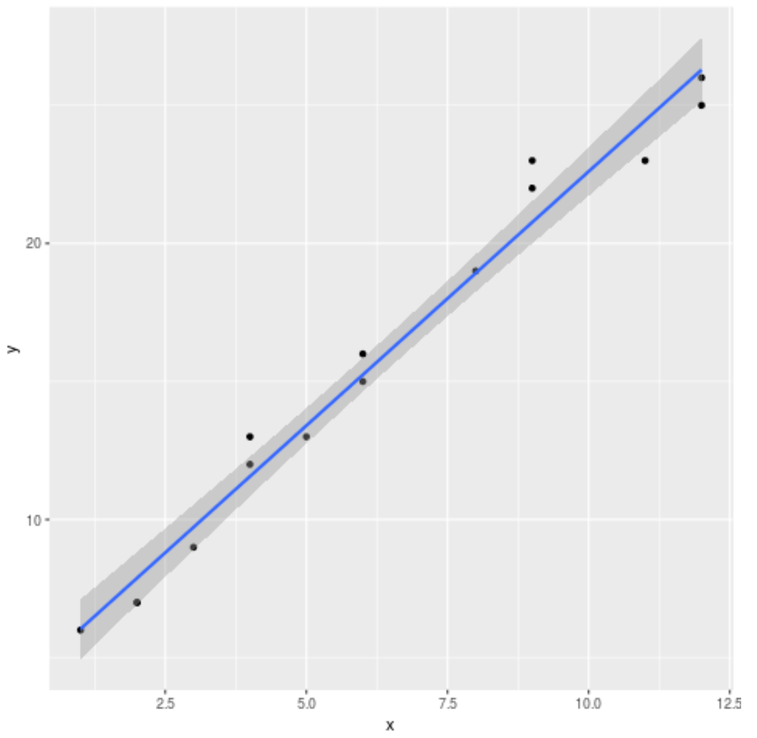
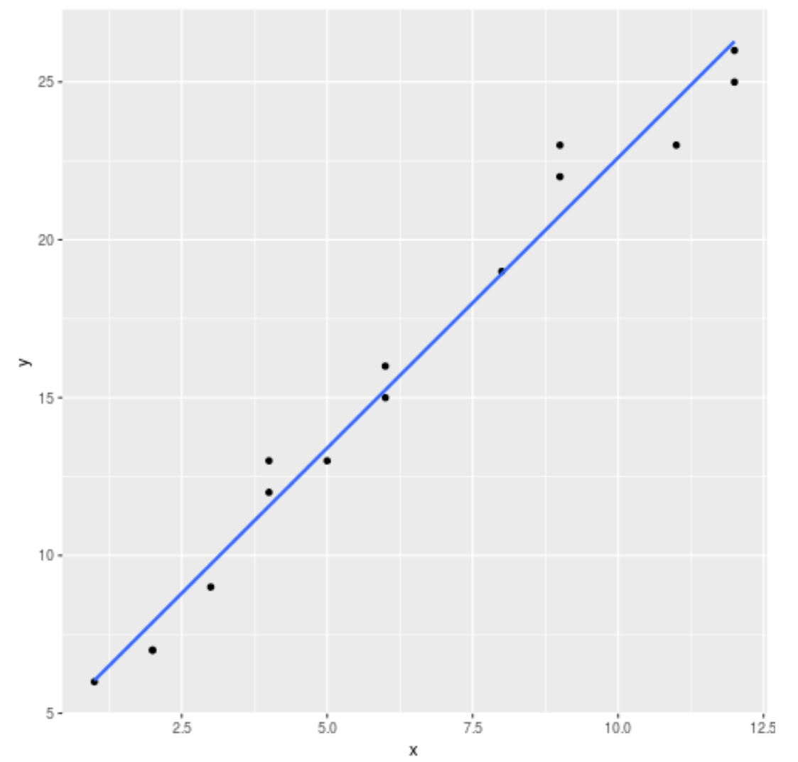
डिफ़ॉल्ट रूप से, ggplot2 ग्राफ़ में मानक त्रुटि रेखाएँ जोड़ता है। आप उन्हें se=FALSE तर्क का उपयोग करके निम्नानुसार अक्षम कर सकते हैं:
 library (ggplot2)

#create regression plot with no standard error lines
ggplot(data,aes(x, y)) +
  geom_point() +
  geom_smooth(method=' lm ', se= FALSE )
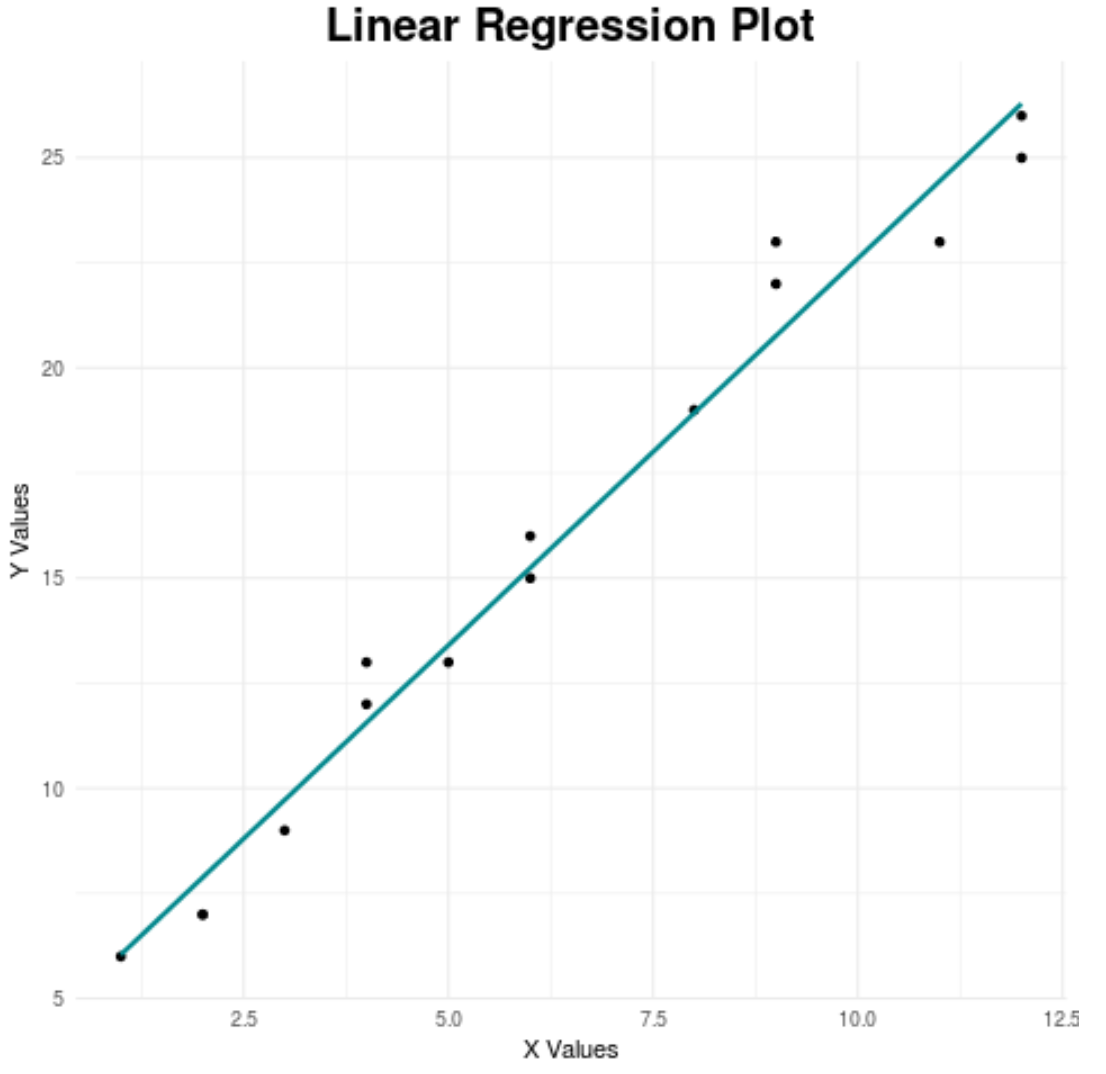
अंत में, हम चार्ट को अधिक आकर्षक बनाने के लिए उसके कुछ पहलुओं को अनुकूलित कर सकते हैं:
 library (ggplot2)

#create regression plot with customized style
ggplot(data,aes(x, y)) +
  geom_point() +
  geom_smooth(method=' lm ', se= FALSE , color=' turquoise4 ') +
  theme_minimal() +
  labs(x=' X Values ', y=' Y Values ', title=' Linear Regression Plot ') +
  theme(plot.title = element_text(hjust=0.5, size=20, face=' bold '))
सर्वोत्तम ggplot2 थीम की संपूर्ण मार्गदर्शिका के लिए इस लेख को देखें।
अतिरिक्त संसाधन
आर में एकाधिक रैखिक प्रतिगमन का परिचय
आर में कॉन्फिडेंस इंटरवल कैसे प्लॉट करें
लेखक के बारे में
डॉ. बेंजामिन एंडरसन
नमस्ते, मैं बेंजामिन हूं, एक सेवानिवृत्त सांख्यिकी प्रोफेसर जो अब समर्पित Statorials शिक्षक बन गया है। सांख्यिकी के क्षेत्र में व्यापक अनुभव और विशेषज्ञता के साथ, मैं Statorials के माध्यम से छात्रों को सशक्त बनाने के लिए अपना ज्ञान साझा करने के लिए उत्सुक हूं। अधिक जाने