मैटप्लॉटलिब में टाइम सीरीज़ कैसे प्लॉट करें (उदाहरण के साथ)
आप Matplotlib में समय श्रृंखला को प्लॉट करने के लिए निम्नलिखित सिंटैक्स का उपयोग कर सकते हैं:
 import matplotlib. pyplot as plt

plt. plot (df. x , df. y )
यह मानता है कि वेरिएबल x datetime.datetime() वर्ग से संबंधित है।
निम्नलिखित उदाहरण दिखाते हैं कि पायथन में समय श्रृंखला डेटा को प्लॉट करने के लिए इस सिंटैक्स का उपयोग कैसे करें।
उदाहरण 1: मैटप्लोटलिब में एक बुनियादी समय श्रृंखला प्लॉट करें
निम्नलिखित कोड दिखाता है कि मैटप्लोटलिब में एक समय श्रृंखला कैसे प्लॉट की जाए जो किसी व्यवसाय द्वारा लगातार 12 दिनों तक की गई कुल बिक्री को दर्शाती है:
 import matplotlib. pyplot as plt
import datetime
import numpy as np
import pandas as pd

#define data
df = pd. DataFrame ({' date ': np. array ([datetime. datetime (2020, 1, i+1)
for i in range(12)]),
                   ' sales ': [3, 4, 4, 7, 8, 9, 14, 17, 12, 8, 8, 13]})

#plot time series
plt. plot (df. date , df. sales , linewidth= 3 )
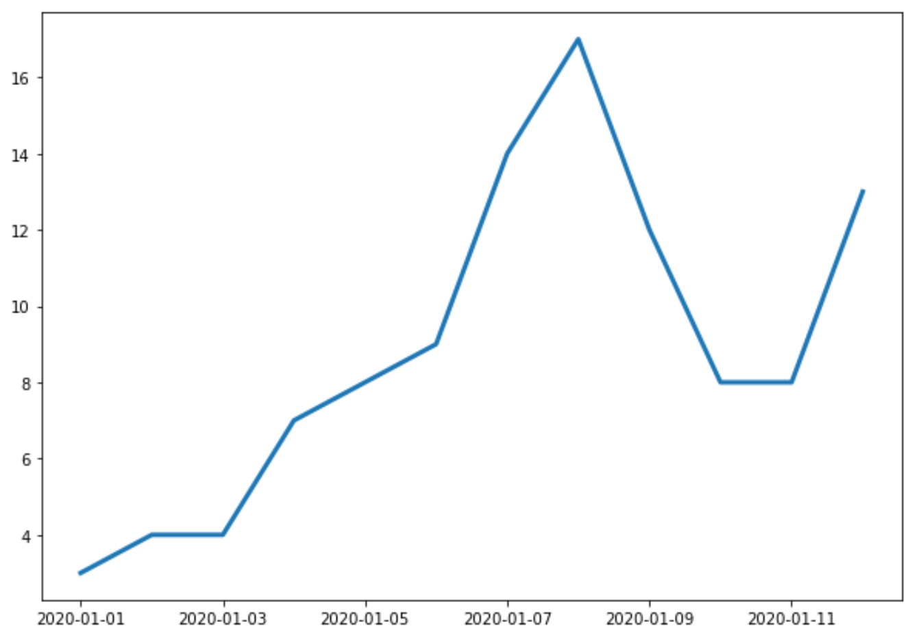
एक्स-अक्ष दिनांक दिखाता है और वाई-अक्ष प्रत्येक तिथि पर कुल बिक्री दिखाता है।
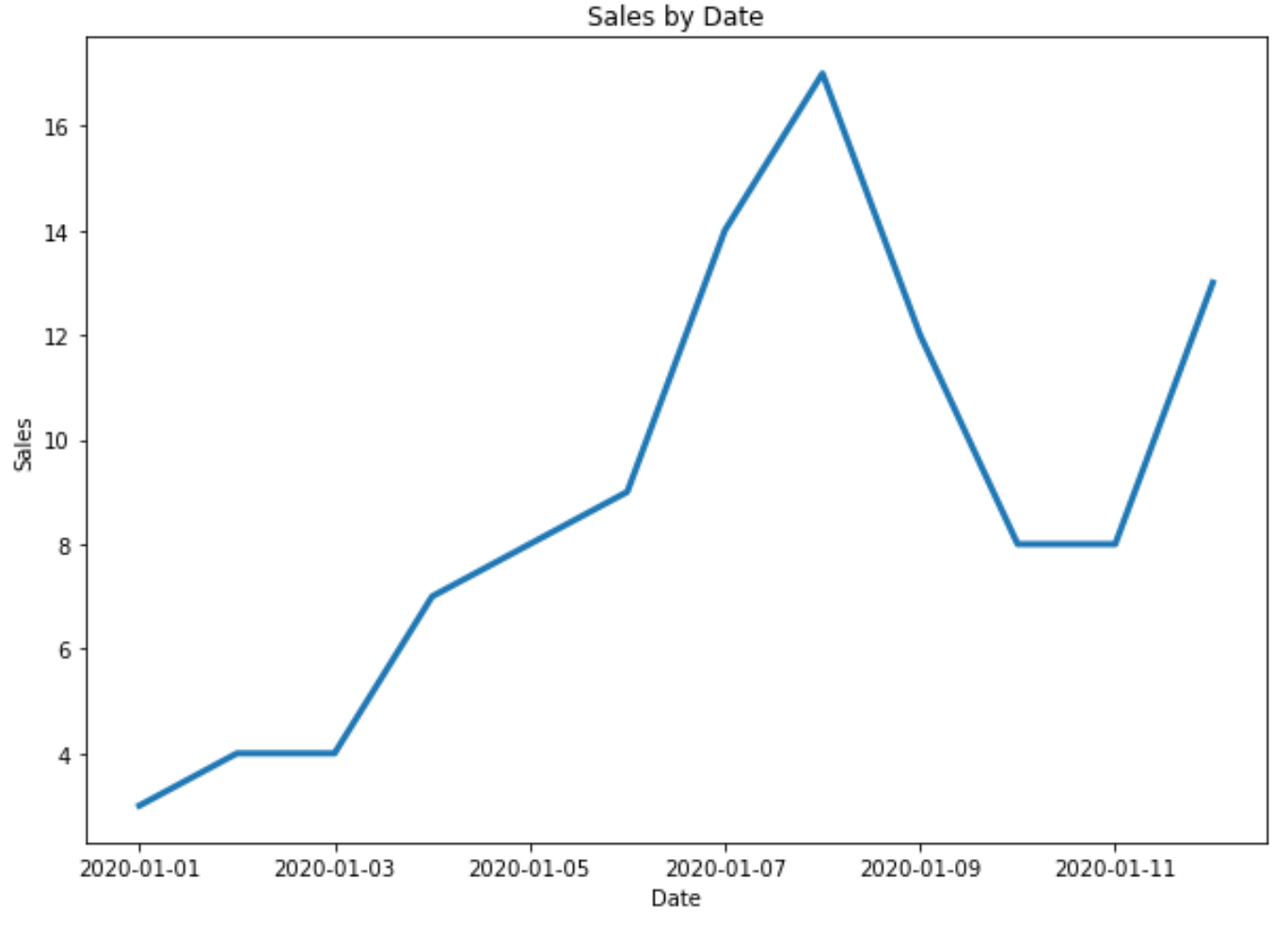
उदाहरण 2: शीर्षक और अक्ष लेबल अनुकूलित करें
आप प्लॉट में शीर्षक और अक्ष लेबल जोड़ने के लिए निम्नलिखित कोड का उपयोग कर सकते हैं:
 import matplotlib. pyplot as plt
import datetime
import numpy as np
import pandas as pd

#define data
df = pd. DataFrame ({' date ': np. array ([datetime. datetime (2020, 1, i+1)
for i in range(12)]),
                   ' sales ': [3, 4, 4, 7, 8, 9, 14, 17, 12, 8, 8, 13]})

#plot time series
plt. plot (df. date , df. sales , linewidth= 3 )

#add title and axis labels
plt. title (' Sales by Date ')
plt. xlabel (' Date ')
plt. ylabel (' Sales ')
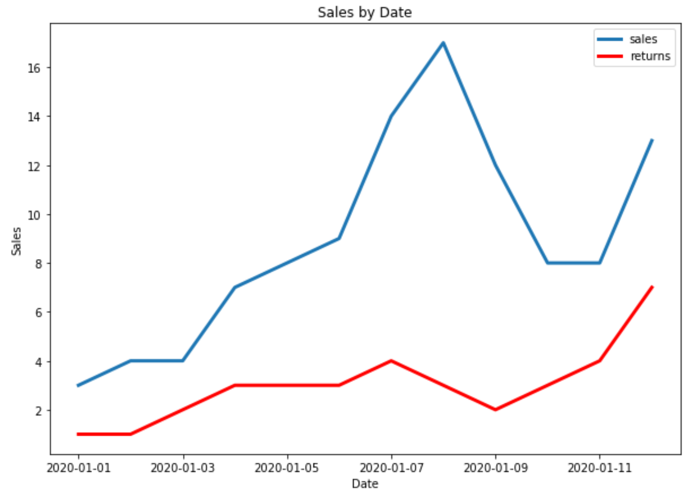
उदाहरण 3: मैटप्लोटलिब में एकाधिक समय श्रृंखला प्लॉट करें
निम्नलिखित कोड दिखाता है कि Matplotlib में एक ही प्लॉट में एकाधिक समय श्रृंखला को कैसे प्लॉट किया जाए:
 import matplotlib. pyplot as plt
import datetime
import numpy as np
import pandas as pd

#define data
df = pd. DataFrame ({' date ': np. array ([datetime. datetime (2020, 1, i+1)
                                     for i in range(12)]),
                   ' sales ': [3, 4, 4, 7, 8, 9, 14, 17, 12, 8, 8, 13]})

df2 = pd. DataFrame ({' date ': np. array ([datetime. datetime (2020, 1, i+1)
                                      for i in range(12)]),
                   ' returns ': [1, 1, 2, 3, 3, 3, 4, 3, 2, 3, 4, 7]})

#plot both time series
plt. plot ( df.date , df.sales , label=' sales ', linewidth= 3 )
plt. plot ( df2.date , df2.returns , color=' red ', label=' returns ', linewidth= 3 )

#add title and axis labels
plt. title (' Sales by Date ')
plt. xlabel (' Date ')
plt. ylabel (' Sales ')

#add legend
plt. legend ()

#displayplot
plt. show ()
अतिरिक्त संसाधन
Matplotlib: समूह द्वारा बॉक्सप्लॉट कैसे बनाएं
मैटप्लोटलिब: स्टैक्ड बार चार्ट कैसे बनाएं
लेखक के बारे में
डॉ. बेंजामिन एंडरसन
नमस्ते, मैं बेंजामिन हूं, एक सेवानिवृत्त सांख्यिकी प्रोफेसर जो अब समर्पित Statorials शिक्षक बन गया है। सांख्यिकी के क्षेत्र में व्यापक अनुभव और विशेषज्ञता के साथ, मैं Statorials के माध्यम से छात्रों को सशक्त बनाने के लिए अपना ज्ञान साझा करने के लिए उत्सुक हूं। अधिक जाने