Cara merencanakan distribusi normal dengan python: dengan contoh
Untuk memplot distribusi normal dengan Python, Anda dapat menggunakan sintaks berikut:
 #x-axis ranges from -3 and 3 with .001 steps
x = np. arange (-3, 3, 0.001)

#plot normal distribution with mean 0 and standard deviation 1
plt. plot (x, norm. pdf (x, 0, 1))
Array x mendefinisikan rentang sumbu x dan plt.plot() menghasilkan kurva distribusi normal dengan mean dan deviasi standar yang ditentukan.
Contoh berikut menunjukkan cara menggunakan fungsi-fungsi ini dalam praktik.
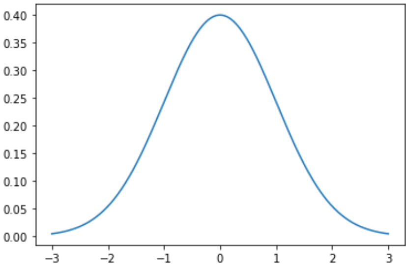
Contoh 1: Merencanakan Distribusi Normal Tunggal
Kode berikut menunjukkan cara memplot kurva distribusi normal tunggal dengan rata-rata 0 dan deviasi standar 1:
 import numpy as np
import matplotlib. pyplot as plt
from scipy. stats import norm

#x-axis ranges from -3 and 3 with .001 steps
x = np. arange (-3, 3, 0.001)

#plot normal distribution with mean 0 and standard deviation 1
plt. plot (x, norm. pdf (x, 0, 1))
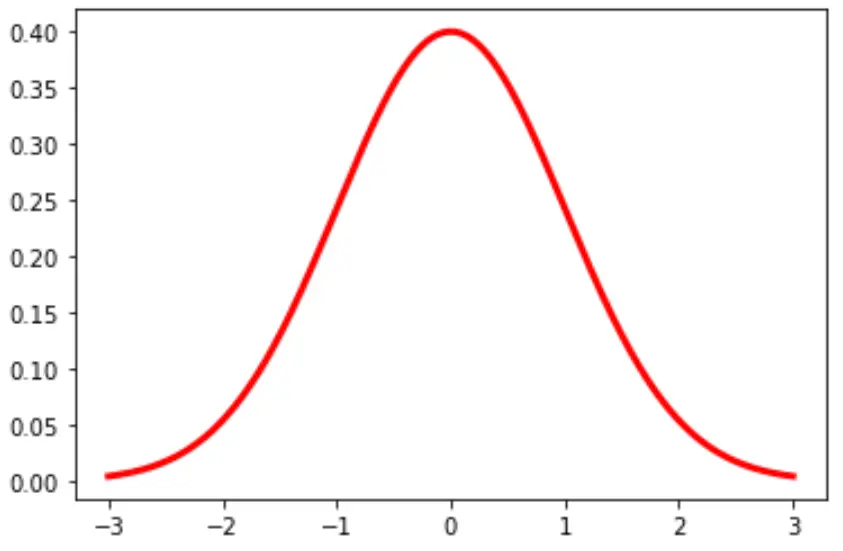
Anda juga dapat mengubah warna dan lebar garis pada grafik:
plt. plot (x, norm. pdf (x, 0, 1), color=' red ', linewidth= 3 )
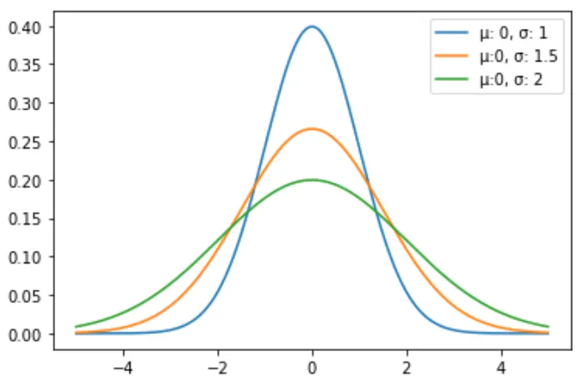
Contoh 2: Merencanakan Distribusi Normal Berganda
Kode berikut menunjukkan cara memplot beberapa kurva distribusi normal dengan rata-rata dan deviasi standar yang berbeda:
 import numpy as np
import matplotlib. pyplot as plt
from scipy. stats import norm

#x-axis ranges from -5 and 5 with .001 steps
x = np. arange (-5, 5, 0.001)

#define multiple normal distributions
plt. plot (x, norm. pdf (x, 0, 1), label=' μ: 0, σ: 1 ')
plt. plot (x, norm. pdf (x, 0, 1.5), label=' μ:0, σ: 1.5 ')
plt. plot (x, norm. pdf (x, 0, 2), label=' μ:0, σ: 2 ')

#add legend to plot
plt. legend ()
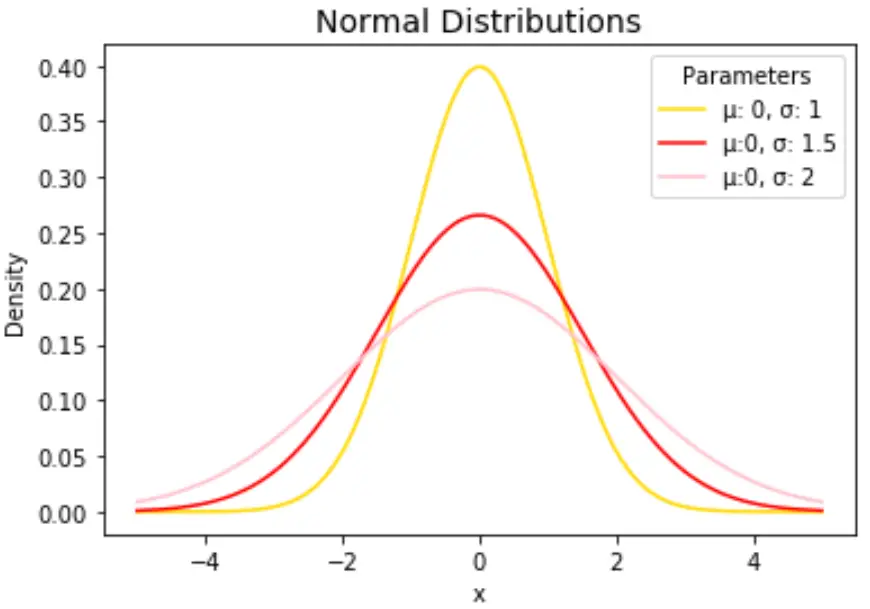
Jangan ragu untuk mengubah warna garis dan menambahkan judul dan label sumbu untuk melengkapi bagan:
 import numpy as np
import matplotlib. pyplot as plt
from scipy. stats import norm

#x-axis ranges from -5 and 5 with .001 steps
x = np. arange (-5, 5, 0.001)

#define multiple normal distributions
plt. plot (x, norm. pdf (x, 0, 1), label=' μ: 0, σ: 1 ', color=' gold ')
plt. plot (x, norm. pdf (x, 0, 1.5), label=' μ:0, σ: 1.5 ', color=' red ')
plt. plot (x, norm. pdf (x, 0, 2), label=' μ:0, σ: 2 ', color=' pink ')

#add legend to plot
plt. legend (title=' Parameters ')

#add axes labels and a title
plt. ylabel (' Density ')
plt. xlabel (' x ')
plt. title (' Normal Distributions ', fontsize= 14 )
Lihat dokumentasi matplotlib untuk penjelasan detail tentang fungsi plt.plot() .
Tentang Penulis
Benjamin anderson
Halo, saya Benjamin, pensiunan profesor statistika yang menjadi guru Statorial yang berdedikasi. Dengan pengalaman dan keahlian yang luas di bidang statistika, saya ingin berbagi ilmu untuk memberdayakan mahasiswa melalui Statorials. Baca selengkapnya