Come impostare il colore delle barre in un barplot seaborn
È possibile utilizzare i seguenti metodi per impostare il colore delle barre in un grafico a barre marino :
Metodo 1: imposta il colore per tutte le barre
 #use steelblue for the color of all bars
sns. barplot (x=xvar, y=yvar, color=' steelblue ')
Metodo 2: imposta il colore della barra con il valore massimo
 #use orange for bar with max value and gray for all other bars
cols = [' gray ' if (x < max (df. yvar )) else ' orange ' for x in df. yvar ]

#create barplot using specified colors
sns. barplot (x=df. xvar , y=df. yvar , palette=cols)
Metodo 3: imposta il colore della barra in base allo stato
 #use red for bars with value less than 10 and green for all other bars
cols = [' red ' if x < 10 else ' green ' for x in df. yvar ]

#create barplot using specified colors
sns. barplot (x=df. xvar , y=df. yvar , palette=cols)
I seguenti esempi mostrano come utilizzare ciascun metodo nella pratica con i seguenti DataFrame panda:
 import pandas as pd

#createDataFrame
df = pd. DataFrame ({' employee ': ['Andy', 'Bert', 'Chad', 'Doug', 'Eric', 'Frank'],
                   ' sales ': [22, 14, 9, 7, 29, 20]})

#view DataFrame
print (df)

  employee sales
0 Andy 22
1 Bert 14
2 Chad 9
3 Doug 7
4 Eric 29
5 Frank 20
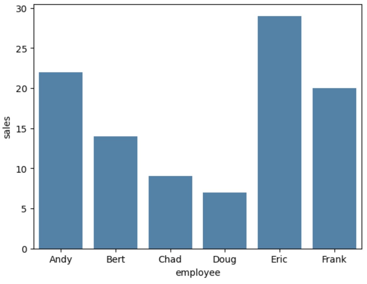
Esempio 1: imposta il colore per tutte le barre
Il codice seguente mostra come creare un grafico a barre in Seaborn e utilizzare il colore “steelblue” per tutte le barre del grafico:
 import seaborn as sns

#create barplot using steelblue as color for each bar
sns. barplot (x= df.employee ,y= df.sales ,color=' steelblue ')
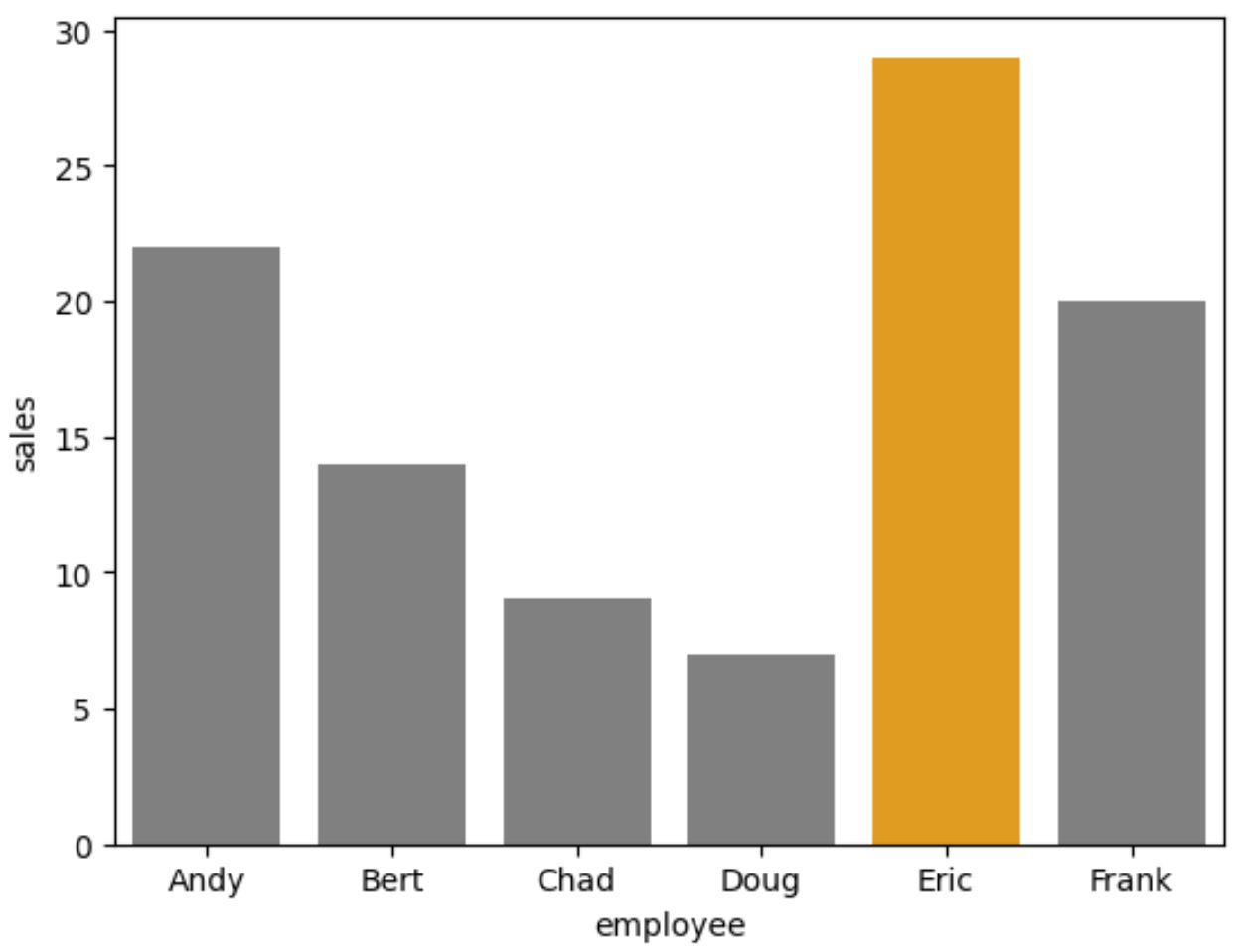
Esempio 2: imposta il colore della barra con il valore massimo
Il codice seguente mostra come utilizzare l’arancione per la barra con il valore massimo nel barplot e il grigio per tutte le altre barre:
 import seaborn as sns

#use orange for bar with max value and gray for all other bars
cols = [' gray ' if (x < max (df. sales )) else ' orange ' for x in df. dirty ]

#create barplot with custom colors
sns. barplot (x=df. employee , y=df. sales , palette=cols)
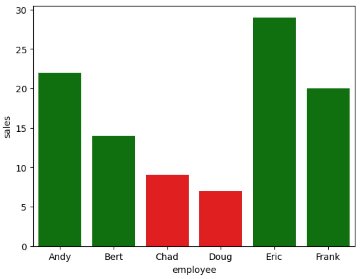
Esempio 3: imposta il colore della barra con il valore massimo
Il codice seguente mostra come utilizzare l’arancione per la barra con il valore massimo nel barplot e il grigio per tutte le altre barre:
 import seaborn as sns

#use red for bars with value less than 10 and green for all other bars
cols = [' red ' if x < 10 else ' green ' for x in df. dirty ]

#create barplot with custom colors
sns. barplot (x=df. employee , y=df. sales , palette=cols)
Risorse addizionali
I seguenti tutorial spiegano come eseguire altre funzioni comuni in Seaborn:
Come creare un barplot raggruppato in Seaborn
Come creare un grafico a torta in Seaborn
Come creare più grafici Seaborn in un’unica figura
Informazioni sull'autore
Benjamin anderson
Ciao, sono Benjamin, un professore di statistica in pensione diventato insegnante dedicato di Statorials. Con una vasta esperienza e competenza nel campo della statistica, sono ansioso di condividere le mie conoscenze per potenziare gli studenti attraverso Statorials. Scopri di più