Come aggiungere barre di errore ai grafici in r (con esempi)
È possibile utilizzare la seguente sintassi di base per aggiungere barre di errore a un grafico a barre in R:
 ggplot(df) +
    geom_bar( aes (x=x, y=y), stat=' identity ') +
    geom_errorbar( aes (x=x, ymin=y-sd, ymax=y+sd), width= 0.4 )
I seguenti esempi mostrano come utilizzare questa funzione nella pratica.
Esempio 1: aggiungere barre di errore utilizzando dati di riepilogo
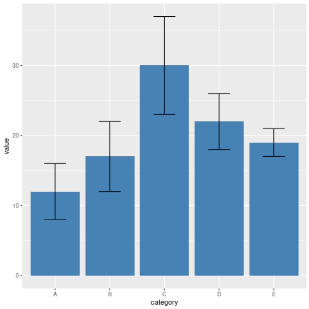
Supponiamo di avere il seguente frame di dati in R che visualizza le statistiche riepilogative per cinque categorie:
 #create data frame
df <- data. frame (category=c('A', 'B', 'C', 'D', 'E'),
                 value=c(12, 17, 30, 22, 19),
                 sd=c(4, 5, 7, 4, 2))

#view data frame
df

  category value sd
1 to 12 4
2 B 17 5
3 C 30 7
4 D 22 4
5 E 19 2
Possiamo utilizzare il seguente codice per creare un grafico a barre con barre di errore per visualizzare questi dati:
 library (ggplot2)

#create bar plot with error bars
ggplot(df) +
    geom_bar( aes (x=category, y=value), stat=' identity ', fill=' steelblue ') +
    geom_errorbar( aes (x=category, ymin=value-sd, ymax=value+sd), width= 0.4 )
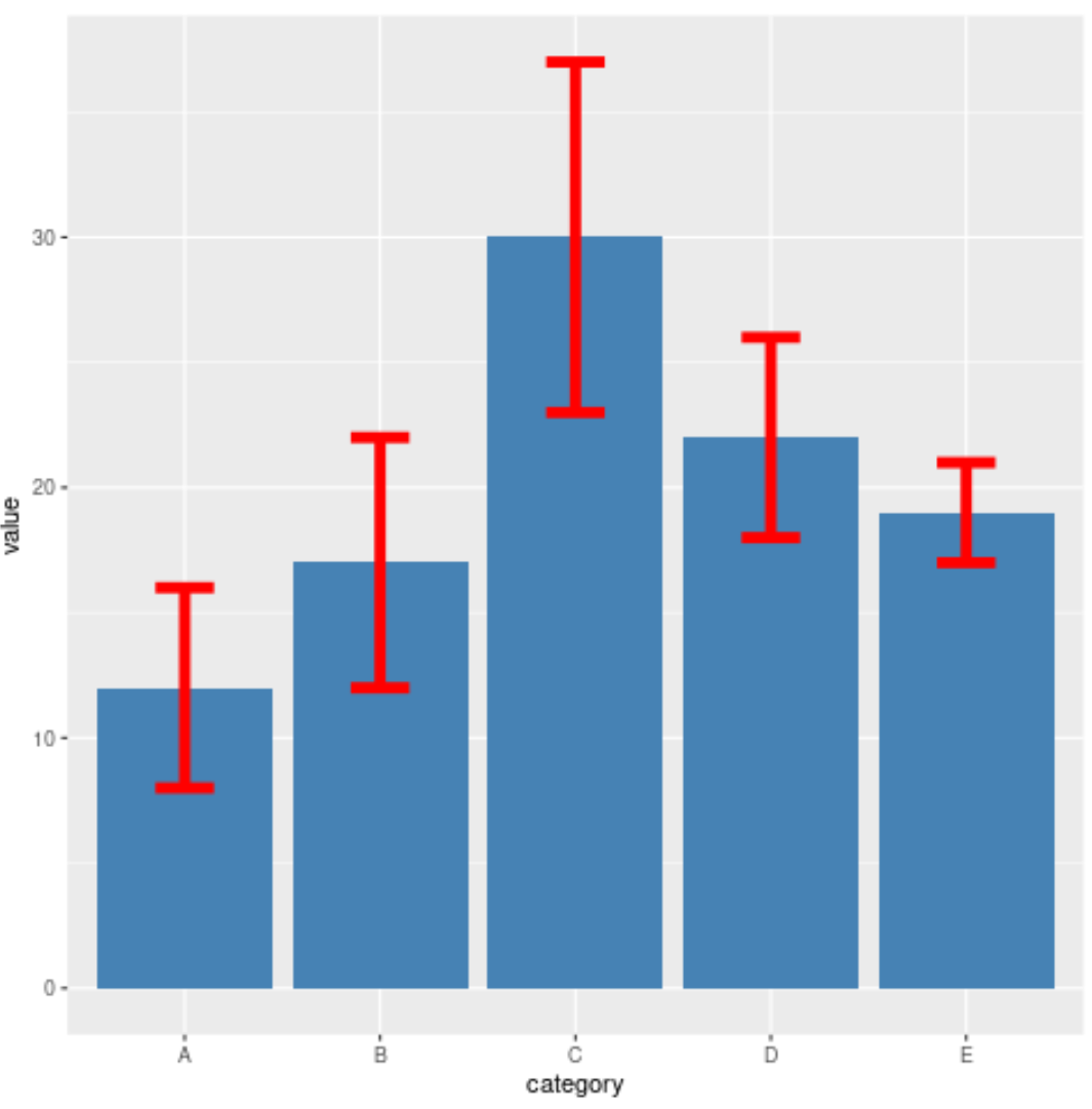
Sentiti libero di utilizzare i seguenti argomenti per modificare l’aspetto delle barre di errore:
- larghezza : la larghezza delle barre di errore
- size : lo spessore delle barre di errore
- color : il colore delle barre di errore
Per esempio:
 library (ggplot2)

#create bar plot with custom error bars
ggplot(df) +
    geom_bar( aes (x=category, y=value), stat=' identity ', fill=' steelblue ') +
    geom_errorbar( aes (x=category, ymin=value-sd, ymax=value+sd),
                  width= 0.3 , size= 2.3 , color=' red ')
Esempio 2: aggiungere barre di errore utilizzando dati grezzi
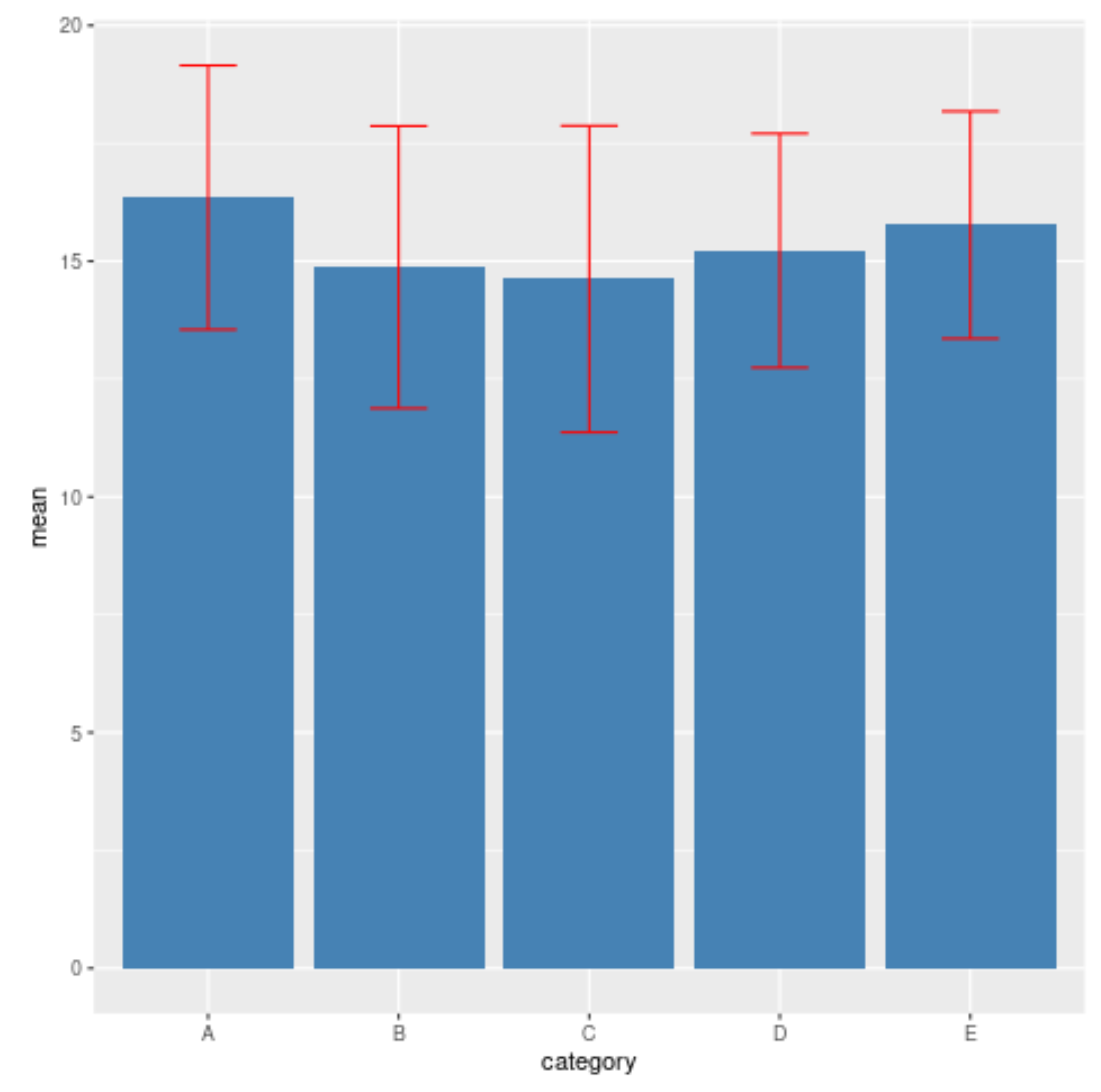
Supponiamo di avere il seguente frame di dati che mostra i dati grezzi per cinque diverse categorie:
 #make this example reproducible
set. seeds (0)

#create data frame
df <- data. frame (category=rep(c('A', 'B', 'C', 'D', 'E'), each= 10 ),
                 value=runif(50, 10, 20))

#view first six rows of data frame
head(df)

  category value
1 A 18.96697
2 A 12.65509
3 A 13.72124
4 A 15.72853
5 A 19.08208
6 A 12.01682
Il codice seguente mostra come riepilogare i dati e quindi creare un grafico a barre con barre di errore:
 library (dplyr)
library (ggplot2)

#summarize mean and sd for each category
df_summary <- df %>%
  group_by(category) %>%
  summarize(mean=mean(value),
            sd=sd(value))

#view summary data
df_summary

# A tibble: 5 x 3
  category mean sd

1 A 16.4 2.80
2B 14.9 2.99
3 C 14.6 3.25
4 D 15.2 2.48
5 E 15.8 2.41

#create bar plot with error bars
ggplot(df_summary) +
    geom_bar( aes (x=category, y=mean), stat=' identity ', fill=' steelblue ') +
    geom_errorbar( aes (x=category, ymin=mean-sd, ymax=mean+sd), width= 0.3 , color=' red ')
Risorse addizionali
I seguenti tutorial spiegano come creare altre visualizzazioni di dati comuni in R:
Come tracciare più boxplot in R
Come tracciare più istogrammi in R
Come disegnare più linee in R
Informazioni sull'autore
Benjamin anderson
Ciao, sono Benjamin, un professore di statistica in pensione diventato insegnante dedicato di Statorials. Con una vasta esperienza e competenza nel campo della statistica, sono ansioso di condividere le mie conoscenze per potenziare gli studenti attraverso Statorials. Scopri di più