相関係数を使用して seaborn 散布図を作成する方法
次の基本構文を使用して、Seaborn で散布図を作成し、そのプロットに 相関係数を追加できます。
 import scipy
import matplotlib. pyplot as plt
import seaborn as sns

#calculate correlation coefficient between x and y
r = scipy. stats . pearsonr (x=df. x , y=df. y )[0]

#create scatterplot
sns. scatterplot (data=df, x=df. x , y=df. y )

#add correlation coefficient to plot
plt. text (5, 30, ' r = ' + str ( round (r,2)))
次の例は、この構文を実際に使用する方法を示しています。
例: 相関係数を使用した Seaborn 散布図の作成
さまざまなバスケットボール選手のポイントとアシストを表示する次のパンダ データフレームがあるとします。
 import pandas as pd

#createDataFrame
df = pd. DataFrame ({' team ': ['A', 'A', 'A', 'A', 'B', 'C', 'C', 'C', 'D', 'D'],
                   ' points ': [12, 11, 18, 15, 14, 20, 25, 24, 32, 30],
                   ' assists ': [4, 7, 7, 8, 9, 10, 10, 12, 10, 15]})

#view DataFrame
print (df)

  team points assists
0 to 12 4
1 to 11 7
2 To 18 7
3 to 15 8
4 B 14 9
5 C 20 10
6 C 25 10
7 C 24 12
8 D 32 10
9 D 30 15
次の構文を使用して散布図を作成し、パスとポイント間の関係を視覚化することができます。また、 scipyのpearsonr()関数を使用してこれら 2 つの変数間の相関係数を計算することもできます。
 import scipy
import matplotlib. pyplot as plt
import seaborn as sns

#calculate correlation coefficient between assists and points
r = scipy. stats . pearsonr (x=df. assists , y=df. points )[0]

#create scatterplot
sns. scatterplot (data=df, x=df. assists , y=df. points )

#add correlation coefficient to plot
plt. text (5, 30, ' r = ' + str ( round (r,2)))
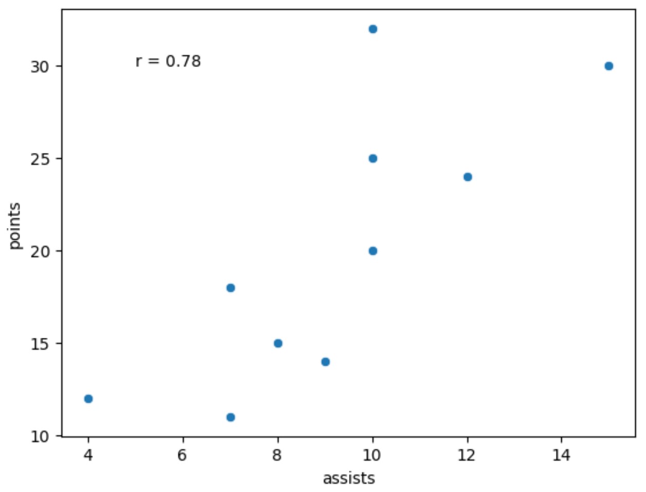
結果から、アシストとポイントの間のピアソン相関係数は0.78であることがわかります。
関連: 「強い」相関関係とは何ですか?
Round()関数を使用して相関係数を小数点第 2 位に四捨五入したことに注意してください。
自由に別の小数点以下の桁数に四捨五入したり、 fontsize引数を使用してプロット上の相関係数のフォント サイズを変更したりできます。
 import scipy
import matplotlib. pyplot as plt
import seaborn as sns

#calculate correlation coefficient between assists and points
r = scipy. stats . pearsonr (x=df. assists , y=df. points )[0]

#create scatterplot
sns. scatterplot (data=df, x=df. assists , y=df. points )

#add correlation coefficient to plot
plt. text (5, 30, ' r= '+ str ( round (r,4)), fontsize= 20 ))
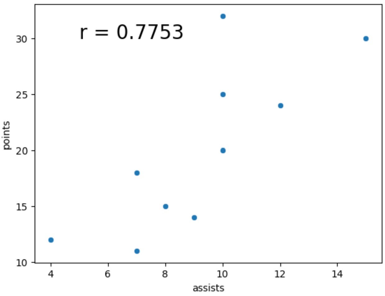
相関係数が小数点第 4 位に四捨五入され、フォント サイズが前の例よりも大幅に大きくなっていることに注意してください。
注: seabornscatterplot()関数の完全なドキュメントはここで見つけることができます。
追加リソース
次のチュートリアルでは、seaborn で他の一般的な機能を実行する方法を説明します。
Seaborn で分布をプロットする方法
Seaborn で箱ひげ図を X 軸に並べる方法
Seaborn プロットにテーブルを追加する方法
著者について
ベンジャミン・アンダーソン博士
私はベンジャミンです。退職した統計教授から、専任の Statorials 教育者になりました。 統計分野における豊富な経験と専門知識を活かして、私は Statorials を通じて学生に力を与えるために自分の知識を共有することに尽力しています。もっと知る