Ggplot2 で x 軸上に項目を並べる方法
次の基本構文を使用して、ggplot2 のプロットの x 軸上の項目を並べ替えることができます。
 ggplot(df, aes(x=factor(x_var, level=c(' value1 ', ' value2 ', ' value3 ')), y=y_var)) +
  geom_col()
次の例は、この構文を実際に使用する方法を示しています。
例: ggplot2 の x 軸上の項目の順序
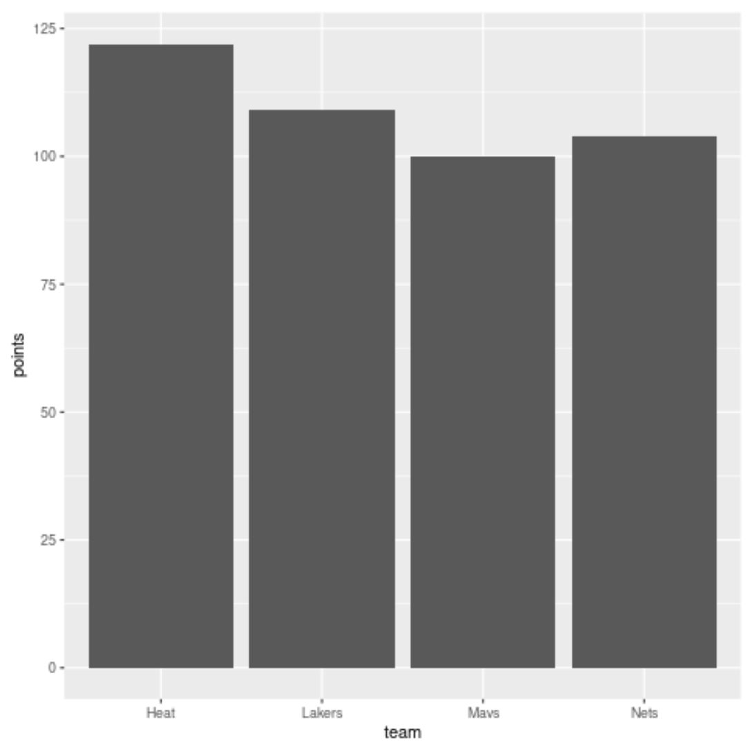
R に、さまざまなバスケットボール チームの得点を示す次のデータ フレームがあるとします。
 #create data frame
df <- data. frame (team=c('Mavs', 'Heat', 'Nets', 'Lakers'),
                 dots=c(100, 122, 104, 109))

#view data frame
df

    team points
1 Mavs 100
2 Heat 122
3 Nets 104
4 Lakers 109
各チームの得点を視覚化する棒グラフを作成すると、ggplot2 は自動的に棒をアルファベット順に並べ替えます。
 library (ggplot2)

#create bar plot
ggplot(df, aes(x=team, y=points)) +
  geom_col()
X 軸上のバーの順序を指定するには、次のようにlevel引数を使用します。
 library (ggplot2)

#create bar plot with specific axis order
ggplot(df, aes(x=factor(team, level=c(' Mavs ', ' Heat ', ' Nets ', ' Lakers ')), y=points)) +
  geom_col()
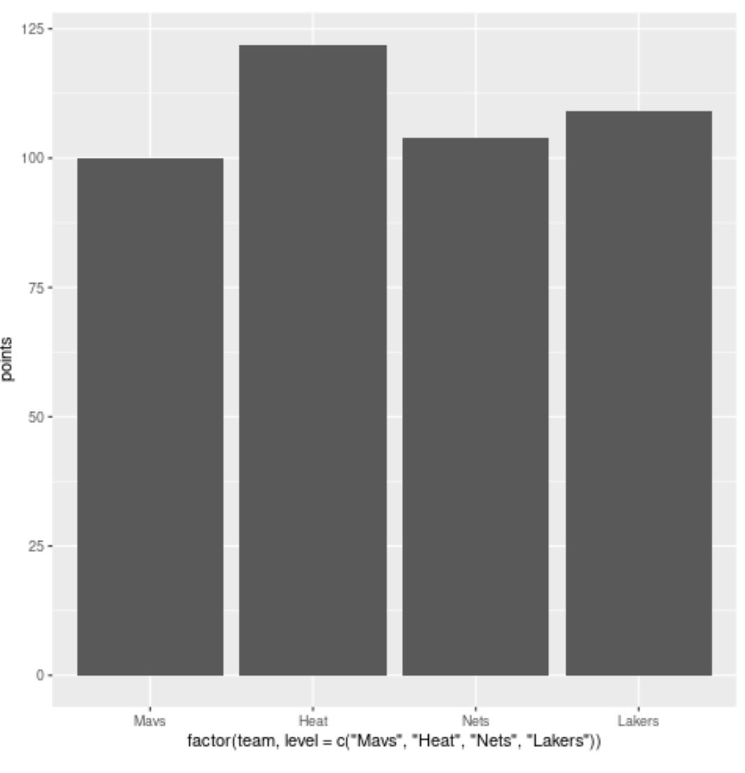
バーは、 level引数で指定した順序とまったく同じになります。
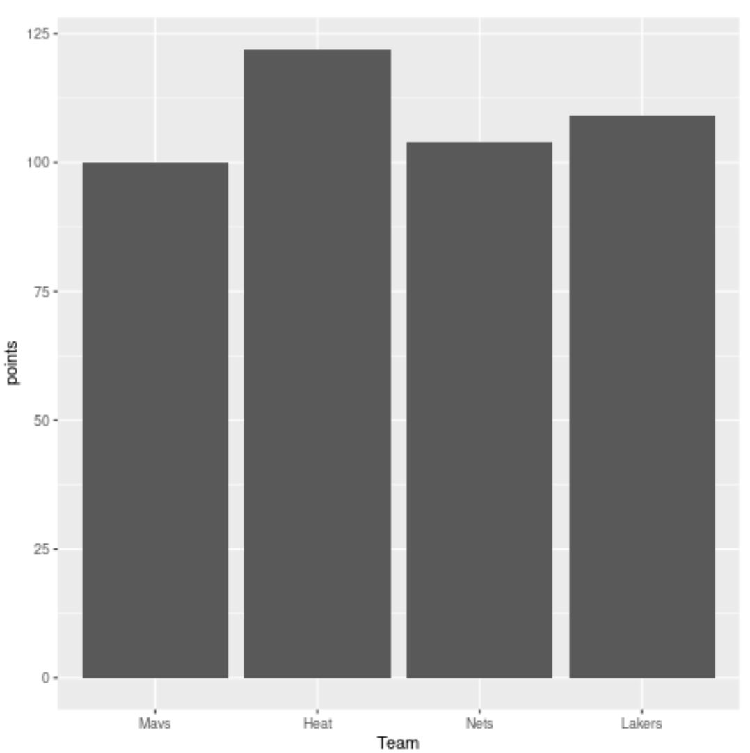
xlab()を使用して、x 軸の名前を読みやすい名前に変更することもできます。
 library (ggplot2)

#create bar plot with specific axis order
ggplot(df, aes(x=factor(team, level=c(' Mavs ', ' Heat ', ' Nets ', ' Lakers ')), y=points)) +
  geom_col() +
  xlab(' Team ')
追加リソース
次のチュートリアルでは、ggplot2 で他の一般的なタスクを実行する方法を説明します。
ggplot2 で軸ラベルを回転する方法
ggplot2で軸ブレークを設定する方法
ggplot2 で軸の制限を設定する方法
ggplot2で凡例ラベルを変更する方法
著者について
ベンジャミン・アンダーソン博士
私はベンジャミンです。退職した統計教授から、専任の Statorials 教育者になりました。 統計分野における豊富な経験と専門知識を活かして、私は Statorials を通じて学生に力を与えるために自分の知識を共有することに尽力しています。もっと知る