Matplotlib と ggplot2: どちらを使用する必要がありますか?
データ サイエンス全体で最も人気のあるデータ視覚化ライブラリの 2 つは、 ggplot2とMatplotlibです。
ggplot2ライブラリは R 統計プログラミング言語で使用され、 Matplotlibは Python で使用されます。
どちらのライブラリでも高度にカスタマイズされたデータ視覚化を作成できますが、ggplot2 では一般に、Matplotlib に比べて少ないコード行で作成できます。
この点を説明するために、両方のライブラリを使用して同じタイプのグラフを作成する方法を示します。
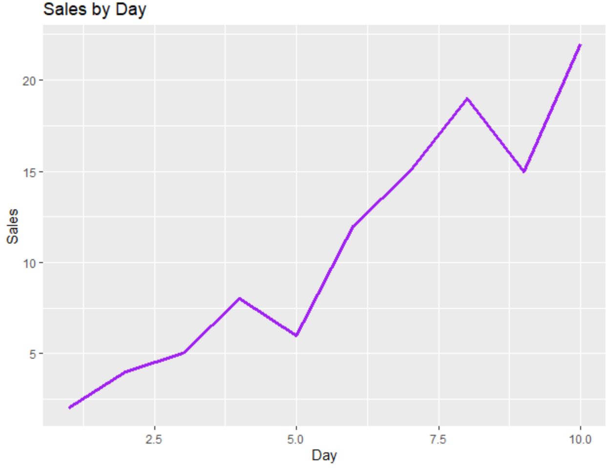
折れ線グラフ: ggplot2 と Matplotlib
次のコードは、 ggplot2を使用して折れ線グラフを作成する方法を示しています。
 library (ggplot2)

#create data frame
df <- data. frame (day=c(1, 2, 3, 4, 5, 6, 7, 8, 9, 10),
                 sales=c(2, 4, 5, 8, 6, 12, 15, 19, 15, 22))

#create line chart
ggplot(df, aes(x=day, y=sales)) +
  geom_line(size= 1.2 , col=' purple ') +
  ggtitle(' Sales by Day ') +
  xlab(' Day ') +
  ylab(' Sales ')
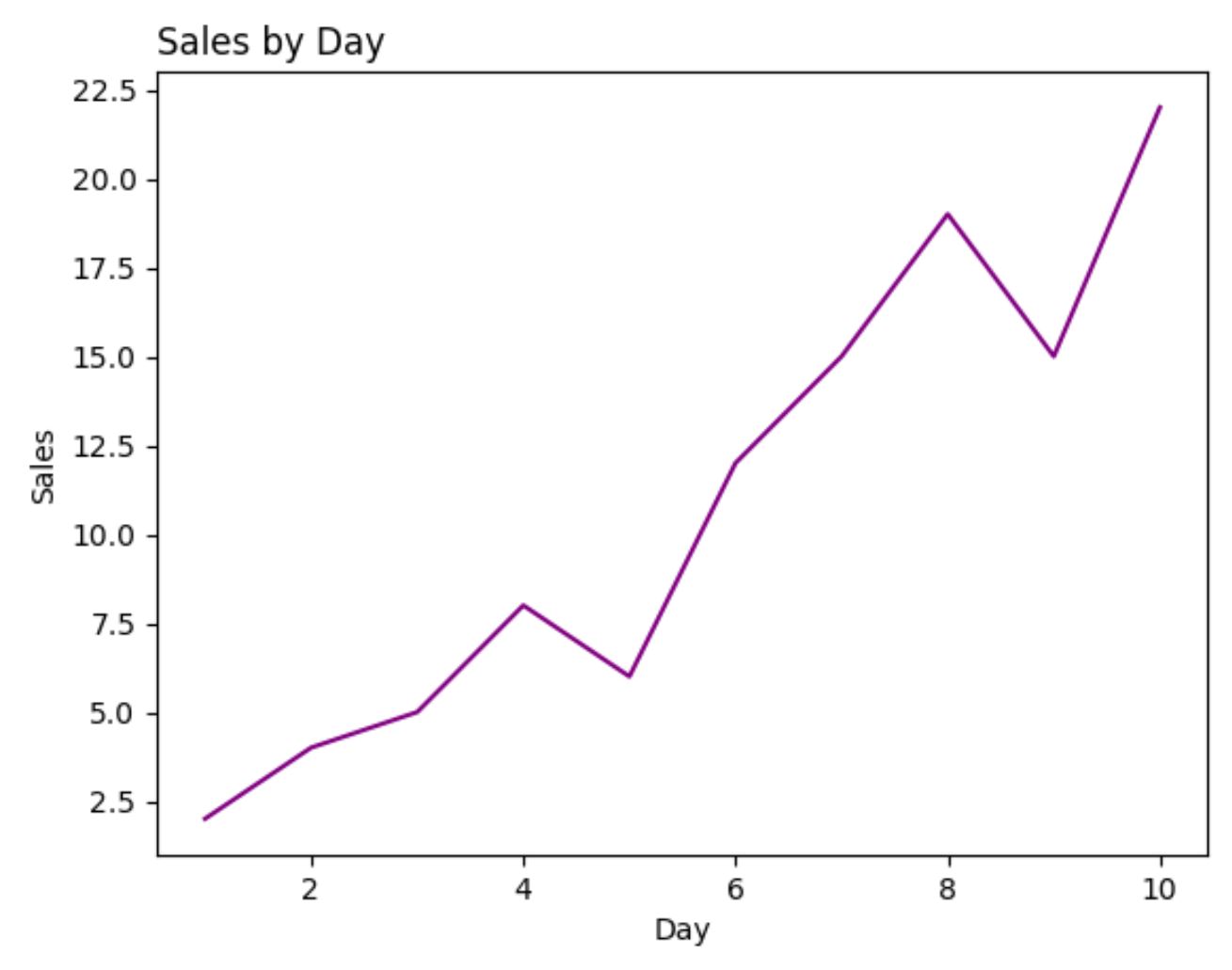
次のコードは、 Matplotlibを使用して同じ折れ線グラフを作成する方法を示しています。
 import pandas as pd
import matplotlib. pyplot as plt

#createDataFrame
df = pd. DataFrame ({' day ': [1, 2, 3, 4, 5, 6, 7, 8, 9, 10],
                   ' sales ': [2, 4, 5, 8, 6, 12, 15, 19, 15, 22]})

#create line chart
plt. plot (df. day , df. sales , color=' purple ')
plt. title (' Sales by Day ', loc=' left ')
plt. ylabel (' Sales ')
plt. xlabel (' Day ')
この例では、各プロットの生成に必要なコード行数は、ggplot2 と Matplotlib でほぼ同じです。
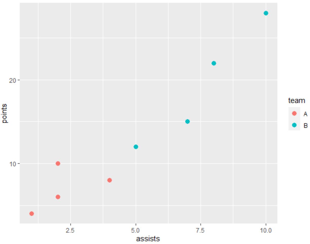
散布図: ggplot2 と Matplotlib の比較
次のコードは、点がカテゴリごとに色分けされた散布図をggplot2で作成する方法を示しています。
 library (ggplot2)

#create data frame
df <- data. frame (team=c('A', 'A', 'A', 'A', 'B', 'B', 'B', 'B'),
                 assists=c(1, 2, 2, 4, 5, 7, 8, 10),
                 points=c(4, 6, 10, 8, 12, 15, 22, 28))

#create scatterplot
ggplot(df, aes(x=assists, y=points)) +
  geom_point(aes(col=team), size= 3 )
次のコードは、 Matplotlibを使用して同じ散布図を作成する方法を示しています。
 import pandas as pd
import matplotlib. pyplot as plt

#createDataFrame
df = pd. DataFrame ({' team ': ['A', 'A', 'A', 'A', 'B', 'B', 'B', 'B'],
                   ' assists ': [1, 2, 2, 4, 5, 7, 8, 10],
                   ' points ': [4, 6, 10, 8, 12, 15, 22, 28]})

#define colors to use
color_list = []
for x in df[' team ']:
    if x == ' A ': color_list. append (' #F8766D ')
    else : color_list. append (' #00BFC4 ')

#create scatterplot
plt. scatter (df. assists , df. points , c=color_list)
plt. ylabel (' points ')
plt. xlabel (' assists ')
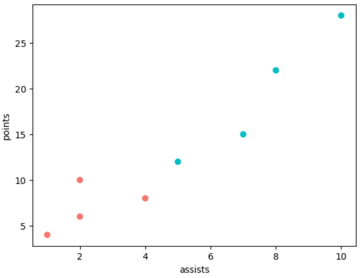
ggplot2 と同じプロットを生成するには、Matplotlib でさらに多くのコード行を使用する必要があることに注意してください。
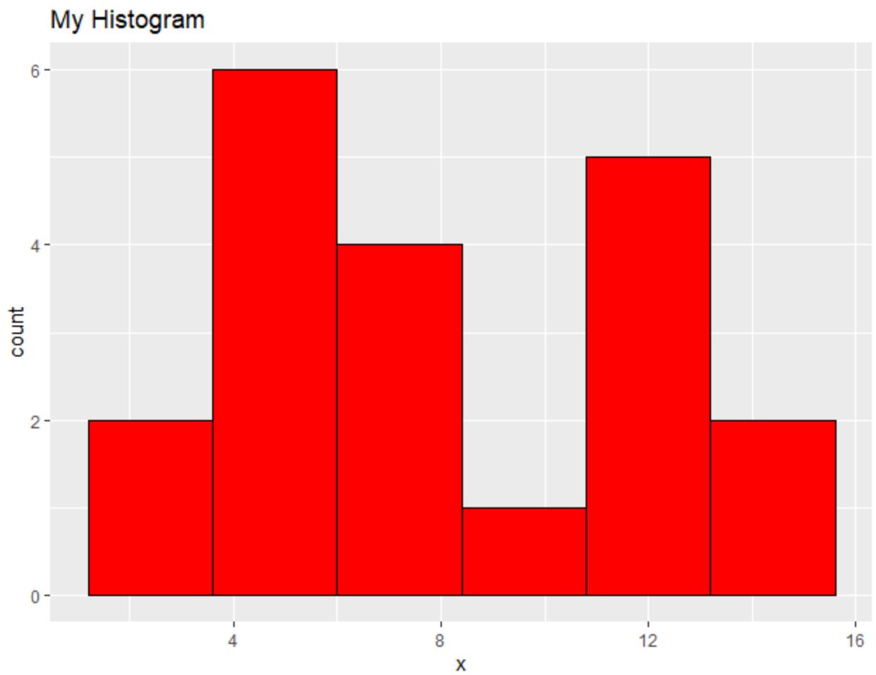
ヒストグラム: ggplot2 対 Matplotlib
次のコードは、 ggplot2でヒストグラムを作成する方法を示しています。
 library (ggplot2)

#create data frame
df <- data. frame (x=c(2, 2, 4, 4, 4, 5, 5, 6, 7, 7, 8, 8,
                     10, 11, 11, 11, 12, 13, 14, 14))

#create scatterplot
ggplot(df, aes(x=x)) +
  geom_histogram(bins= 6 , fill=' red ', color=' black ') +
  ggtitle(' My Histogram ')
次のコードは、 Matplotlibを使用して同様のヒストグラムを作成する方法を示しています。
 import pandas as pd
import matplotlib. pyplot as plt

#createDataFrame
df = pd. DataFrame ({' x ': [2, 2, 4, 4, 4, 5, 5, 6, 7, 7, 8, 8,
                         10, 11, 11, 11, 12, 13, 14, 14]})

#create histogram
plt. hist (df[' x '], bins= 6 , color=' red ', ec=' black ')
plt. title (' My Histogram ', loc=' left ')
plt. xlabel (' x ')
plt. ylabel (' Count ')
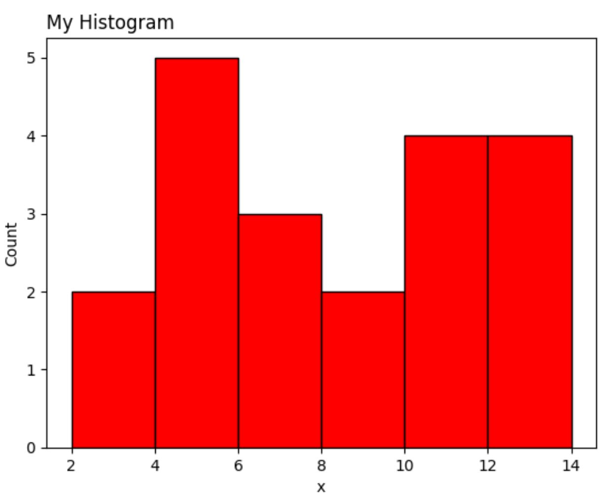
もう一度言いますが、Matplotlib バージョンには ggplot2 よりも多くのコード行が必要です。
結論
ggplot2 と Matplotlib を使用すると、高度にカスタマイズ可能なデータ視覚エフェクトを作成できますが、ggplot2 では使用するコードが少なくなる傾向があります。
多くの場合、ggplot2 と Matplotlib のどちらを優先するかは、データ分析に使用するプログラミング言語によって決まります。
Python を使用する人は、単一のプログラミング言語を使用してデータ分析を実行し、データの視覚化を作成できるため、Matplotlib を使用する傾向があります。
逆に、R を使用する人は、単一のプログラミング言語ですべてのデータ分析と視覚化を実行できるため、ggplot2 を使用する傾向があります。
著者について
ベンジャミン・アンダーソン博士
私はベンジャミンです。退職した統計教授から、専任の Statorials 教育者になりました。 統計分野における豊富な経験と専門知識を活かして、私は Statorials を通じて学生に力を与えるために自分の知識を共有することに尽力しています。もっと知る