Ggplot2 で平均と標準偏差をプロットする方法
ggplot2 でグループごとに平均と標準偏差をプロットしたい場合がよくあります。
幸いなことに、これは、ggplot2 のgeom_point()関数とgeom_errorbar()関数を使用して簡単に行うことができます。
次の例は、これらの関数を使用して、さまざまなバスケットボール チームが獲得したポイントの平均と標準偏差を示す次のグラフを作成する方法を示しています。
例: ggplot2 での平均と標準偏差のプロット
R に、3 つの異なるチームのバスケットボール選手が獲得したポイント数に関する情報を含む次のデータ フレームがあるとします。
 #create data frame
df <- data. frame (team=rep(c(' A ', ' B ', ' C '), each= 6 ),
                 points=c(8, 10, 12, 12, 14, 15, 10, 11, 12,
                          18, 22, 24, 3, 5, 5, 6, 7, 9))

#view head of data frame
head(df)

  team points
1 to 8
2 to 10
3 to 12
4 to 12
5 to 14
6 to 15
dplyrパッケージの関数を使用して、各チームのプレーヤーが獲得したポイントの平均と標準偏差をすばやく計算できます。
library (dplyr)
#calculate mean and sd of points by team
df_mean_std <- df %>%
group_by(team) %>%
summarise_at(vars(points), list(mean=mean, sd=sd)) %>%
as. data . frame ()
#view results
df_mean_std
team mean sd
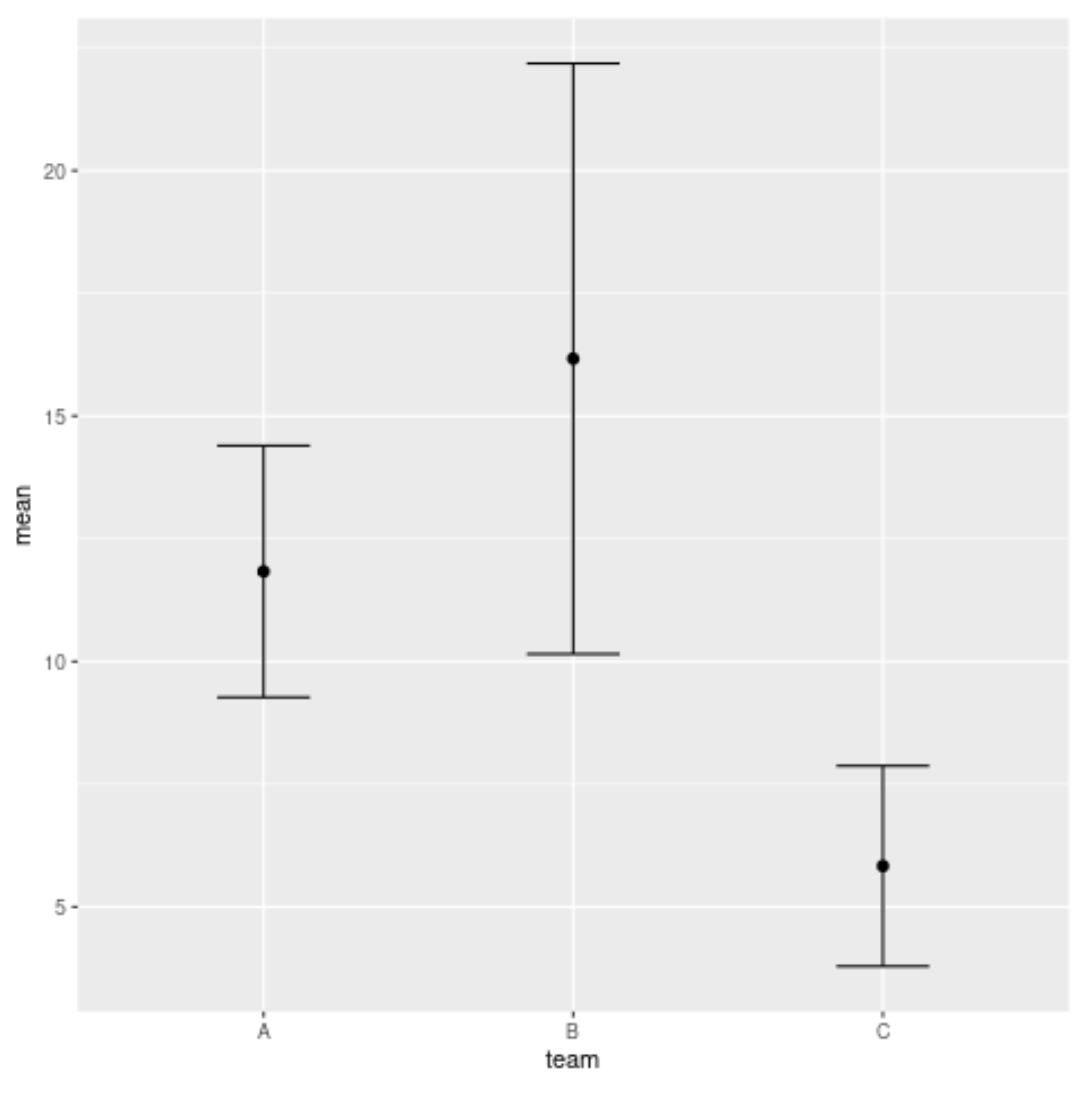
1 A 11.833333 2.562551
2 B 16.166667 6.013873
3 C 5.833333 2.041241
最後に、次のggplot2関数を使用して、各チームのプレーヤーが獲得したポイントの平均と標準偏差を視覚化できます。
 library (ggplot2)

#plot mean and standard deviation of points by team
ggplot(df_mean_std, aes(x=team, y=mean)) +
  geom_errorbar(aes(ymin=mean-sd, ymax=mean+sd), width= .3 ) +
  geom_point(size= 2 )
結果のグラフには、各チームのプレーヤーが獲得したポイントの平均と標準偏差が表示されます。
円は平均値を表し、各円の上下のバーの長さは標準偏差を表します。
注: geom_errorbar()関数のwidth引数は、エラーバーの幅を指定します。この値を自由に変更して、プロット内の誤差範囲の幅を調整してください。
追加リソース
次のチュートリアルでは、ggplot2 で他の一般的なタスクを実行する方法を説明します。
ggplot2 プロットに凡例を追加する方法
ggplot2でフォントサイズを変更する方法
ggplot2で凡例を削除する方法
ggplot2 で軸ラベルを回転する方法
著者について
ベンジャミン・アンダーソン博士
私はベンジャミンです。退職した統計教授から、専任の Statorials 教育者になりました。 統計分野における豊富な経験と専門知識を活かして、私は Statorials を通じて学生に力を与えるために自分の知識を共有することに尽力しています。もっと知る