Ggplot2 のプロットにテーブルを追加する方法 (2 つの例)
多くの場合、R の ggplot2 で作成されたプロットにテーブルを追加して、読者がプロットとともに生データを視覚化できるようにすることができます。
幸いなことに、ggpmisc パッケージを使用すると、プロットにテーブルを簡単に追加できます。
 install. packages (' ggpmisc ')
library (ggpmisc)
次の例は、このパッケージを使用して、次のデータ フレームを使用して棒グラフと散布図にテーブルを追加する方法を示しています。
 #create data frame
df <- data. frame (team=c('A', 'A', 'A', 'A', 'B', 'B', 'B', 'B'),
                 position=c('G', 'G', 'F', 'F', 'G', 'G', 'F', 'F'),
                 points=c(13, 23, 24, 20, 19, 14, 29, 31))

#view data frame
df

  team position points
1 AG 13
2 AG 23
3 AF 24
4 AF 20
5 BG 19
6 BG 14
7 BF 29
8 BF 31
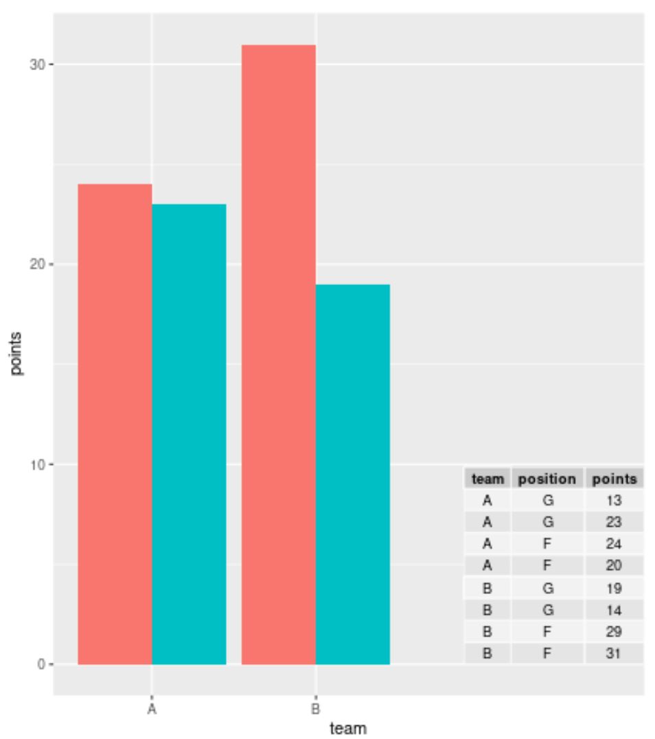
例 1: ggplot2 の Barplot にテーブルを追加する
次のコードを使用して、ggplot2 でグループ化された棒グラフを作成し、プロットの右下隅にテーブルを追加して、データ フレームの実際の値を表示できます。
 library (ggplo2)
library (ggpmisc)

#create barplot with table
ggplot(df, aes(x=team, y=points, fill=position)) +
    geom_bar(position=' dodge ', stat=' identity ') +
    annotate(geom = ' table ',
           x=4,
           y=0,
           label=list(df))
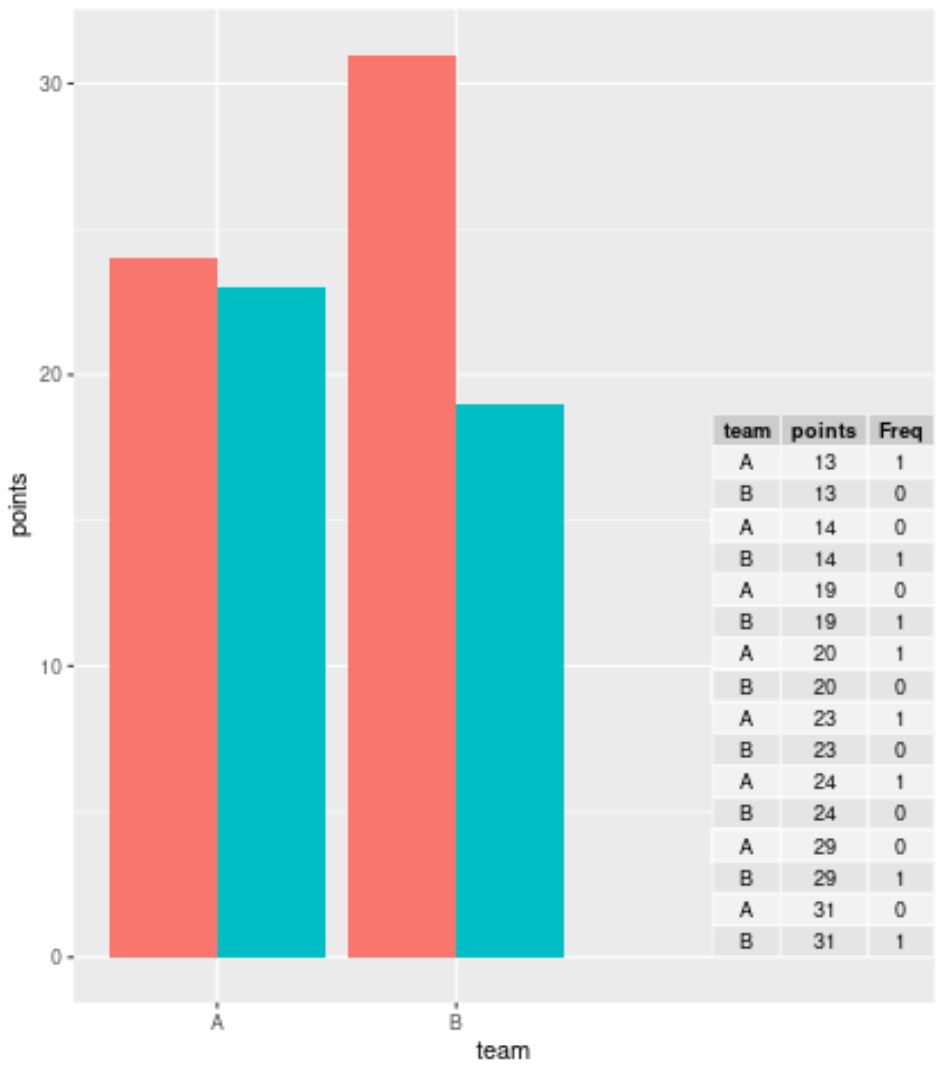
大規模なデータセットを操作していて、個々の行を表示したくない場合は、ggplot2 でテーブルを作成する前にtable()関数を使用してデータを要約できます。
 library (ggplot2)
library (ggpmisc)

#summarize frequencies of team and points in table
my_table <- as. data . frame (table(df[, c(1, 3)]))

#create barplot with table
ggplot(df, aes(x=team, y=points, fill=position)) +
    geom_bar(position=' dodge ', stat=' identity ') +
    annotate(geom = ' table ',
           x=4,
           y=0,
           label=list(my_table))
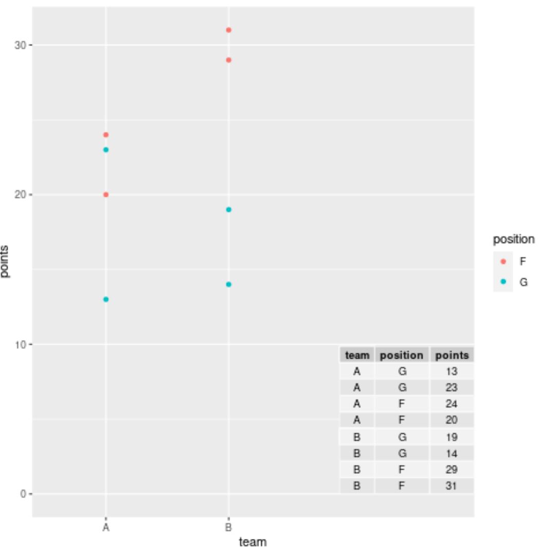
例 2: ggplot2 の散布図にテーブルを追加する
次のコードを使用して、ggplot2 で散布図を作成し、プロットの右下隅にテーブルを追加して、データ フレームからの実際の値を表示できます。
 library (ggplo2)
library (ggpmisc)

#create scatterplot with table
ggplot(df, aes(x=team, y=points)) +
    geom_point(aes(color=position)) +
    annotate(geom=' table ',
           x=4,
           y=0,
           label=list(df))
注: annotate()関数でx値とy値を自由に操作して、希望する正確な場所に配列を配置してください。
追加リソース
次のチュートリアルでは、ggplot2 で他の一般的なタスクを実行する方法を説明します。
ggplot2 プロットにテキストを追加する方法
ggplot2でタイトルの位置を変更する方法
ggplot2凡例の項目の順序を変更する方法
著者について
ベンジャミン・アンダーソン博士
私はベンジャミンです。退職した統計教授から、専任の Statorials 教育者になりました。 統計分野における豊富な経験と専門知識を活かして、私は Statorials を通じて学生に力を与えるために自分の知識を共有することに尽力しています。もっと知る