2 つの y 軸を持つ matplotlib プロットを作成する方法
2 つの y 軸を持つ Matplotlib プロットを作成する最も簡単な方法は、 twinx()関数を使用することです。
次の例は、この関数を実際に使用する方法を示しています。
例: 2 つの Y 軸を持つ Matplotlib プロットを作成する
次の 2 つのパンダ DataFrame があると仮定します。
 import pandas as pd

#createDataFrames
df1 = pd. DataFrame ({' year ': [1, 2, 3, 4, 5, 6, 7, 8, 9, 10],
                    ' sales ': [14, 16, 19, 22, 24, 25, 24, 24, 27, 30]})

df2 = pd. DataFrame ({' year ': [1, 2, 3, 4, 5, 6, 7, 8, 9, 10],
                    ' leads ': [4, 4, 4, 5, 4, 5, 7, 8, 5, 3]})
両方の DataFrame は 1 ~ 10 の範囲の「年」変数を共有しますが、最初の DataFrame は毎年の総売上高を表示し、2 番目の DataFrame は毎年の合計リードを表示します。
次のコードを使用して、2 つの Y 軸を持つグラフに売上と見込み客を表示する Matplotlib プロットを作成できます。
 import matplotlib. pyplot as plt

#define colors to use
col1 = ' steelblue '
col2 = ' red '

#define subplots
fig,ax = plt. subplots ()

#add first line to plot
ax. plot (df1. year , df1. sales , color=col1)

#add x-axis label
ax. set_xlabel (' Year ', fontsize= 14 )

#add y-axis label
ax. set_ylabel (' Sales ', color=col1, fontsize= 16 )

#define second y-axis that shares x-axis with current plot
ax2 = ax. twinx ()

#add second line to plot
ax2. plot (df2. year , df2. leads , color=col2)

#add second y-axis label
ax2. set_ylabel (' Leads ', color=col2, fontsize= 16 )
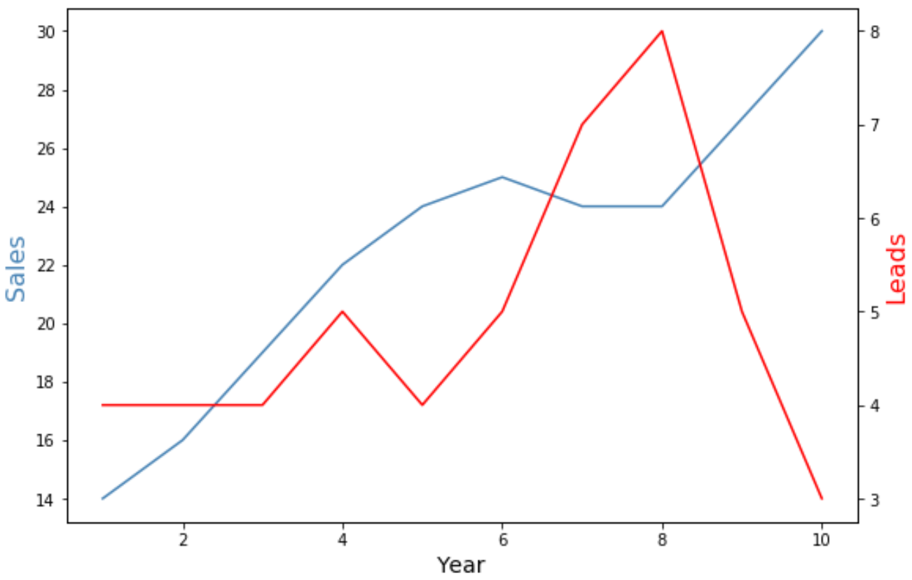
グラフの左側の Y 軸は年間の総売上高を示し、グラフの右側の Y 軸は年間の総リード数を示します。
グラフの青線は年間総売上高を表し、赤線は年間総リードを表します。
マーカーと線の幅の引数を自由に使用して、グラフ内の線の外観を変更できます。
 import matplotlib. pyplot as plt

#define colors to use
col1 = ' steelblue '
col2 = ' red '

#define subplots
fig,ax = plt. subplots ()

#add first line to plot
ax. plot (df1. year , df1. sales , color=col1, marker=' o ', linewidth= 3 )

#add x-axis label
ax. set_xlabel (' Year ', fontsize= 14 )

#add y-axis label
ax. set_ylabel (' Sales ', color=col1, fontsize= 16 )

#define second y-axis that shares x-axis with current plot
ax2 = ax. twinx ()

#add second line to plot
ax2. plot (df2. year , df2. leads , color=col2, marker=' o ', linewidth= 3 )

#add second y-axis label
ax2. set_ylabel (' Leads ', color=col2, fontsize= 16 )
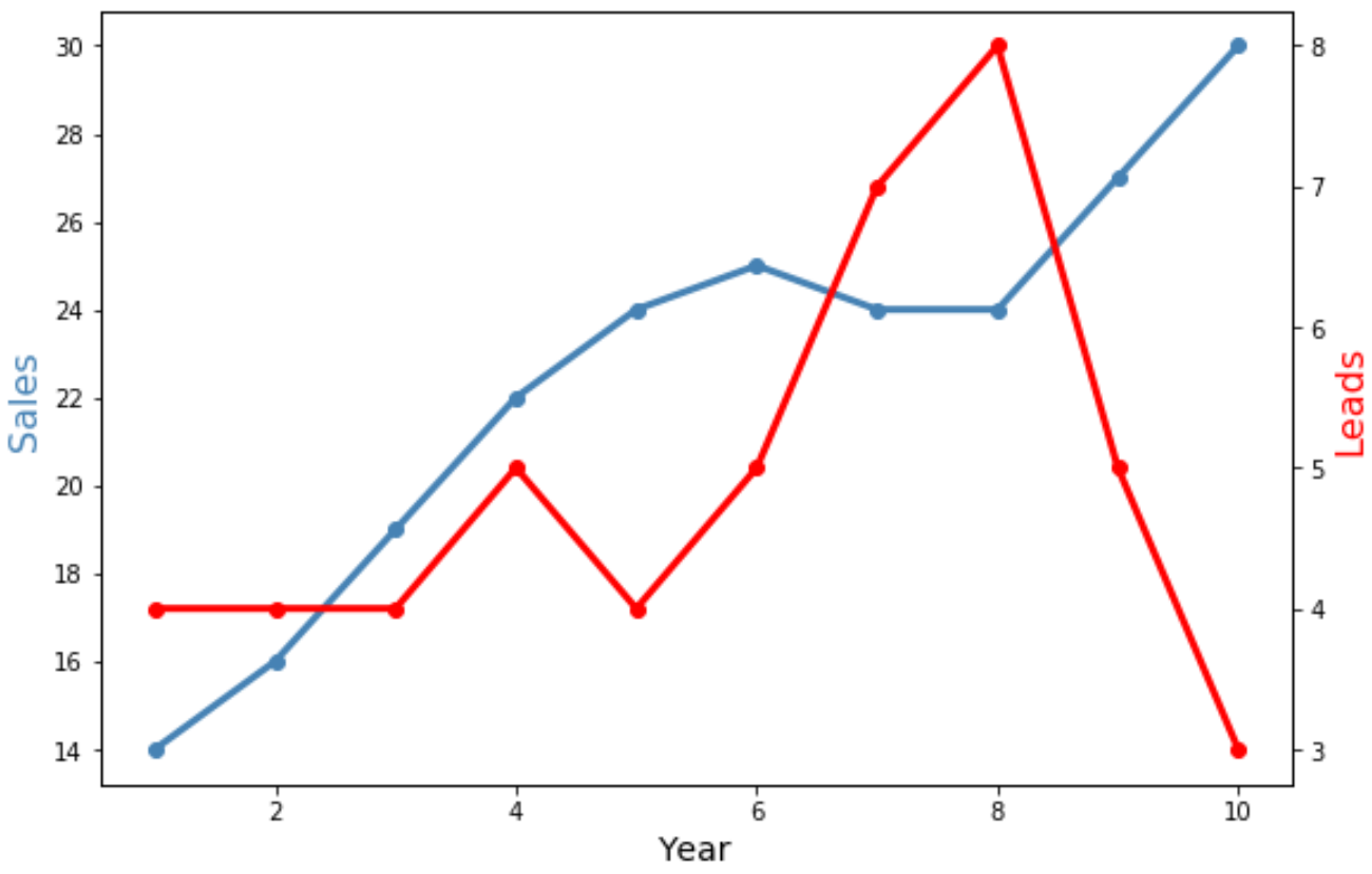
両方の線の幅が広くなり、個々のデータ ポイントを表示するための「o」マーカーが含まれることに注意してください。
追加リソース
次のチュートリアルでは、Matplotlib で他の一般的な操作を実行する方法を説明します。
Matplotlib で軸ラベルの位置を調整する方法
Matplotlib で軸範囲を設定する方法
MatplotlibでX軸の値を設定する方法
著者について
ベンジャミン・アンダーソン博士
私はベンジャミンです。退職した統計教授から、専任の Statorials 教育者になりました。 統計分野における豊富な経験と専門知識を活かして、私は Statorials を通じて学生に力を与えるために自分の知識を共有することに尽力しています。もっと知る