Matplotlib で軸の制限を取得する方法 (例あり)
次の構文を使用して、Matplotlib のプロットの x 軸と y 軸の軸制限を取得できます。
 import matplotlib. pyplot as plt

#get x-axis and y-axis limits
xmin, xmax, ymin, ymax = plt. axis ()

#print axis limits
print (xmin, xmax, ymin, ymax)
次の例は、この構文を実際に使用する方法を示しています。
例: Matplotlib で軸の制限を取得する方法
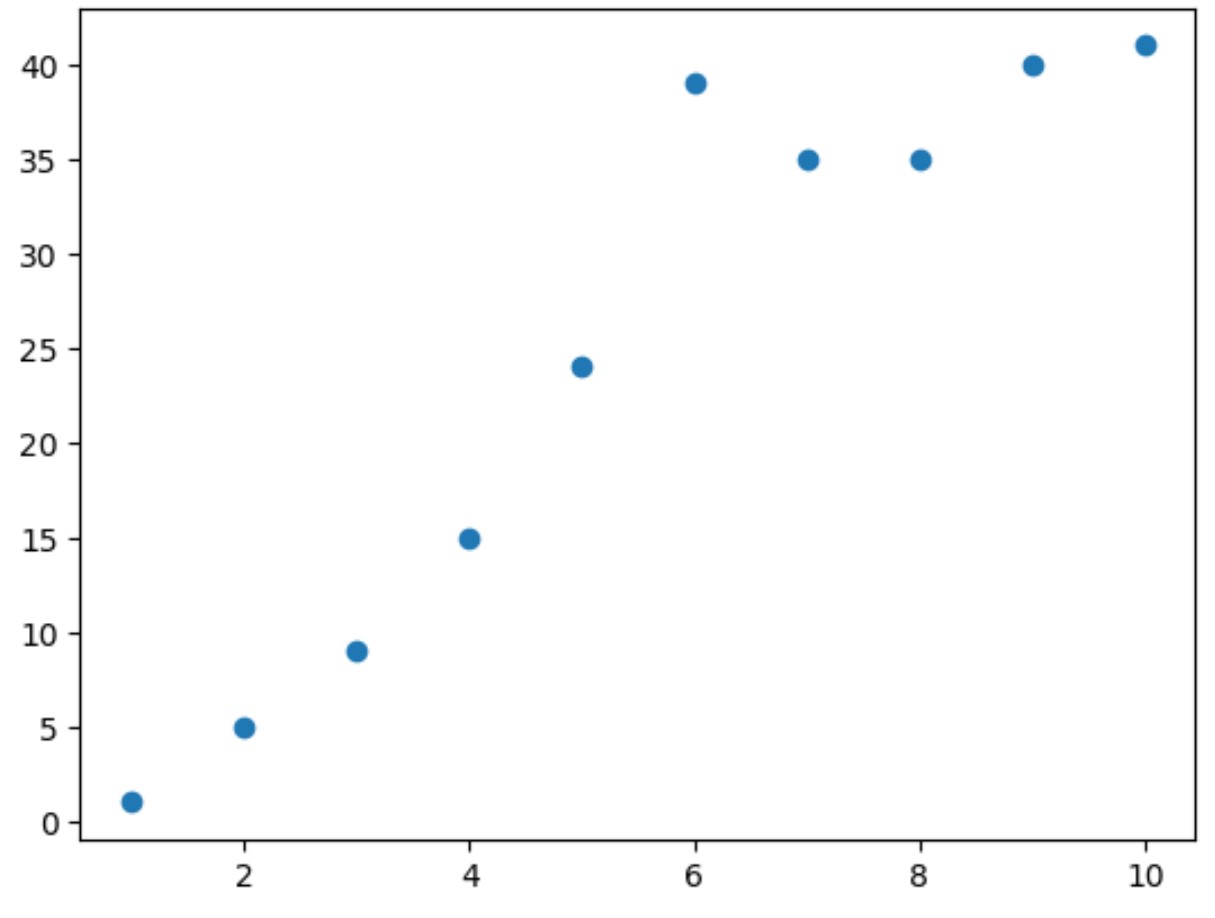
Matplotlib で次の散布図を作成するとします。
 import matplotlib. pyplot as plt

#define x and y
x = [1, 2, 3, 4, 5, 6, 7, 8, 9, 10]
y = [1, 5, 9, 15, 24, 39, 35, 35, 40, 41]

#create scatter plot of x vs. y
plt. scatter (x,y)
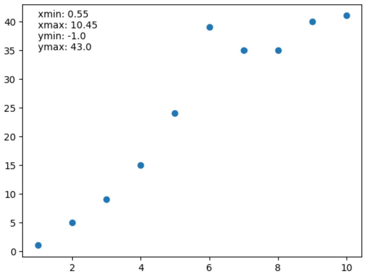
次の構文を使用して、散布図の x 軸と y 軸の軸制限を取得できます。
 import matplotlib. pyplot as plt

#define x and y
x = [1, 2, 3, 4, 5, 6, 7, 8, 9, 10]
y = [1, 5, 9, 15, 24, 39, 35, 35, 40, 41]

#create scatter plot of x vs. y
plt. scatter (x,y)

#get x-axis and y-axis limits
xmin, xmax, ymin, ymax = plt. axis ()

#print axis limits
print (xmin, xmax, ymin, ymax)

0.55 10.45 -1.0 43.0
結果から次のことがわかります。
- X 軸の最小値: 0.55
- X 軸の最大値: 10.45
- Y 軸の最小値: -1.0
- y 軸の最大値: 43.0
これらの値は、上の散布図に表示される軸の制限に対応します。
必要に応じて、 annotate()関数を使用して、これらの軸の制限をテキスト値としてプロットに追加することもできます。
 import matplotlib. pyplot as plt

#define x and y
x = [1, 2, 3, 4, 5, 6, 7, 8, 9, 10]
y = [1, 5, 9, 15, 24, 39, 35, 35, 40, 41]

#create scatter plot of x vs. y
plt. scatter (x,y)

#get x-axis and y-axis limits
xmin, xmax, ymin, ymax = plt. axis ()

#print axis limits
lims = ' xmin: ' + str(round(xmin, 2 )) + ' \n ' + \
       ' xmax: ' + str(round(xmax, 2 )) + ' \n ' + \
       ' ymin: ' + str(round(ymin, 2 )) + ' \n ' + \
       ' ymax: ' + str(round(ymax, 2 ))

#add axis limits to plot at (x,y) coordinate (1.35)
plt. annotate (lims, ( 1 , 35 ))
追加リソース
次のチュートリアルでは、Matplotlib で他の一般的なタスクを実行する方法を説明します。
Matplotlib で軸の目盛りを設定する方法
Matplotlib でプロット サイズを増やす方法
Matplotlib プロットにテキストを追加する方法
著者について
ベンジャミン・アンダーソン博士
私はベンジャミンです。退職した統計教授から、専任の Statorials 教育者になりました。 統計分野における豊富な経験と専門知識を活かして、私は Statorials を通じて学生に力を与えるために自分の知識を共有することに尽力しています。もっと知る