Python でパレート図を作成する方法 (ステップバイステップ)
パレート図は、カテゴリの順序付けされた度数とカテゴリの累積度数を表示するグラフの一種です。
このチュートリアルでは、Python でパレート図を作成するステップバイステップの例を示します。
ステップ 1: データを作成する
350 人の異なる人々に、ブランド A、B、C、D、E の中からお気に入りのシリアル ブランドを特定するよう依頼するアンケートを実施するとします。
調査結果を保持するために、次のパンダ データフレームを作成できます。
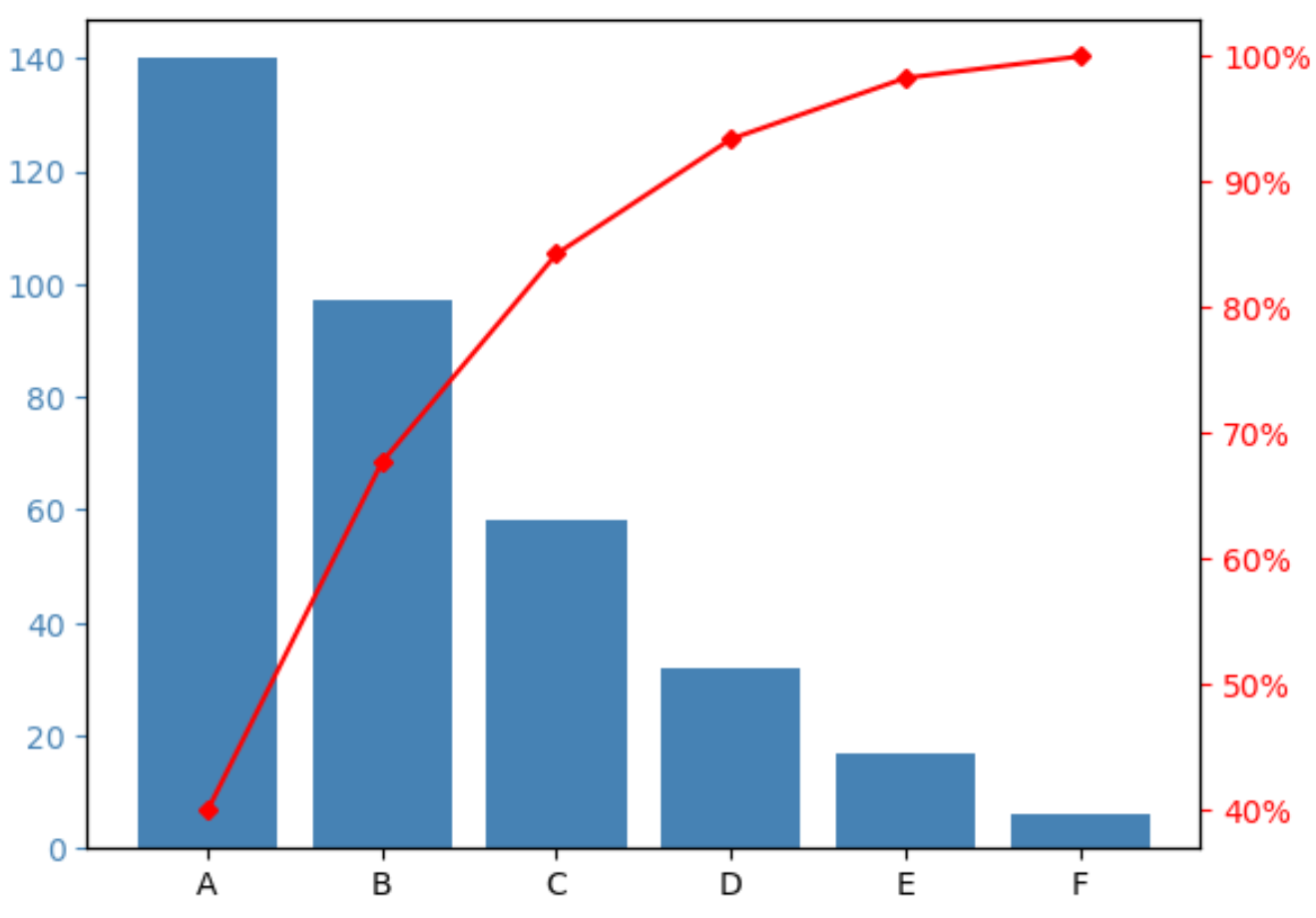
 import pandas as pd

#createDataFrame
df = pd. DataFrame ({' count ': [97, 140, 58, 6, 17, 32]})
df. index = ['B', 'A', 'C', 'F', 'E', 'D']

#sort DataFrame by count descending
df = df. sort_values (by=' count ', ascending= False )

#add column to display cumulative percentage
df[' cumperc '] = df[' count ']. cumsum ()/df[' count ']. sum ()*100

#view DataFrame
df

	count cumperc
At 140 40.000000
B 97 67.714286
C 58 84.285714
D 32 93.428571
E 17 98.285714
F 6 100.000000
ステップ 2: パレート図を作成する
次のコードを使用してパレート図を作成できます。
 import matplotlib. pyplot as plt
from matplotlib. ticker import PercentFormatter

#define aesthetics for plot
color1 = ' steelblue '
color2 = ' red '
line_size = 4

#create basic bar plot
fig, ax = plt. subplots ()
ax. bar (df. index , df[' count '], color=color1)

#add cumulative percentage line to plot
ax2 = ax. twinx ()
ax2. plot ( df.index , df[' cumperc '], color=color2, marker=" D ", ms=line_size)
ax2. yaxis . set_major_formatter (PercentFormatter())

#specify axis colors
ax. tick_params (axis=' y ', colors=color1)
ax2. tick_params (axis=' y ', colors=color2)

#display Pareto chart
plt. show ()
X 軸には、さまざまなブランドが頻度の高い順に表示されます。
左側の Y 軸は各ブランドの頻度を示し、右側の Y 軸はブランドの累積頻度を示します。
たとえば、次のことがわかります。
- ブランド A は、調査回答全体の約 40% を占めています。
- ブランド A と B は、調査回答全体の約 70% を占めています。
- ブランド A、B、C は、調査回答全体の約 85% を占めています。
等々。
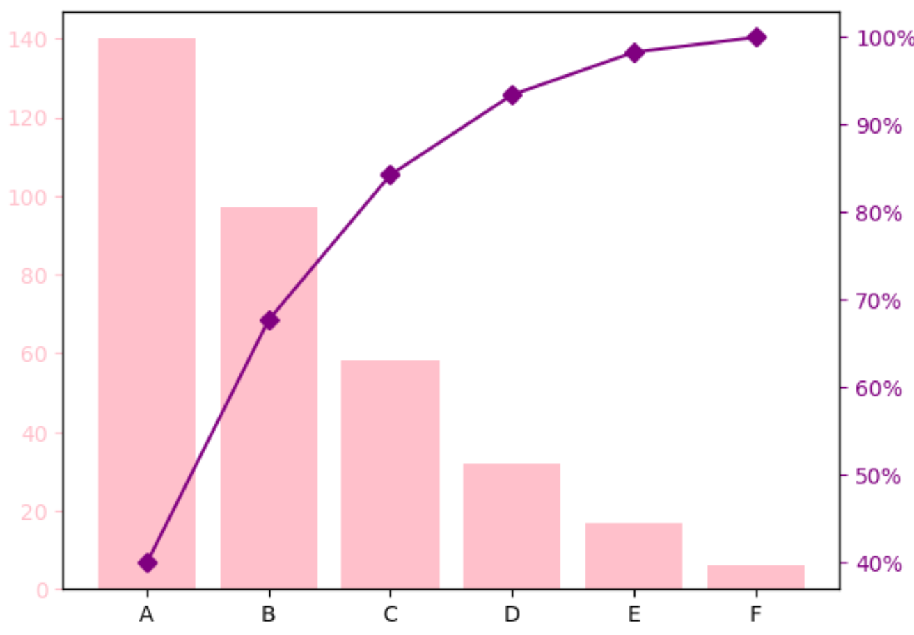
ステップ 3: パレート図をカスタマイズする (オプション)
バーの色と累積パーセンテージ線のサイズを変更して、パレート図を好みの外観にすることができます。
たとえば、バーをピンクに変更し、線を紫の少し太い色に変更できます。
 import matplotlib. pyplot as plt
from matplotlib. ticker import PercentFormatter

#define aesthetics for plot
color1 = ' pink '
color2 = ' purple '
line_size = 6

#create basic bar plot
fig, ax = plt. subplots ()
ax. bar (df. index , df[' count '], color=color1)

#add cumulative percentage line to plot
ax2 = ax. twinx ()
ax2. plot (df.index , df[' cumperc '], color=color2, marker=" D ", ms=line_size )
ax2. yaxis . set_major_formatter (PercentFormatter())

#specify axis colors
ax. tick_params (axis=' y ', colors=color1)
ax2. tick_params (axis=' y ', colors=color2)

#display Pareto chart
plt. show ()
追加リソース
次のチュートリアルでは、Python で他の一般的なビジュアライゼーションを作成する方法を説明します。
Python でベルカーブを作成する方法
Python で Ogive チャートを作成する方法
Python でステムとリーフのプロットを作成する方法
著者について
ベンジャミン・アンダーソン博士
私はベンジャミンです。退職した統計教授から、専任の Statorials 教育者になりました。 統計分野における豊富な経験と専門知識を活かして、私は Statorials を通じて学生に力を与えるために自分の知識を共有することに尽力しています。もっと知る