Ggplot2のプロットと凡例に水平線を追加する方法
次の構文を使用して、ggplot2 のプロットに水平線を追加し、その水平線を凡例の要素として追加することもできます。
 library (ggplot2)

#create data frame with values to plot
df <- data. frame (team=rep(c(' A ', ' B '), each= 5 ),
                 assists=c(1, 3, 3, 4, 5, 7, 7, 9, 9, 10),
                 points=c(4, 8, 12, 10, 18, 25, 20, 28, 33, 35))

#create data frame that contains horizontal line location
cutoff <- data. frame (yintercept= 22 , Lines=' Cutoff ')

#create scatterplot with horizontal line and include horizontal line in legend
ggplot(df, aes(x=assists, y=points)) +
  geom_point(aes(color=team)) +
  geom_hline(aes(yintercept=yintercept, linetype=Lines), cutoff)
水平線の y 切片値のみを含む別のデータ フレームを作成すると、水平線をプロットに追加し、凡例に自動的に追加できます。
次の例は、この構文を実際に使用する方法を示しています。
例: ggplot2 のプロットと凡例に水平線を追加します。
R に、さまざまなチームのバスケットボール選手に関する情報を含む次のデータ フレームがあるとします。
 #create data frame
df <- data. frame (team=rep(c(' A ', ' B '), each= 5 ),
                 assists=c(1, 3, 3, 4, 5, 7, 7, 9, 9, 10),
                 points=c(4, 8, 12, 10, 18, 25, 20, 28, 33, 35))

#view data frame
df

   team assists points
1 To 1 4
2 to 3 8
3 to 3 12
4 to 4 10
5 to 5 18
6 B 7 25
7 B 7 20
8 B 9 28
9 B 9 33
10 B 10 35
ggplot2 で散布図を作成して、チームに基づいて各プレーヤーのポイントとアシストの値を視覚化し、y = 22 に水平線を追加して、良いプレーヤーと悪いプレーヤーの差の「しきい値」を定義したいとします。選手たち。
これを行うには、次の構文を使用できます。
 library (ggplot2)

#create data frame that contains horizontal line location
cutoff <- data. frame (yintercept= 22 , Lines=' Cutoff ')

#create scatterplot with horizontal line and include horizontal line in legend
ggplot(df, aes(x=assists, y=points)) +
  geom_point(aes(color=team)) +
  geom_hline(aes(yintercept=yintercept, linetype=Lines), cutoff)
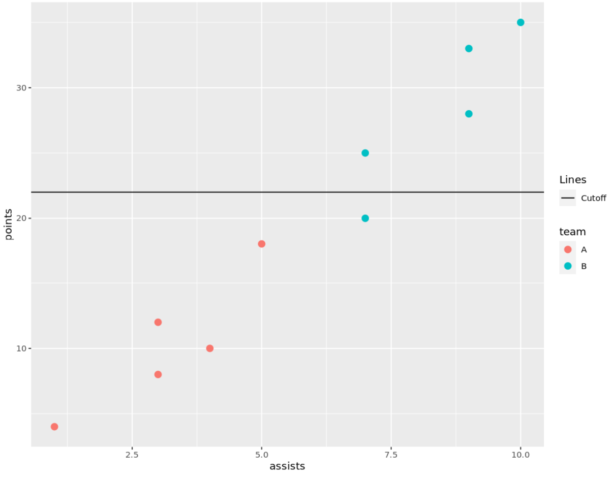
プロットの右側の凡例には、プロット上のどの点がどのチームに属するかを示す円が含まれており、カットオフラインを表す水平線も凡例に追加されていることに注意してください。
凡例の水平線のキャプションを変更する場合は、ブレークデータ フレームの[行]列のテキストを編集するだけです。
たとえば、次の構文を使用して、水平線のラベルを「善対悪のしきい値」に変更できます。
 library (ggplot2)

#create data frame that contains horizontal line location
cutoff <- data. frame (yintercept= 22 , Lines=' Cutoff of Good vs. Bad ')

#create scatterplot with horizontal line and include horizontal line in legend
ggplot(df, aes(x=assists, y=points)) +
  geom_point(aes(color=team)) +
  geom_hline(aes(yintercept=yintercept, linetype=Lines), cutoff)
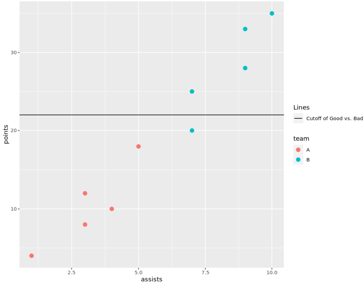
凡例の水平線のラベルが変更されていることに注意してください。
追加リソース
次のチュートリアルでは、ggplot2 で他の一般的なタスクを実行する方法を説明します。
ggplot2で凡例のタイトルを変更する方法
ggplot2で凡例のサイズを変更する方法
ggplot2で凡例の位置を変更する方法
著者について
ベンジャミン・アンダーソン博士
私はベンジャミンです。退職した統計教授から、専任の Statorials 教育者になりました。 統計分野における豊富な経験と専門知識を活かして、私は Statorials を通じて学生に力を与えるために自分の知識を共有することに尽力しています。もっと知る