R で最適な線を引く方法 (例付き)
次のいずれかの方法を使用して、R で最適な線を描画できます。
方法 1: R ベースに最適な線を引く
 #create scatter plot of x vs. y
plot(x, y)

#add line of best fit to scatter plot
abline(lm(y ~ x))
方法 2: ggplot2 で最適な直線をプロットする
 library (ggplot2)

#create scatter plot with line of best fit
ggplot(df, aes (x=x, y=y)) +
    geom_point() +
    geom_smooth(method=lm, se= FALSE )
次の例は、各メソッドを実際に使用する方法を示しています。
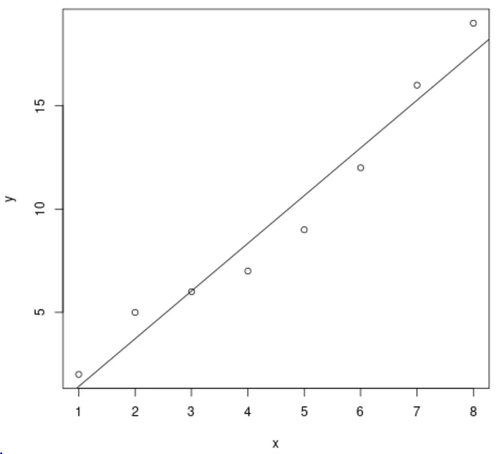
例 1: R ベースに最適な線を引く
次のコードは、R 基底を使用して単純な線形回帰モデルに最適な線を引く方法を示しています。
 #define data
x <- c(1, 2, 3, 4, 5, 6, 7, 8)
y <- c(2, 5, 6, 7, 9, 12, 16, 19)

#create scatter plot of x vs. y
plot(x, y)

#add line of best fit to scatter plot
abline(lm(y ~ x))
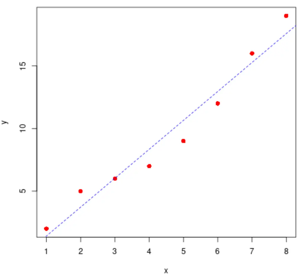
点と線のスタイルも遠慮なく変更してください。
 #define data
x <- c(1, 2, 3, 4, 5, 6, 7, 8)
y <- c(2, 5, 6, 7, 9, 12, 16, 19)

#create scatter plot of x vs. y
plot(x, y, pch= 16 , col=' red ', cex= 1.2 )

#add line of best fit to scatter plot
abline(lm(y ~ x), col=' blue ', lty=' dashed ')
次のコードを使用して、最適な線をすばやく計算することもできます。
 #find regression model coefficients
summary(lm(y ~ x))$coefficients

              Estimate Std. Error t value Pr(>|t|)
(Intercept) -0.8928571 1.0047365 -0.888648 4.084029e-01
x 2.3095238 0.1989675 11.607544 2.461303e-05
最適な直線は、 y = -0.89 + 2.31xであることがわかります。
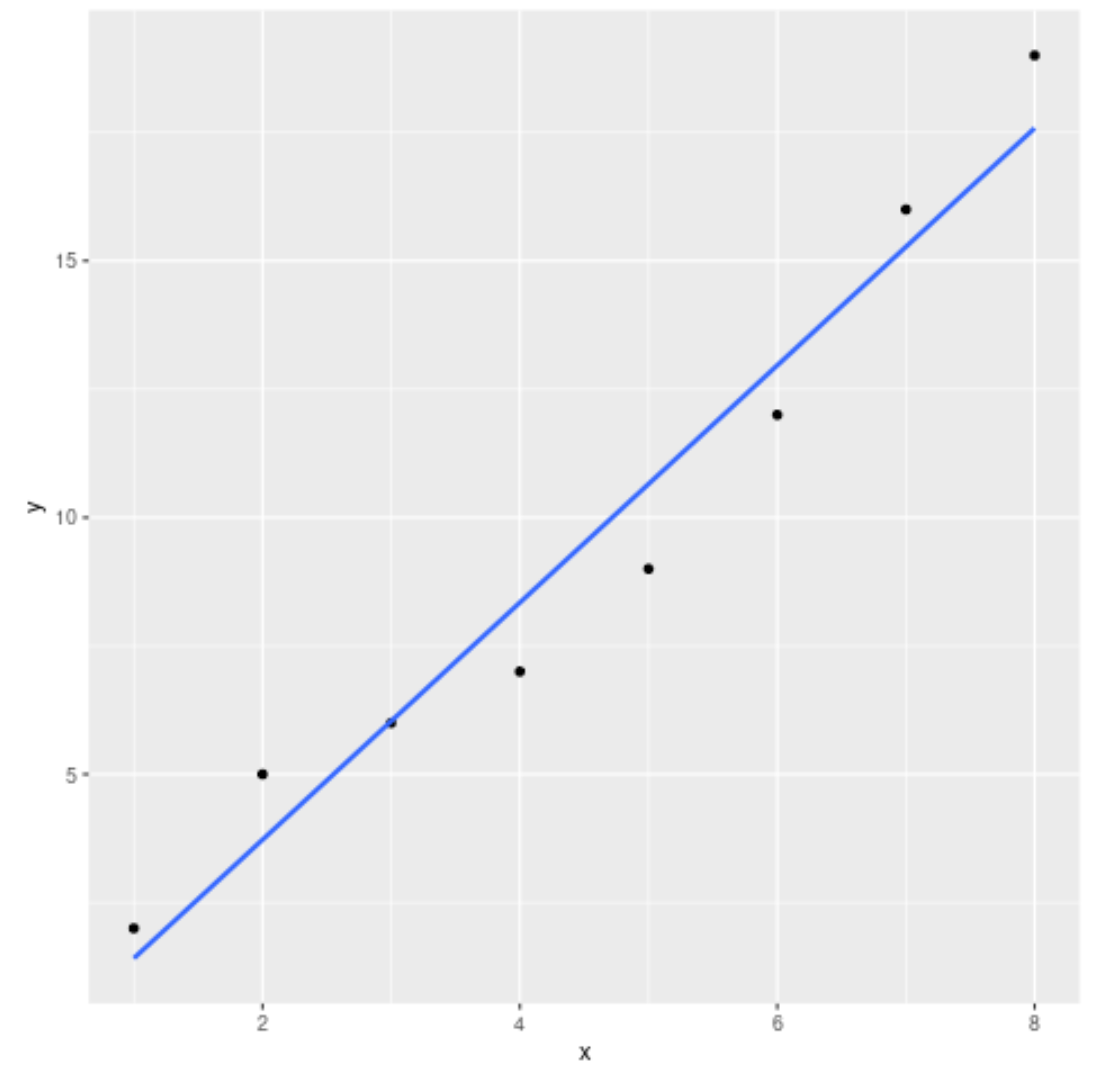
例 2: ggplot2 での最適直線のプロット
次のコードは、 ggplot2データ視覚化パッケージを使用して単純な線形回帰モデルの最適直線をプロットする方法を示しています。
 library (ggplot2)

#define data
df <- data. frame (x=c(1, 2, 3, 4, 5, 6, 7, 8),
y=c(2, 5, 6, 7, 9, 12, 16, 19))

#create scatter plot with line of best fit
ggplot(df, aes (x=x, y=y)) +
    geom_point() +
    geom_smooth(method=lm, se= FALSE )
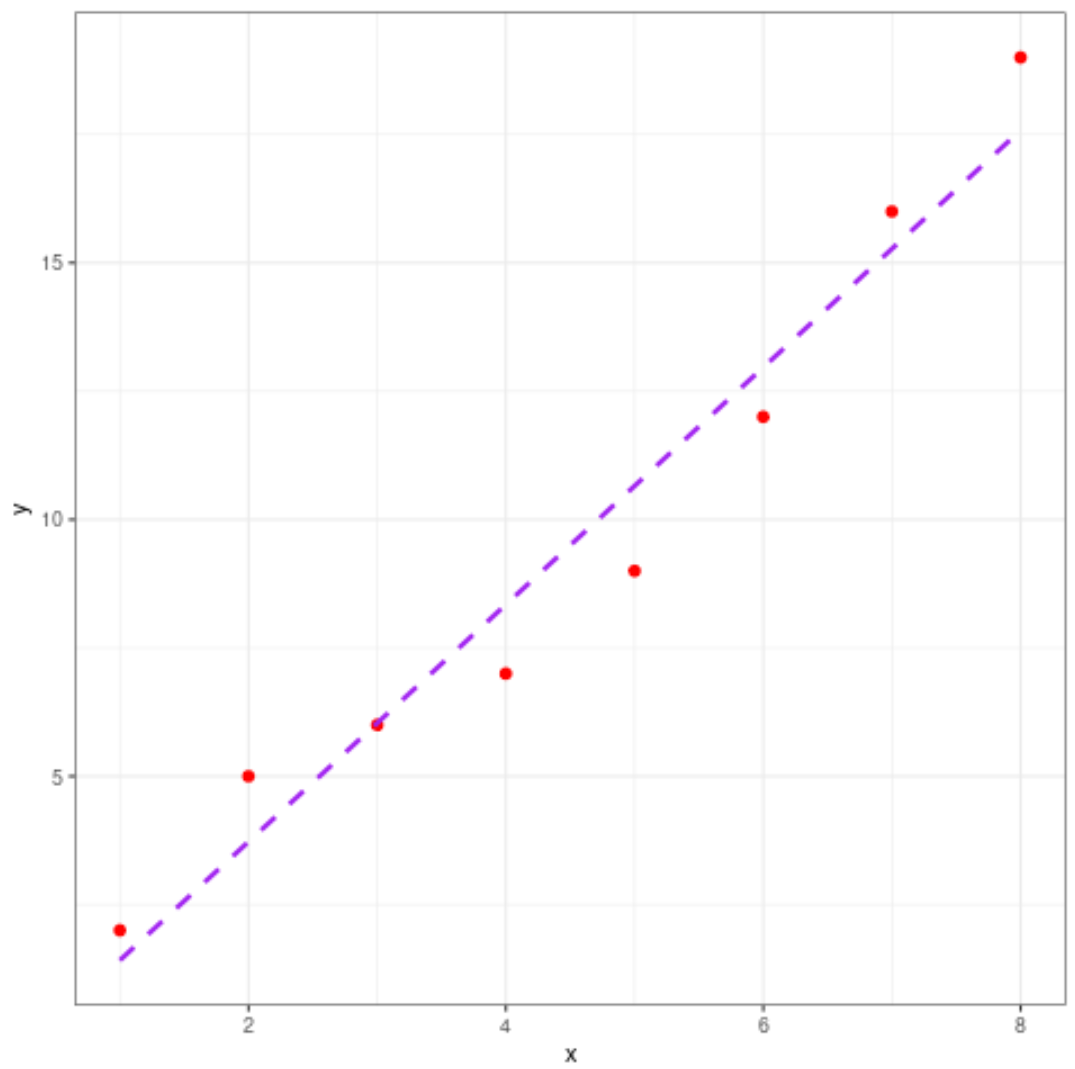
プロットの美学も自由に変更してください。
 library (ggplot2)

#define data
df <- data. frame (x=c(1, 2, 3, 4, 5, 6, 7, 8),
y=c(2, 5, 6, 7, 9, 12, 16, 19))

#create scatter plot with line of best fit
ggplot(df, aes (x=x, y=y)) +
    geom_point(col=' red ', size= 2 ) +
    geom_smooth(method=lm, se= FALSE , col=' purple ', linetype=' dashed ') +
    theme_bw()
追加リソース
次のチュートリアルでは、R で他の一般的な操作を実行する方法について説明します。
著者について
ベンジャミン・アンダーソン博士
私はベンジャミンです。退職した統計教授から、専任の Statorials 教育者になりました。 統計分野における豊富な経験と専門知識を活かして、私は Statorials を通じて学生に力を与えるために自分の知識を共有することに尽力しています。もっと知る