R で箱ひげ図の軸ラベルを変更する方法 (例あり)
次のいずれかの方法を使用して、R の箱ひげ図の X 軸ラベルを変更できます。
方法 1: ベース R の箱ひげ図の軸ラベルを変更する
boxplot(df, names=c(' Label 1 ', ' Label 2 ', ' Label 3 '))
方法 2: ggplot2 で箱ひげ図の軸ラベルを変更する
 levels(df_long$variable) <- c(' Label 1 ', ' Label 2 ', ' Label 3 ')

ggplot(df_long, aes(variable, value)) +
  geom_boxplot()
次の例は、R の次のデータ フレームで各メソッドを実際に使用する方法を示しています。
 #make this example reproducible
set. seeds (0)

#create data frame
df <- data. frame (A=rnorm(1000, mean=5),
                 B=rnorm(1000, mean=10),
                 C=rnorm(1000, mean=15))

#view head of data frame
head(df)

         ABC
1 6.262954 9.713148 15.44435
2 4.673767 11.841107 15.01193
3 6.329799 9.843236 14.99072
4 6.272429 8.610197 14.69762
5 5.414641 8.526896 15.49236
6 3.460050 9.930481 14.39728
例 1: Base R で箱ひげ図の軸ラベルを編集する
boxplot()関数を使用して R ベースの箱ひげ図を作成すると、デフォルトでデータ フレームの列名が X 軸ラベルとして使用されます。
 #create boxplots
boxplot(df)
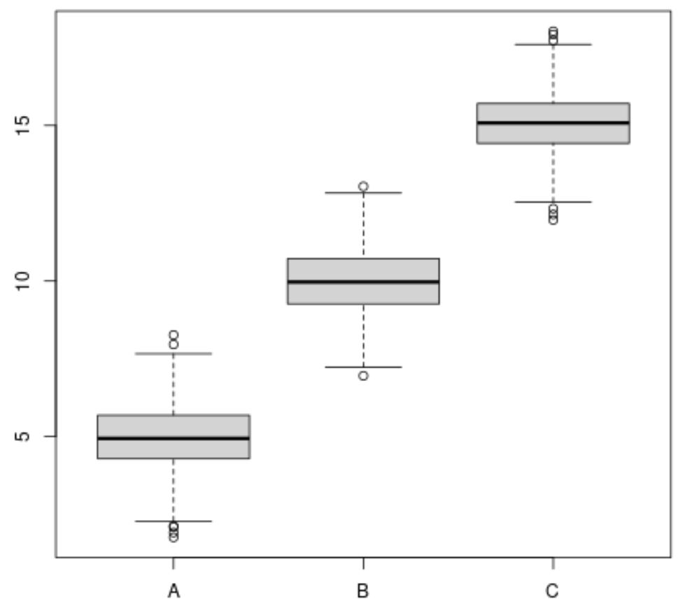
ただし、 names引数を使用して、使用する x 軸ラベルを指定できます。
 #create boxplots with specific x-axis names
boxplot(df, names=c(' Team A ', ' Team B ', ' Team C '))
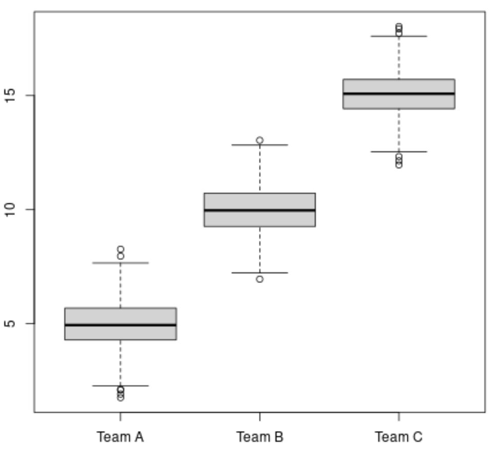
names引数で指定したラベルが x 軸のラベルとして使用されることに注意してください。
例 2: ggplot2 で箱ひげ図の軸ラベルを変更する
ggplot2 で箱ひげ図を作成する前に、 reshape2パッケージのMelt()関数を使用して、データ フレームを長い形式に「溶かす」必要があります。
 library (reshape2)

#reshape data frame to long format
df_long <- melt(df)

#view head of long data frame
head(df_long)

  variable value
1 A 6.262954
2 A 4.673767
3 A 6.329799
4 A 6.272429
5 A 5.414641
6 A 3.460050
次に、 levels() 関数を使用して x 軸のラベルを指定し、 geom_boxplot()関数を使用して実際に ggplot2 に箱ひげ図を作成します。
 library (ggplot2)

#specify x-axis names to use
levels(df_long$variable) <- c(' Team A ', ' Team B ', ' Team C ')

#create box plot with specific x-axis labels
ggplot(df_long, aes(variable, value)) +
  geom_boxplot()
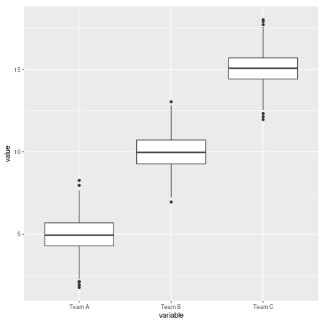
関数 levelを使用して指定したラベルが X 軸ラベルとして使用されることに注意してください。
追加リソース
次のチュートリアルでは、R で他の一般的なタスクを実行する方法について説明します。
R で箱ひげ図を再配置する方法
R でグループ化箱ひげ図を作成する方法
R の箱ひげ図で外れ値にラベルを付ける方法
Rで平均値を使用して箱ひげ図を描く方法
著者について
ベンジャミン・アンダーソン博士
私はベンジャミンです。退職した統計教授から、専任の Statorials 教育者になりました。 統計分野における豊富な経験と専門知識を活かして、私は Statorials を通じて学生に力を与えるために自分の知識を共有することに尽力しています。もっと知る