パンダ: groupby から棒グラフを作成する方法
次の構文を使用して、pandas の GroupBy 関数から棒グラフを作成できます。
 #calculate sum of values by group
df_groups = df. groupby ([' group_var '])[' values_var ']. sum ()

#create bar plot by group
df_groups. plot (kind=' bar ')
次の例は、この構文を実際に使用する方法を示しています。
例: Pandas で GroupBy から棒グラフを作成する
さまざまなチームのバスケットボール選手が獲得したポイントを示す次のパンダ データフレームがあるとします。
 import pandas as pd

#createDataFrame
df = pd. DataFrame ({' team ': ['A', 'A', 'A', 'A', 'A',
                            'B', 'B', 'B', 'B', 'B',
                            'C', 'C', 'C', 'C', 'C'],
                   ' points ': [12, 29, 34, 14, 10, 11, 7, 36,
                              34, 22, 41, 40, 45, 36, 38]})

#view first five rows of DataFrame
df. head ()

	team points
0 to 12
1 to 29
2 to 34
3 to 14
4 to 10
次の構文を使用して、各チームが獲得したポイントの合計を計算し、棒グラフを作成して各チームの合計を視覚化できます。
 import matplotlib. pyplot as plt

#calculate sum of points for each team
df. groupby (' team ')[' points ']. sum ()

#create bar plot by group
df_groups. plot (kind=' bar ')
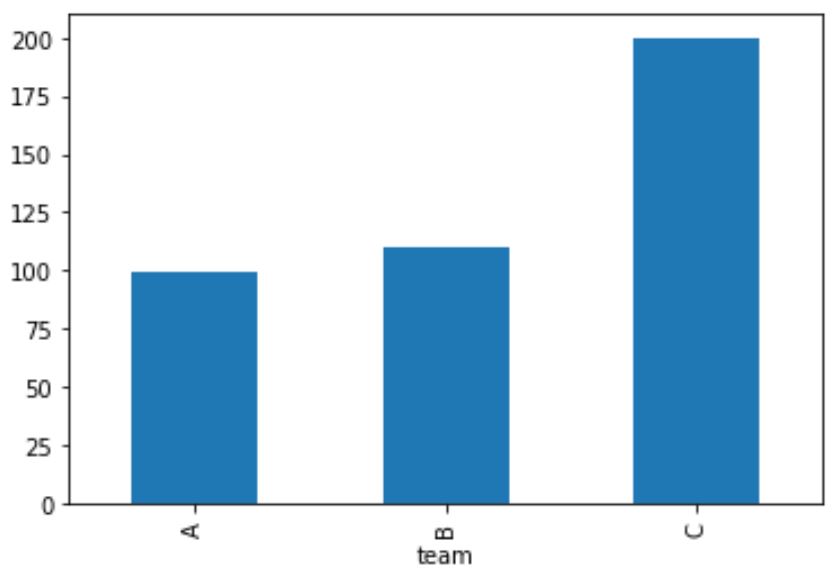
X 軸は各チームの名前を示し、Y 軸は各チームが獲得したポイントの合計を示します。
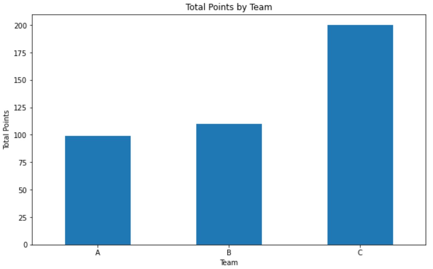
次のコードを使用して、プロットをもう少し改善することもできます。
 import matplotlib. pyplot as plt

#calculate sum of points for each team
df_groups = df. groupby ([' team '])[' points ']. sum ()

#create bar plot with custom aesthetics
df_groups. plot (kind=' bar ', title=' Total Points by Team ',
               ylabel=' Total Points ' , xlabel=' Team ', figsize=( 10,6 ) )

#rotate x-axis ticks vertically
plt. xticks (rotation= 0 )
注: GroupBy関数の完全なドキュメントはここで見つけることができます。
追加リソース
次のチュートリアルでは、パンダで他の一般的な操作を実行する方法を説明します。
パンダ: グループごとに一意の値を数える方法
Pandas: グループごとにモードを計算する方法
パンダ: グループごとの相関を計算する方法
著者について
ベンジャミン・アンダーソン博士
私はベンジャミンです。退職した統計教授から、専任の Statorials 教育者になりました。 統計分野における豊富な経験と専門知識を活かして、私は Statorials を通じて学生に力を与えるために自分の知識を共有することに尽力しています。もっと知る