パンダ: 上位 10 の値を視覚化する棒グラフを作成する方法
次の基本構文を使用して、特定の列の最も頻繁に使用される 10 個の値のみを含む棒グラフをパンダで作成できます。
 import pandas as pd
import matplotlib. pyplot as plt

#find values with top 10 occurrences in 'my_column'
top_10 = (df[' my_column ']. value_counts ()). iloc [:10]

#create bar chart to visualize top 10 values
top_10. plot (kind='bar')
次の例は、この構文を実際に使用する方法を示しています。
例: Pandas で棒グラフを作成して上位 10 の値を視覚化する
チーム名と 500 人の異なるバスケットボール選手が獲得したポイントに関する情報を含む次のパンダ データフレームがあるとします。
 import pandas as pd
import numpy as np
from string import ascii_uppercase
import random
from random import choice

#make this example reproducible
random. seeds (1)
n.p. random . seeds (1)

#createDataFrame
df = pd. DataFrame ({' team ': [choice(ascii_uppercase) for _ in range(500)],
                   ' points ': np. random . uniform (0, 20, 500)})

#view first five rows of DataFrame
print ( df.head ())

  team points
0 E 8.340440
1 S 14.406490
2 Z 0.002287
3 Y 6.046651
4 C 2.935118
次の構文を使用して、チーム列に最も頻繁に使用される 10 個の値を表示する棒グラフを作成できます。
 import matplotlib. pyplot as plt

#find teams with top 10 occurrences
top_10_teams = (df[' team ']. value_counts ()).[:10]

#create bar chart of top 10 teams
top_10_teams. plot (kind=' bar ')
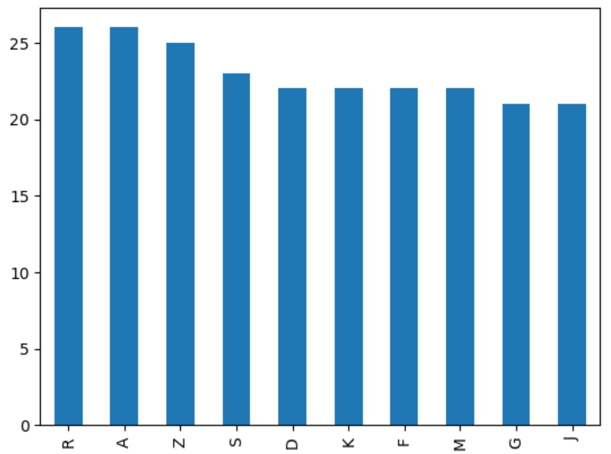
棒グラフには、最も頻繁に使用された 10 チームの名前のみが含まれています。
X 軸はチーム名を表示し、Y 軸は頻度を表示します。
プロットをカスタマイズして、見た目をより美しくすることもできることに注意してください。
 import matplotlib. pyplot as plt

#find teams with top 10 occurrences
top_10_teams = (df[' team ']. value_counts ()).[:10]

#create bar chart of top 10 teams
top_10_teams. plot (kind=' bar ', edgecolor=' black ', rot=0)

#add axis labels
plt. xlabel (' Team ')
plt. ylabel (' Frequency ')
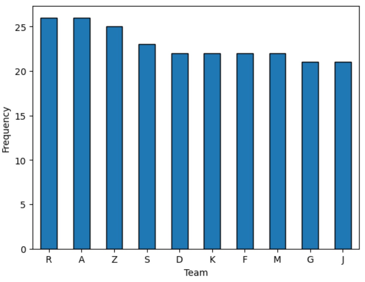
読みやすくするために、 edgecolor引数によって各バーの周囲に黒い境界線が追加され、 rot引数によって x 軸ラベルが 90 度回転されたことに注意してください。
追加リソース
次のチュートリアルでは、パンダで他の一般的なタスクを実行する方法を説明します。
パンダ: 積み上げ棒グラフを作成する方法
パンダ: 棒グラフの棒に注釈を付ける方法
パンダ: 棒グラフに複数の列をプロットする方法
著者について
ベンジャミン・アンダーソン博士
私はベンジャミンです。退職した統計教授から、専任の Statorials 教育者になりました。 統計分野における豊富な経験と専門知識を活かして、私は Statorials を通じて学生に力を与えるために自分の知識を共有することに尽力しています。もっと知る