パンダ: 複数の列を使用して散布図を作成する
次の基本構文を使用して、pandas DataFrame の複数の列を使用して散布図を作成できます。
 import pandas as pd

#create scatter plot of A vs. B
ax1 = df. plot (kind=' scatter ', x=' A ', y=' B ', color=' r ')

#add scatter plot on same graph of C vs. D
ax2 = df. plot (kind=' scatter ', x=' C ', y=' D ', color=' g ', ax=ax1)
この特定の例では、列 A と B を使用して散布図を作成し、列 C と D を使用して同じグラフに別の散布図を重ね合わせます。
次の例は、この構文を実際に使用する方法を示しています。
例: 複数の列を使用して Pandas 散布図を作成する
チーム A と B のさまざまなバスケットボール選手のポイントとアシストを示す次のパンダ データフレームがあるとします。
 import pandas as pd

#createDataFrame
df = pd. DataFrame ({' A_assists ': [3, 4, 5, 6, 7, 7, 8, 9],
                   ' A_points ': [6, 8, 8, 10, 13, 13, 15, 16],
                   ' B_assists ': [3, 4, 4, 5, 5, 6, 7, 7],
                   ' B_points ': [7, 9, 9, 13, 10, 11, 12, 13]})
#view DataFrame
print (df)

   A_assists A_points B_assists B_points
0 3 6 3 7
1 4 8 4 9
2 5 8 4 9
3 6 10 5 13
4 7 13 5 10
5 7 13 6 11
6 8 15 7 12
7 9 16 7 13
次の構文を使用して、 A_assists 列とA_points列を使用して散布図を作成し、 B_assists列とB_points列を使用して同じグラフに別の散布図を重ね合わせることができます。
 #create scatter plot of A_assists vs. A_points
ax1=df. plot (kind=' scatter ', x=' A_assists ', y=' A_points ', color=' r ', label=' A ')

#add scatter plot on same graph using B_assists vs. B_points
ax2=df. plot (kind=' scatter ', x=' B_assists ', y=' B_points ', color=' g ', label=' B ', ax=ax1)

#specify x-axis and y-axis labels
ax1. set_xlabel (' Assists ')
ax1. set_ylabel (' Points ')
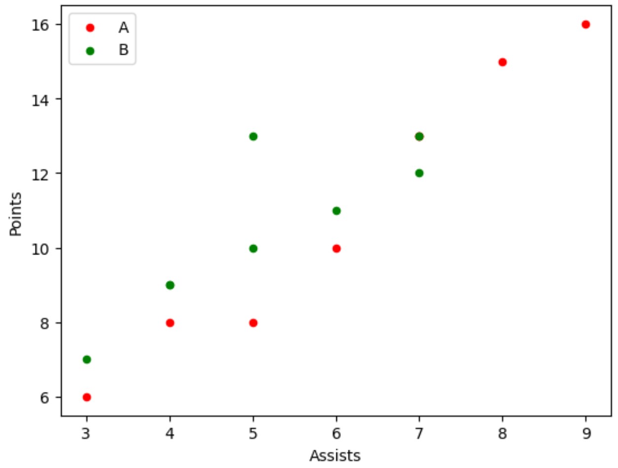
最終結果は、赤色の A_assistors列とA_points列の値、緑色のB_assistors列とB_points列の値を含む散布図です。
注 #1 : label 引数は、プロットの凡例で使用するラベルを指定します。
注 #2 : この例では、2 つの列グループを使用して、同じグラフ上に 2 つの散布図をプロットしました。ただし、 ax3 、 ax4などを使用できます。散布図に必要なだけ列を追加します。
追加リソース
次のチュートリアルでは、パンダで他の一般的なタスクを実行する方法を説明します。
Pandas でグループごとにヒストグラムをプロットする方法
Pandas でカテゴリデータをプロットする方法
Pandasで列値の分布をプロットする方法
著者について
ベンジャミン・アンダーソン博士
私はベンジャミンです。退職した統計教授から、専任の Statorials 教育者になりました。 統計分野における豊富な経験と専門知識を活かして、私は Statorials を通じて学生に力を与えるために自分の知識を共有することに尽力しています。もっと知る