Pandas シリーズからヒストグラムを作成する方法
次の基本構文を使用して、pandas シリーズからヒストグラムを作成できます。
my_series. plot (kind=' hist ')
次の例は、この構文を実際に使用する方法を示しています。
注: オンライン Python ノートブックを使用していて、この構文を使用してもヒストグラムが表示されない場合は、最初に%matplotlib onlineを指定する必要がある場合があります。
例 1: 頻度ヒストグラムを作成する
次のコードは、pandas シリーズから頻度ヒストグラムを作成する方法を示しています。
 import pandas as pd

#createSeries
data = pd. Series ([2, 2, 2, 3, 3, 4, 5, 7, 8, 9, 12, 12, 14, 15, 16, 16, 18,
                    19, 22, 22, 22, 25, 26, 27, 30, 33, 33, 33, 34, 35])

#create histogram from Series
data. plot (kind=' hist ')
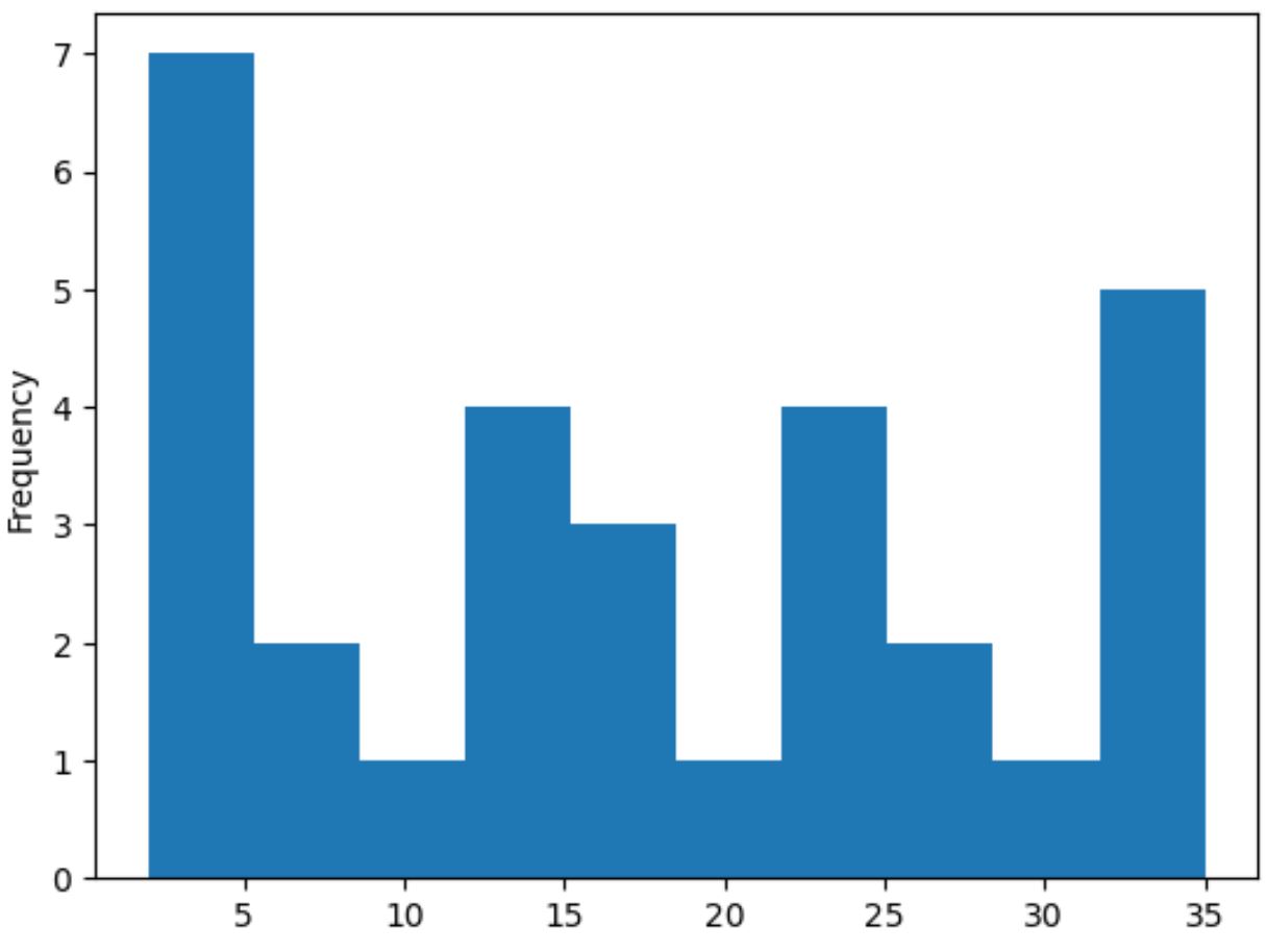
X 軸は pandas シリーズの値を表示し、Y 軸は各値の頻度を表示します。
例 2: 密度ヒストグラムを作成する
pandas シリーズから密度ヒストグラムを作成するには、 plot()関数でdensity=Trueを指定します。
 import pandas as pd

#createSeries
data = pd. Series ([2, 2, 2, 3, 3, 4, 5, 7, 8, 9, 12, 12, 14, 15, 16, 16, 18,
                    19, 22, 22, 22, 25, 26, 27, 30, 33, 33, 33, 34, 35])

#create histogram from Series
data. plot (kind=' hist ', density= True )
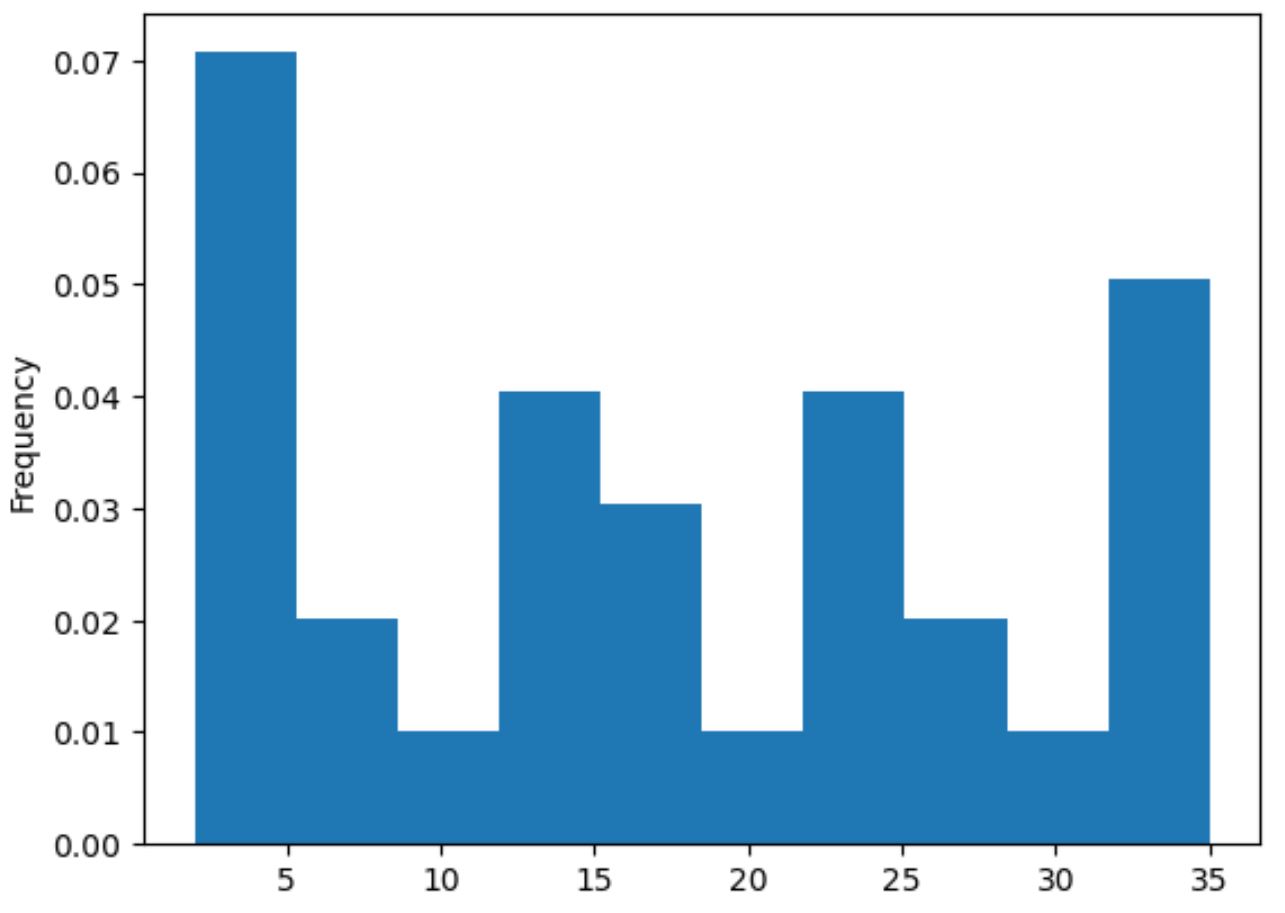
X 軸にはパンダ系列の値が表示され、Y 軸には密度が表示されます。
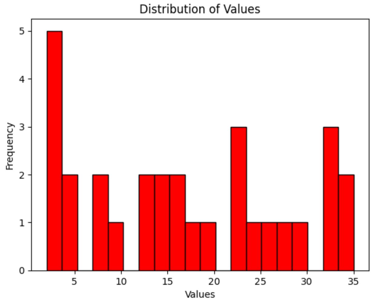
例 3: カスタム ヒストグラムを作成する
最後に、次の構文を使用して、ヒストグラム バーの色、使用するビンの数、軸ラベル、プロット タイトルをカスタマイズできます。
 import pandas as pd

#createSeries
data = pd. Series ([2, 2, 2, 3, 3, 4, 5, 7, 8, 9, 12, 12, 14, 15, 16, 16, 18,
                    19, 22, 22, 22, 25, 26, 27, 30, 33, 33, 33, 34, 35])

#create histogram with custom color, edgecolor, and number of bins
my_hist = data. plot (kind=' hist ', color=' red ', edgecolor=' black ', bins= 20 )

#add x-axis label
my_hist. set_xlabel (' Values ')

#add title
my_hist. set_title (' Distribution of Values ')
追加リソース
次のチュートリアルでは、Python で他の一般的なプロットを作成する方法を説明します。
Matplotlib で複数の線をプロットする方法
Pandas DataFrame から箱ひげ図を作成する方法
複数の Pandas 列を棒グラフにプロットする方法
著者について
ベンジャミン・アンダーソン博士
私はベンジャミンです。退職した統計教授から、専任の Statorials 教育者になりました。 統計分野における豊富な経験と専門知識を活かして、私は Statorials を通じて学生に力を与えるために自分の知識を共有することに尽力しています。もっと知る