Python で回帰直線を含む散布図を作成する方法
単純な線形回帰を実行する場合、散布図を作成して、x 値と y 値のさまざまな組み合わせや推定回帰直線を視覚化することがよくあります。
幸いなことに、Python でこのタイプのプロットを作成する簡単な方法が 2 つあります。このチュートリアルでは、次のデータを使用して両方の方法について説明します。
 import numpy as np

#createdata
x = np.array([1, 1, 2, 3, 4, 4, 5, 6, 7, 7, 8, 9])
y = np.array([13, 14, 17, 12, 23, 24, 25, 25, 24, 28, 32, 33])
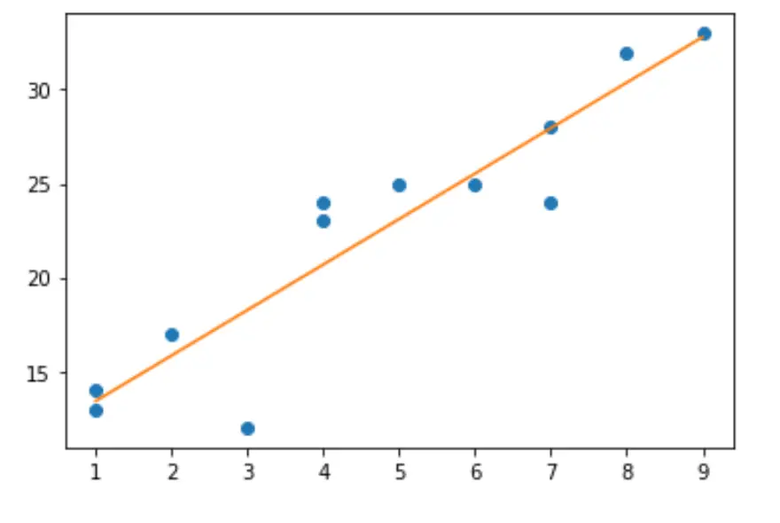
方法 1: Matplotlib を使用する
次のコードは、Matplotlib を使用して、このデータの推定回帰直線を含む散布図を作成する方法を示しています。
 import matplotlib.pyplot as plt

#create basic scatterplot
plt.plot(x, y, 'o')

#obtain m (slope) and b(intercept) of linear regression line
m, b = np.polyfit(x, y, 1)

#add linear regression line to scatterplot
plt.plot(x, m*x+b)
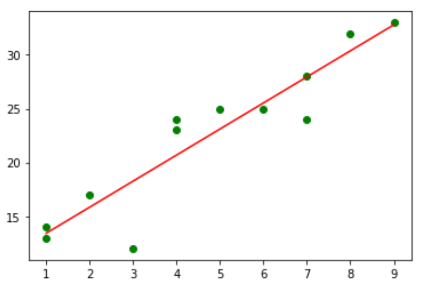
グラフの色はお好みに合わせて変更してください。たとえば、個々の点を緑に変更し、線を赤に変更する方法は次のとおりです。
 #use green as color for individual points
plt.plot(x, y, 'o', color=' green ')

#obtain m (slope) and b(intercept) of linear regression line
m, b = np.polyfit(x, y, 1)

#use red as color for regression line
plt.plot(x, m*x+b, color=' red ')
方法 2: Seaborn を使用する
Seaborn 視覚化ライブラリのregplot()関数を使用して、回帰直線を含む散布図を作成することもできます。
 import seaborn as sns

#create scatterplot with regression line
sns.regplot(x, y, ci=None)
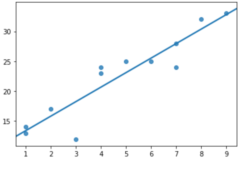
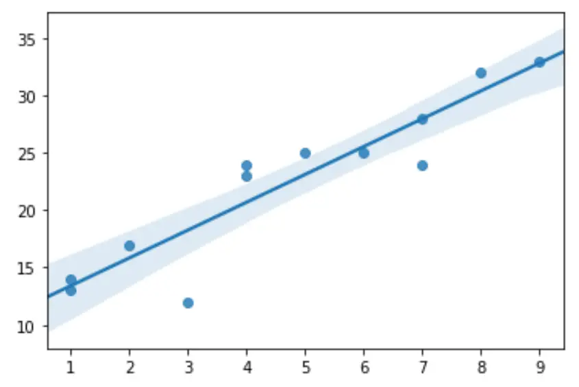
ci=Noneは、Seaborn にプロット上の信頼区間バンドを非表示にするよう指示することに注意してください。ただし、必要に応じて、それらを表示することを選択できます。
 import seaborn as sns

#create scatterplot with regression line and confidence interval lines
sns.regplot(x,y)
regplot()関数の完全なドキュメントはここで見つけることができます。
追加リソース
著者について
ベンジャミン・アンダーソン博士
私はベンジャミンです。退職した統計教授から、専任の Statorials 教育者になりました。 統計分野における豊富な経験と専門知識を活かして、私は Statorials を通じて学生に力を与えるために自分の知識を共有することに尽力しています。もっと知る