Python で正規分布をプロットする方法: 例付き
Python で正規分布をプロットするには、次の構文を使用できます。
 #x-axis ranges from -3 and 3 with .001 steps
x = np. arange (-3, 3, 0.001)

#plot normal distribution with mean 0 and standard deviation 1
plt. plot (x, norm. pdf (x, 0, 1))
x配列は x 軸の範囲を定義し、 plt.plot() は指定された平均と標準偏差を持つ正規分布の曲線を生成します。
次の例は、これらの関数を実際に使用する方法を示しています。
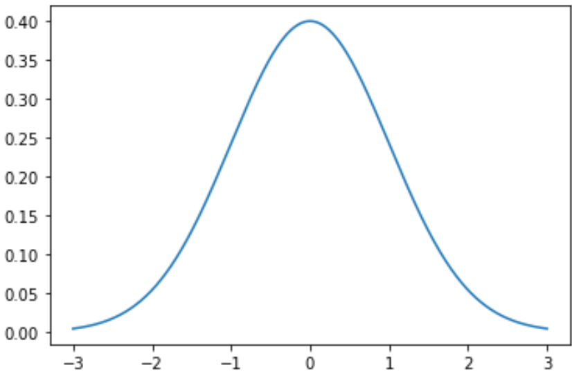
例 1: 単一の正規分布をプロットする
次のコードは、平均 0、標準偏差 1 の単一の正規分布曲線をプロットする方法を示しています。
 import numpy as np
import matplotlib. pyplot as plt
from scipy. stats import norm

#x-axis ranges from -3 and 3 with .001 steps
x = np. arange (-3, 3, 0.001)

#plot normal distribution with mean 0 and standard deviation 1
plt. plot (x, norm. pdf (x, 0, 1))
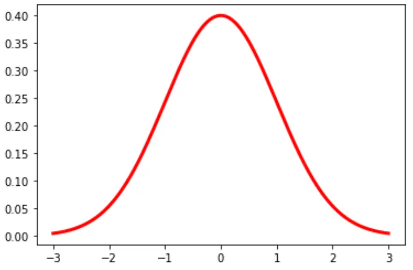
グラフの線の色と幅を変更することもできます。
plt. plot (x, norm. pdf (x, 0, 1), color=' red ', linewidth= 3 )
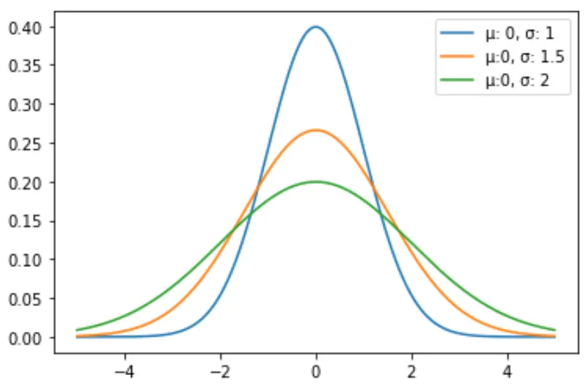
例 2: 複数の正規分布のプロット
次のコードは、異なる平均と標準偏差を使用して複数の正規分布曲線をプロットする方法を示しています。
 import numpy as np
import matplotlib. pyplot as plt
from scipy. stats import norm

#x-axis ranges from -5 and 5 with .001 steps
x = np. arange (-5, 5, 0.001)

#define multiple normal distributions
plt. plot (x, norm. pdf (x, 0, 1), label=' μ: 0, σ: 1 ')
plt. plot (x, norm. pdf (x, 0, 1.5), label=' μ:0, σ: 1.5 ')
plt. plot (x, norm. pdf (x, 0, 2), label=' μ:0, σ: 2 ')

#add legend to plot
plt. legend ()
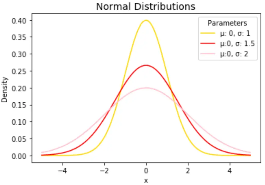
自由に線の色を変更し、タイトルと軸のラベルを追加してグラフを完成させます。
 import numpy as np
import matplotlib. pyplot as plt
from scipy. stats import norm

#x-axis ranges from -5 and 5 with .001 steps
x = np. arange (-5, 5, 0.001)

#define multiple normal distributions
plt. plot (x, norm. pdf (x, 0, 1), label=' μ: 0, σ: 1 ', color=' gold ')
plt. plot (x, norm. pdf (x, 0, 1.5), label=' μ:0, σ: 1.5 ', color=' red ')
plt. plot (x, norm. pdf (x, 0, 2), label=' μ:0, σ: 2 ', color=' pink ')

#add legend to plot
plt. legend (title=' Parameters ')

#add axes labels and a title
plt. ylabel (' Density ')
plt. xlabel (' x ')
plt. title (' Normal Distributions ', fontsize= 14 )
plt.plot()関数の詳細な説明については、 matplotlib のドキュメントを参照してください。
著者について
ベンジャミン・アンダーソン博士
私はベンジャミンです。退職した統計教授から、専任の Statorials 教育者になりました。 統計分野における豊富な経験と専門知識を活かして、私は Statorials を通じて学生に力を与えるために自分の知識を共有することに尽力しています。もっと知る