Seaborn で面グラフを作成する方法 (例付き)
次の基本構文を使用して、 seabornで面グラフを作成できます。
 import matplotlib. pyplot as plt
import seaborn as sns

#set seaborn style
sns. set_theme ()

#create seaborn area chart
plt. stackplot ( df.x , df.y1 , df.y2 , df.y3 )
次の例は、この構文を実際に使用する方法を示しています。
例 1: Seaborn で基本的な面グラフを作成する
次のコードは、Seaborn で基本的な面グラフを作成する方法を示しています。
 import pandas as pd
import matplotlib. pyplot as plt
import seaborn as sns

#set seaborn style
sns. set_theme ()

#define DataFrame
df = pd. DataFrame ({' period ': [1, 2, 3, 4, 5, 6, 7, 8],
                   ' team_A ': [20, 12, 15, 14, 19, 23, 25, 29],
                   ' team_B ': [5, 7, 7, 9, 12, 9, 9, 4],
                   ' team_C ': [11, 8, 10, 6, 6, 5, 9, 12]})

#create area chart
plt. stackplot (df. period , df. team_A , df. team_B , df. team_C )
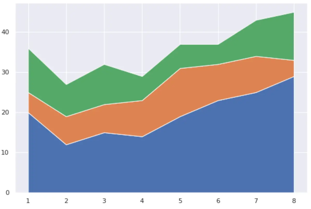
X 軸は期間変数を表示し、Y 軸は 3 つのチームそれぞれの値を経時的に表示します。
例 2: Seaborn でカスタム面グラフを作成する
次のコードは、面グラフの色を変更し、特定のラベルを持つ凡例を追加する方法を示しています。
 import pandas as pd
import matplotlib. pyplot as plt
import seaborn as sns

#set seaborn style
sns. set_theme ()

#define DataFrame
df = pd. DataFrame ({' period ': [1, 2, 3, 4, 5, 6, 7, 8],
                   ' team_A ': [20, 12, 15, 14, 19, 23, 25, 29],
                   ' team_B ': [5, 7, 7, 9, 12, 9, 9, 4],
                   ' team_C ': [11, 8, 10, 6, 6, 5, 9, 12]})

#define colors to use in chart
color_map = [' red ', ' steelblue ', ' pink ']

#create area chart
plt. stackplot (df. period , df. team_A , df. team_B , df. team_C ,
              labels=[' Team A ', ' Team B ', ' Team C '],
              colors=color_map)

#add legend
plt. legend (loc=' upper left ')

#add axis labels
plt. xlabel (' Period ')
plt. ylabel (' Points Scored ')

#display area chart
plt. show ()
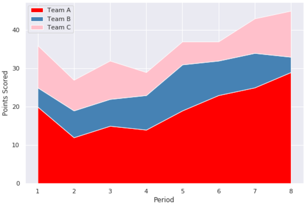
Colors引数は、色の名前と 16 進数のカラー コードを受け入れることに注意してください。
追加リソース
次のチュートリアルでは、Seaborn で他の一般的なプロットを作成する方法を説明します。
Seaborn で時系列プロットを作成する方法
Seaborn で円グラフを作成する方法
Seaborn でバープロットを作成する方法
著者について
ベンジャミン・アンダーソン博士
私はベンジャミンです。退職した統計教授から、専任の Statorials 教育者になりました。 統計分野における豊富な経験と専門知識を活かして、私は Statorials を通じて学生に力を与えるために自分の知識を共有することに尽力しています。もっと知る