Pandas dataframe から箱ひげ図を作成する方法
次の構文を使用して、パンダ データフレームから箱ひげ図を作成できます。
 #create boxplot of one column
df. boxplot (column=[' col1 '])

#create boxplot of multiple columns
df. boxplot (column=[' col1 ', ' col2 '])

#create boxplot grouped by one column
df. boxplot (column=[' col1 '], by=' col2 ')
次の例は、この構文を次の DataFrame で実際に使用する方法を示しています。
 import pandas as pd

#createDataFrame
df = pd. DataFrame ({' conference ': ['A', 'A', 'A', 'B', 'B', 'B'],
                   ' points ': [5, 7, 7, 9, 12, 9],
                   ' assists ': [11, 8, 10, 6, 6, 5],
                   ' rebounds ': [4, 2, 5, 8, 6, 11],})

#view DataFrame
df
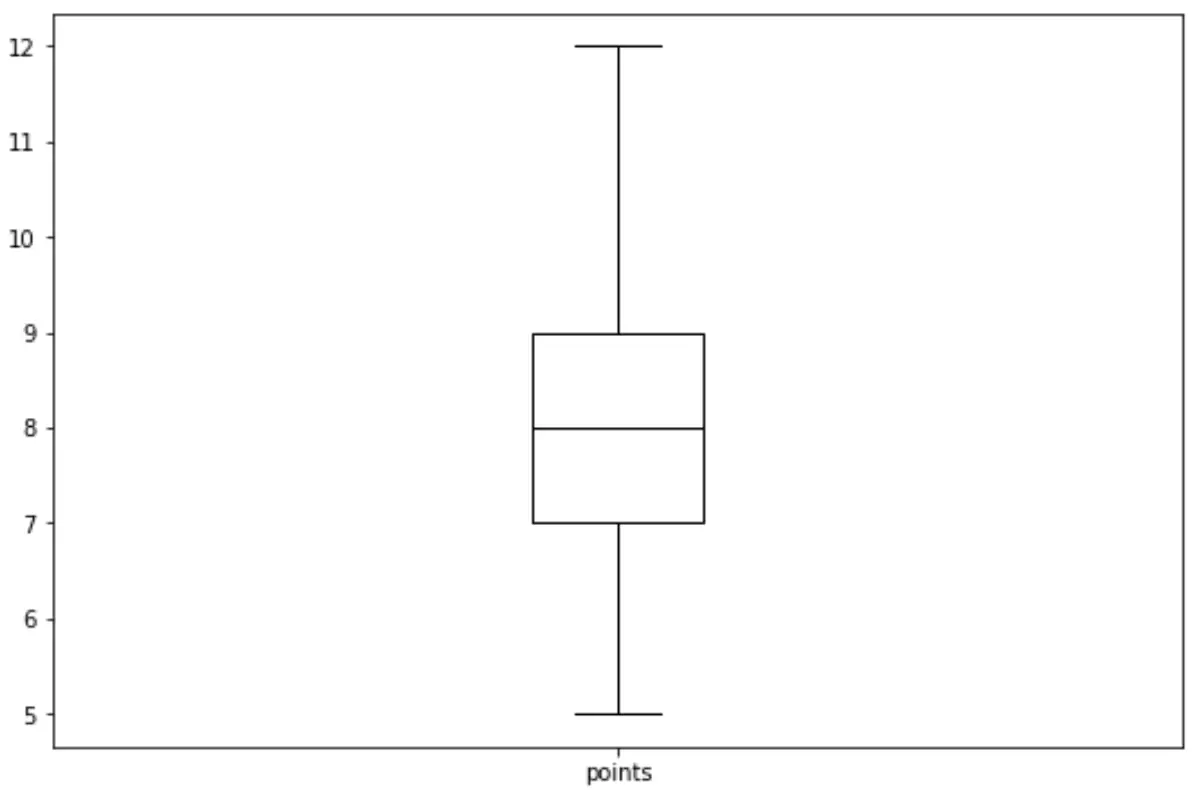
例 1: 列の箱ひげ図
次のコードは、pandas DataFrame の列の箱ひげ図を作成する方法を示しています。
df. boxplot (column=[' points '], grid= False , color=' black ')
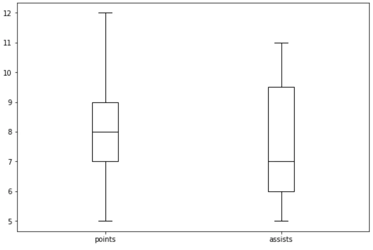
例 2: 複数の列の箱ひげ図
次のコードは、pandas DataFrame の複数の列の箱ひげ図を作成する方法を示しています。
df. boxplot (column=[' points ', ' assists '], grid= False , color=' black ')
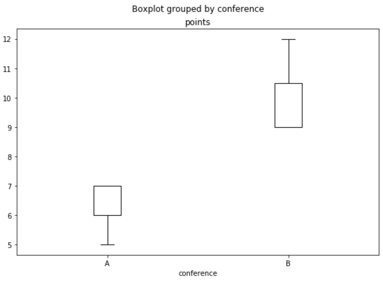
例 3: 1 つの列でグループ化された箱ひげ図
次のコードは、pandas DataFrame の列ごとにグループ化された箱ひげ図を作成する方法を示しています。
df. boxplot (column=[' points '], by=' conference ', grid= False , color=' black ')
追加リソース
著者について
ベンジャミン・アンダーソン博士
私はベンジャミンです。退職した統計教授から、専任の Statorials 教育者になりました。 統計分野における豊富な経験と専門知識を活かして、私は Statorials を通じて学生に力を与えるために自分の知識を共有することに尽力しています。もっと知る