複数のデータ フレームを使用して ggplot2 でプロットを作成する方法
次の基本構文を使用して、複数のデータ フレームを使用して ggplot2 でプロットを作成できます。
 library (ggplot2)

ggplot() +
  geom_line(data=df1, aes(x=x_var, y=y_var), color=' blue ') +
  geom_line(data=df2, aes(x=x_var, y=y_var), color=' red ')
この特定の例では、2 つの異なるデータ フレームのデータを使用して、ggplot2 の 1 つのプロットに複数の線をプロットします。
geom()レベルでデータ フレーム名を指定することにより、複数のデータ フレームのデータを 1 つのプロットに含めることができます。
次の例は、この構文を実際に使用する方法を示しています。
例: 複数のデータ フレームを使用して ggplot2 でプロットを作成する
R に、異なる日に 2 つの異なる店舗で行われた総売上高に関する情報を含む次の 2 つのデータ フレームがあるとします。
 #create first data frame
df1 <- data. frame (day=1:8,
                  sales=c(6, 8, 9, 14, 13, 13, 7, 10))

df1

  day sales
1 1 6
2 2 8
3 3 9
4 4 14
5 5 13
6 6 13
7 7 7
8 8 10

#create second data frame
df2 <- data. frame (day=1:8,
                  sales=c(2, 3, 3, 5, 7, 6, 5, 9))

df2

  day sales
1 1 2
2 2 3
3 3 3
4 4 5
5 5 7
6 6 6
7 7 5
8 8 9
次の構文を使用して、両方のデータ フレームで店舗の売上を表す複数の行を含むプロットを ggplot2 に作成できます。
 library (ggplot2)

#create line plot using multiple data frames
ggplot() +
  geom_line(data=df1, aes(x=day, y=sales), color=' steelblue ') +
  geom_line(data=df2, aes(x=day, y=sales), color=' coral2 ')
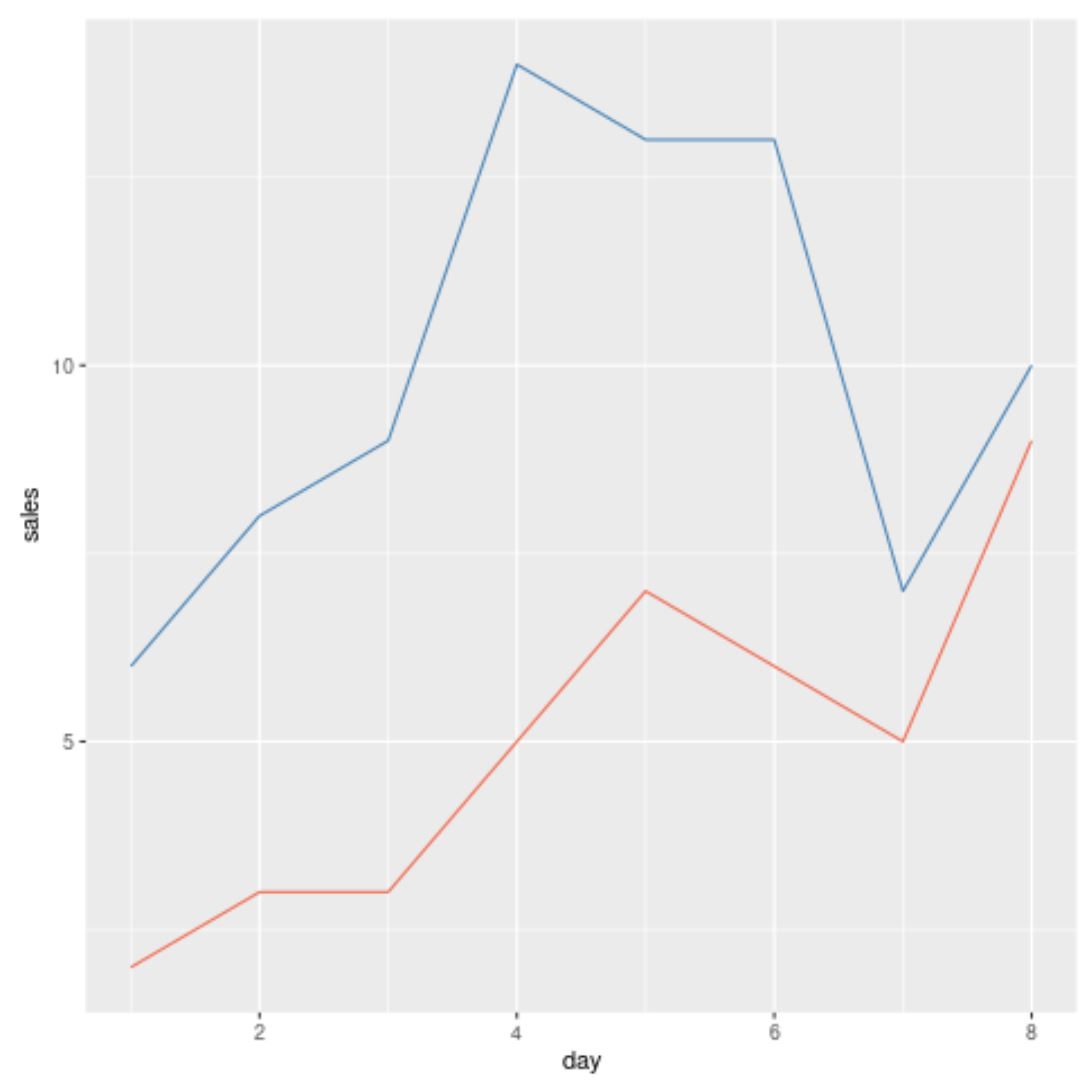
青い線はdf1というデータ ブロックの値を表し、赤い線はdf2というデータ ブロックの値を表します。
このメソッドは他のgeom()関数でも機能することに注意してください。
たとえば、次の散布図を作成して、各データ フレームから店舗ごとの売上を表示できます。
 library (ggplot2)

#create scatter plot using multiple data frames
ggplot() +
  geom_point(data=df1, aes(x=day, y=sales), color=' steelblue ') +
  geom_point(data=df2, aes(x=day, y=sales), color=' coral2 ')
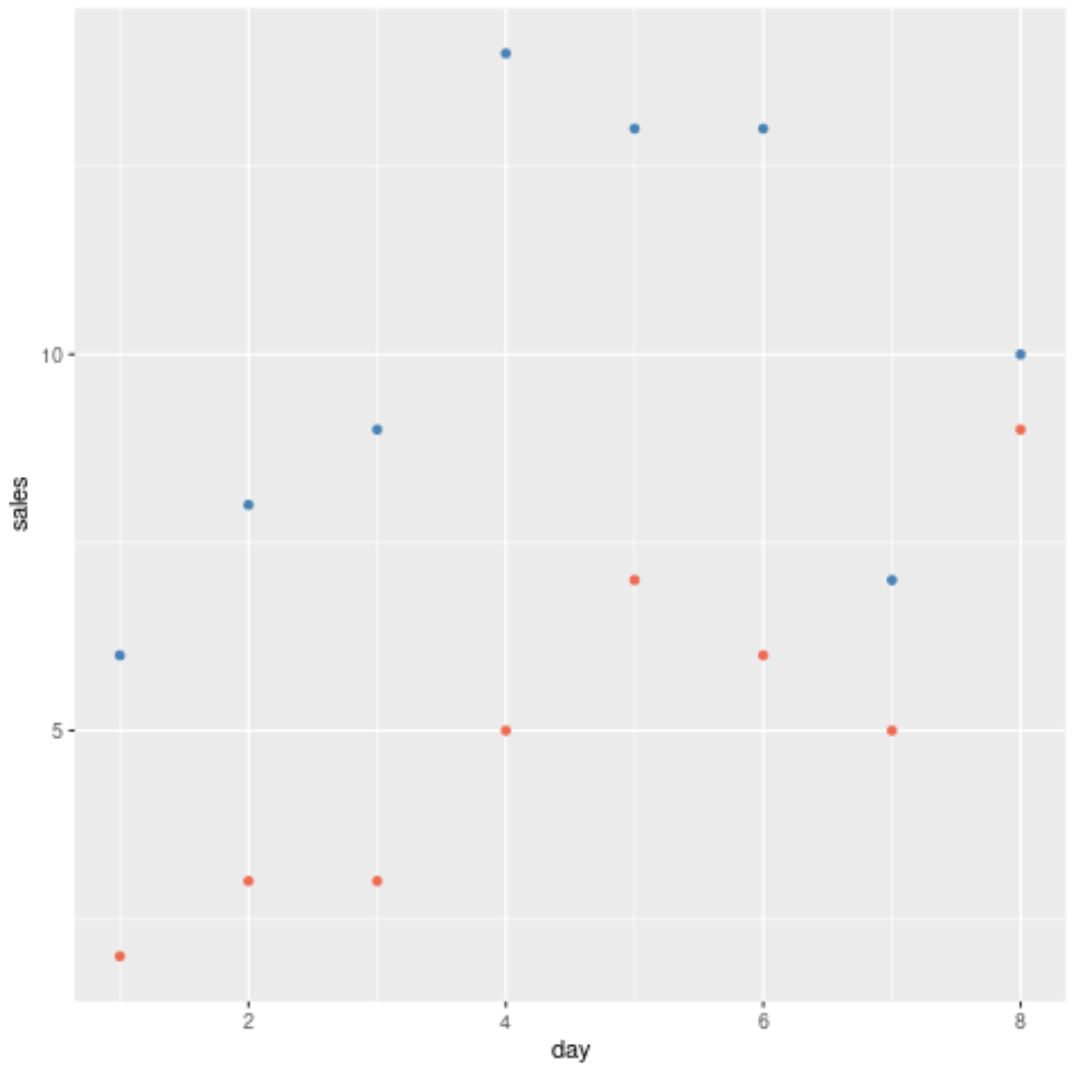
青い点はdf1というデータ ブロックの値を表し、赤い点はdf2というデータ ブロックの値を表します。
追加リソース
次のチュートリアルでは、ggplot2 で他の一般的なタスクを実行する方法を説明します。
ggplot2 で複数の行をプロットする方法
ggplot2で凡例ラベルを変更する方法
ggplot2 で X 軸のラベルを変更する方法
著者について
ベンジャミン・アンダーソン博士
私はベンジャミンです。退職した統計教授から、専任の Statorials 教育者になりました。 統計分野における豊富な経験と専門知識を活かして、私は Statorials を通じて学生に力を与えるために自分の知識を共有することに尽力しています。もっと知る