Matplotlib で複数の線をプロットする方法
次の構文を使用して、単一の Matplotlib プロットに複数の行を表示できます。
 import matplotlib. pyplot as plt

plt. plot (df[' column1 '])
plt. plot (df[' column2 '])
plt. plot (df[' column3 '])

...
plt. show ()
このチュートリアルでは、次の pandas DataFrame を使用してチャートに複数の線をプロットする方法の例をいくつか示します。
 import numpy as np
import pandas as pd

#make this example reproducible
n.p. random . seeds (0)

#create dataset
period = np. arange (1, 101, 1)
leads = np. random . uniform (1, 50, 100)
prospects = np. random . uniform (40, 80, 100)
sales = 60 + 2*period + np. random . normal (loc=0, scale=.5*period, size=100)
df = pd. DataFrame ({' period ': period,
                   ' leads ': leads,
                   ' prospects ': prospects,
                   ' sales ': sales})

#view first 10 rows
df. head (10)


        period leads sales prospects
0 1 27.891862 67.112661 62.563318
1 2 36.044279 50.800319 62.920068
2 3 30.535405 69.407761 64.278797
3 4 27.699276 78.487542 67.124360
4 5 21.759085 49.950126 68.754919
5 6 32.648812 63.046293 77.788596
6 7 22.441773 63.681677 77.322973
7 8 44.696877 62.890076 76.350205
8 9 48.219475 48.923265 72.485540
9 10 19.788634 78.109960 84.221815
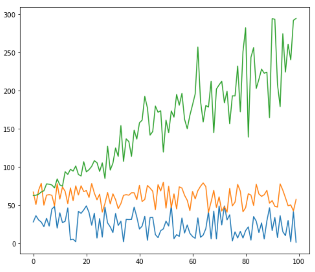
Matplotlib で複数の行をプロットする
次のコードは、matplotlib の 1 つのプロットに 3 つの個別の線をプロットする方法を示しています。
 import matplotlib. pyplot as plt

#plot individual lines
plt. plot (df[' leads '])
plt. plot (df[' prospects '])
plt. plot (df[' sales '])

#displayplot
plt. show ()
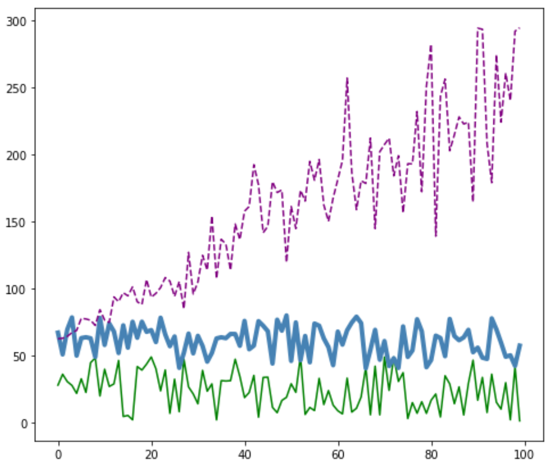
Matplotlib の行をカスタマイズする
各線の色、スタイル、幅をカスタマイズすることもできます。
 #plot individual lines with custom colors, styles, and widths
plt. plot (df[' leads '], color=' green ')
plt. plot (df[' prospects '], color=' steelblue ', linewidth= 4 )
plt. plot (df[' sales '], color=' purple ', linestyle=' dashed ')

#displayplot
plt. show ()
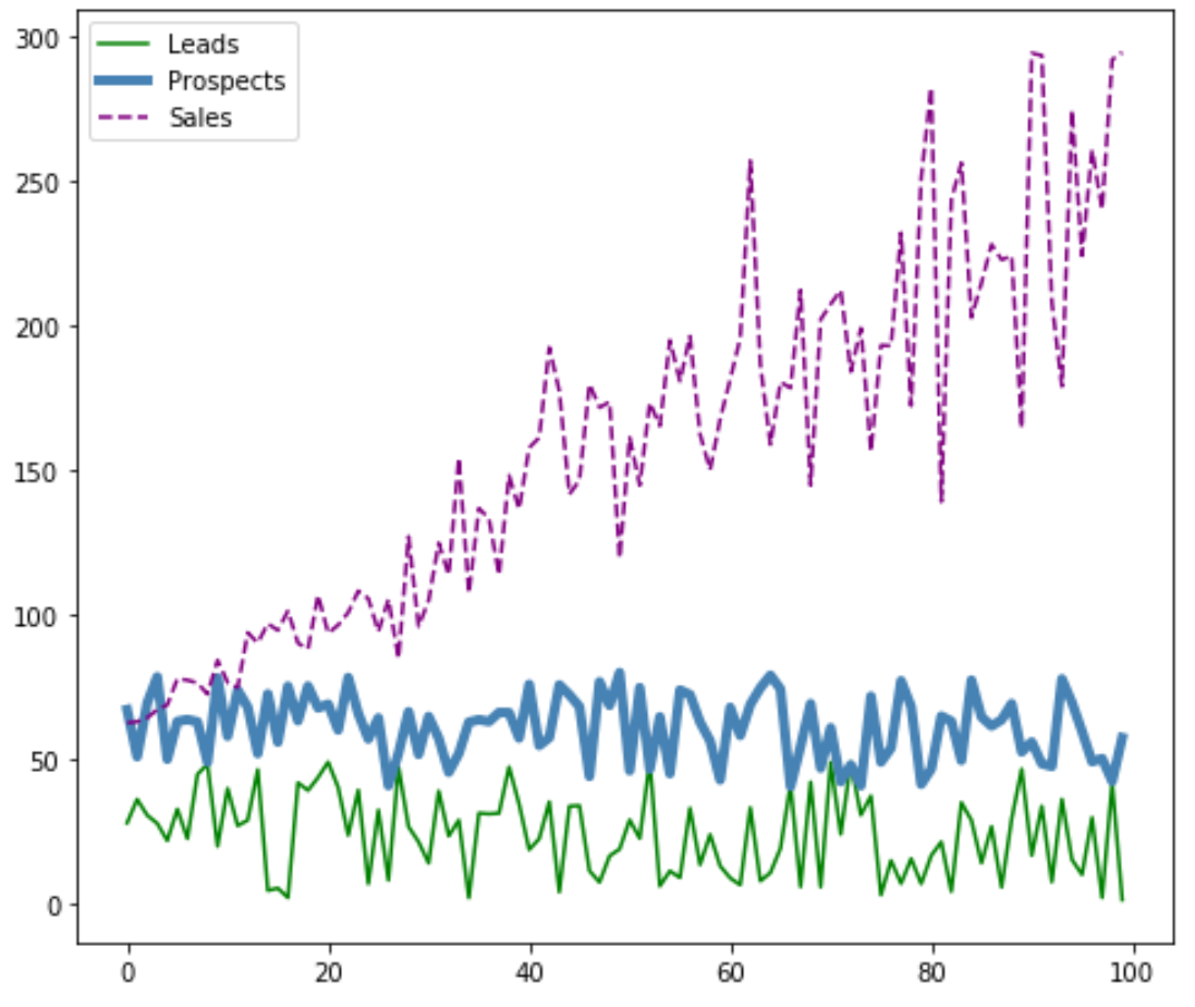
Matplotlib に凡例を追加する
行を区別するためにキャプションを追加することもできます。
 #plot individual lines with custom colors, styles, and widths
plt. plot (df[' leads '], label=' Leads ', color=' green ')
plt. plot (df[' prospects '], label=' Prospects ', color=' steelblue ', linewidth= 4 )
plt. plot (df[' sales '], label=' Sales ', color=' purple ', linestyle=' dashed ')

#add legend
plt. legend ()

#displayplot
plt. show ()
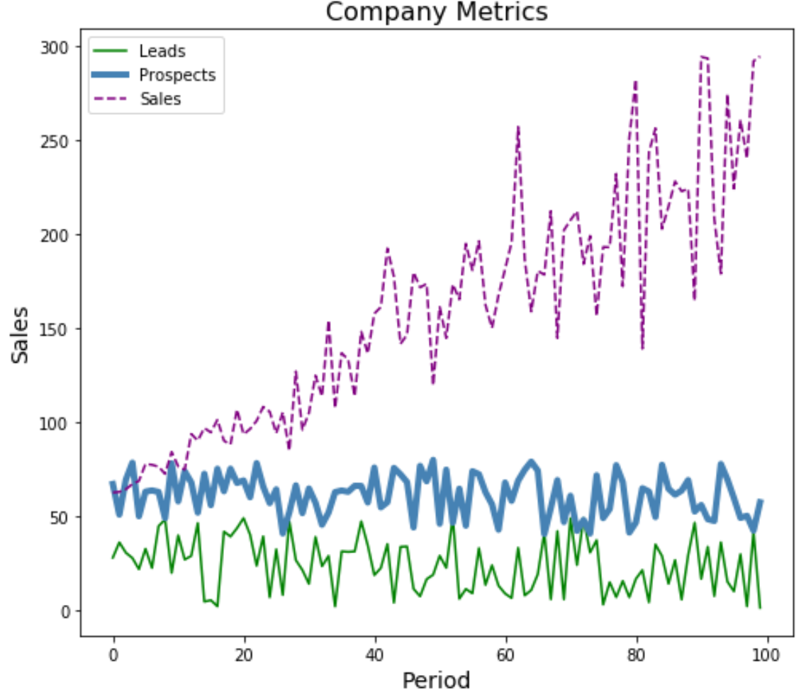
Matplotlib に軸ラベルとタイトルを追加する
最後に、軸ラベルとタイトルを追加してプロットを完成させます。
 #plot individual lines with custom colors, styles, and widths
plt. plot (df[' leads '], label=' Leads ', color=' green ')
plt. plot (df[' prospects '], label=' Prospects ', color=' steelblue ', linewidth= 4 )
plt. plot (df[' sales '], label=' Sales ', color=' purple ', linestyle=' dashed ')

#add legend
plt. legend ()

#add axis labels and a title
plt. ylabel (' Sales ', fontsize= 14 )
plt. xlabel (' Period ', fontsize= 14 )
plt. title (' Company Metrics ', fontsize= 16 )

#displayplot
plt. show ()
ここでその他の Matplotlib チュートリアルを見つけることができます。
著者について
ベンジャミン・アンダーソン博士
私はベンジャミンです。退職した統計教授から、専任の Statorials 教育者になりました。 統計分野における豊富な経験と専門知識を活かして、私は Statorials を通じて学生に力を与えるために自分の知識を共有することに尽力しています。もっと知る