Ggplot2에서 선형 회귀선을 그리는 방법(예제 포함)
R 시각화 라이브러리 ggplot2를 사용하면 다음 기본 구문을 사용하여 적합 선형 회귀 모델을 그릴 수 있습니다.
 ggplot(data,aes(x, y)) +
  geom_point() +
  geom_smooth(method=' lm ')
다음 예에서는 실제로 이 구문을 사용하는 방법을 보여줍니다.
예: ggplot2에서 선형 회귀선 그리기
다음 데이터 세트에 단순 선형 회귀 모델을 적용한다고 가정합니다.
 #create dataset
data <- data.frame(y=c(6, 7, 7, 9, 12, 13, 13, 15, 16, 19, 22, 23, 23, 25, 26),
                   x=c(1, 2, 2, 3, 4, 4, 5, 6, 6, 8, 9, 9, 11, 12, 12))

#fit linear regression model to dataset and view model summary
model <- lm(y~x, data=data)
summary(model)

Call:
lm(formula = y ~ x, data = data)

Residuals:
    Min 1Q Median 3Q Max
-1.4444 -0.8013 -0.2426 0.5978 2.2363

Coefficients:
            Estimate Std. Error t value Pr(>|t|)
(Intercept) 4.20041 0.56730 7.404 5.16e-06 ***
x 1.84036 0.07857 23.423 5.13e-12 ***
---
Significant. codes: 0 '***' 0.001 '**' 0.01 '*' 0.05 '.' 0.1 ' ' 1

Residual standard error: 1.091 on 13 degrees of freedom
Multiple R-squared: 0.9769, Adjusted R-squared: 0.9751
F-statistic: 548.7 on 1 and 13 DF, p-value: 5.13e-12
다음 코드는 적합 선형 회귀 모델을 시각화하는 방법을 보여줍니다.
 library (ggplot2)

#create plot to visualize fitted linear regression model
ggplot(data,aes(x, y)) +
  geom_point() +
  geom_smooth(method=' lm ')
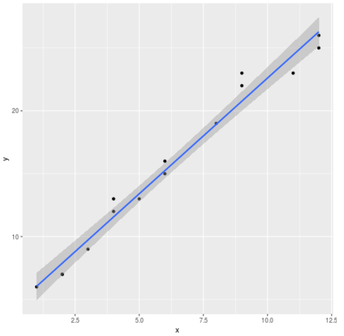
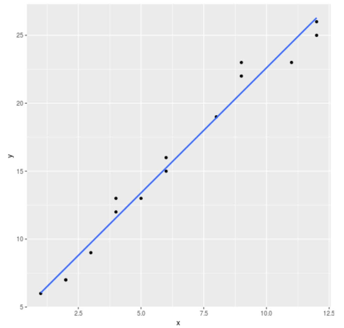
기본적으로 ggplot2는 그래프에 표준 오류 선을 추가합니다. 다음과 같이 se=FALSE 인수를 사용하여 비활성화할 수 있습니다.
 library (ggplot2)

#create regression plot with no standard error lines
ggplot(data,aes(x, y)) +
  geom_point() +
  geom_smooth(method=' lm ', se= FALSE )
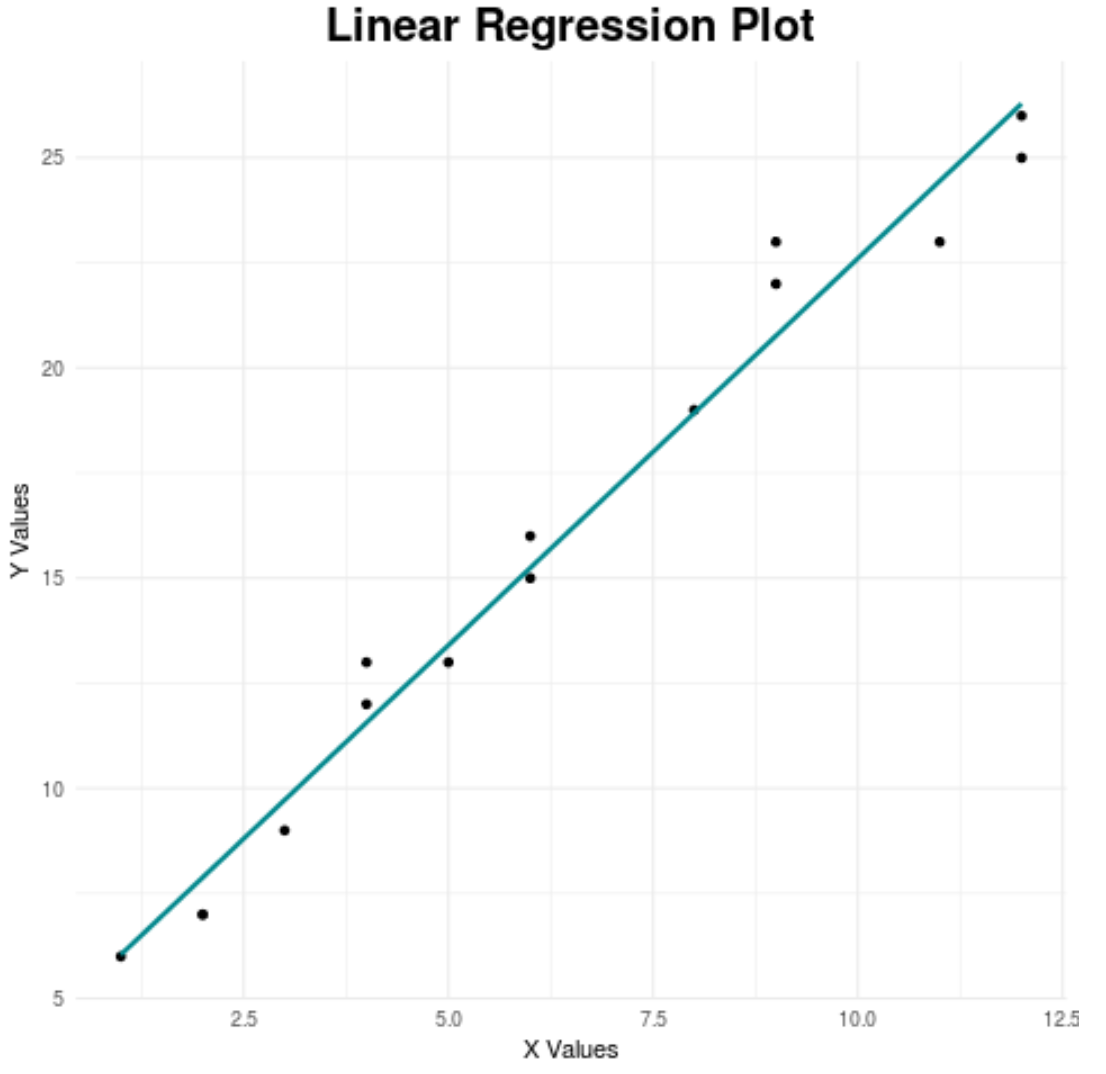
마지막으로 차트의 특정 측면을 사용자 정의하여 시각적으로 더욱 매력적으로 만들 수 있습니다.
 library (ggplot2)

#create regression plot with customized style
ggplot(data,aes(x, y)) +
  geom_point() +
  geom_smooth(method=' lm ', se= FALSE , color=' turquoise4 ') +
  theme_minimal() +
  labs(x=' X Values ', y=' Y Values ', title=' Linear Regression Plot ') +
  theme(plot.title = element_text(hjust=0.5, size=20, face=' bold '))
최고의 ggplot2 테마에 대한 전체 가이드는 이 문서를 참조하세요.
추가 리소스
저자 소개
벤자민 앤더슨
안녕하세요. 저는 통계학 교수를 퇴직하고 전임 통계 교사로 변신한 벤자민입니다. 통계 분야의 광범위한 경험과 전문 지식을 바탕으로 Statorials를 통해 학생들에게 힘을 실어주기 위해 지식을 공유하고 싶습니다. 더 알아보기