Python에서 roc 곡선을 그리는 방법(단계별)
로지스틱 회귀는 응답 변수가 이진일 때 회귀 모델을 맞추는 데 사용하는 통계 방법입니다. 로지스틱 회귀 모델이 데이터 세트에 얼마나 잘 맞는지 평가하기 위해 다음 두 가지 측정항목을 살펴볼 수 있습니다.
- 민감도: 결과가 실제로 긍정적일 때 모델이 관찰에 대한 긍정적인 결과를 예측할 확률입니다. 이를 ‘진양성률’이라고도 합니다.
- 특이성: 결과가 실제로 부정적일 때 모델이 관찰에 대해 부정적인 결과를 예측할 확률입니다. 이를 ‘진음성률’이라고도 합니다.
이 두 가지 측정값을 시각화하는 한 가지 방법은 “수신기 작동 특성” 곡선을 나타내는 ROC 곡선을 만드는 것입니다. 로지스틱 회귀모델의 민감도와 특이도를 표시한 그래프입니다.
다음 단계별 예제에서는 Python에서 ROC 곡선을 만들고 해석하는 방법을 보여줍니다.
1단계: 필요한 패키지 가져오기
먼저 Python에서 로지스틱 회귀를 수행하는 데 필요한 패키지를 가져옵니다.
 import pandas as pd
import numpy as np
from sklearn. model_selection import train_test_split
from sklearn. linear_model import LogisticRegression
from sklearn import metrics
import matplotlib. pyplot as plt
2단계: 로지스틱 회귀 모델 적합
다음으로 데이터세트를 가져와서 여기에 로지스틱 회귀 모델을 적용하겠습니다.
 #import dataset from CSV file on Github
url = "https://raw.githubusercontent.com/Statorials/Python-Guides/main/default.csv"
data = pd. read_csv (url)

#define the predictor variables and the response variable
X = data[[' student ',' balance ',' income ']]
y = data[' default ']

#split the dataset into training (70%) and testing (30%) sets
X_train,X_test,y_train,y_test = train_test_split(X,y,test_size=0.3,random_state=0)

#instantiate the model
log_regression = LogisticRegression()

#fit the model using the training data
log_regression. fit (X_train,y_train)
3단계: ROC 곡선 그리기
다음으로, Matplotlib 데이터 시각화 패키지를 사용하여 참양성률과 거짓양성률을 계산하고 ROC 곡선을 만듭니다.
 #define metrics
y_pred_proba = log_regression. predict_proba (X_test)[::,1]
fpr, tpr, _ = metrics. roc_curve (y_test, y_pred_proba)

#create ROC curve
plt. plot (fpr,tpr)
plt. ylabel (' True Positive Rate ')
plt. xlabel (' False Positive Rate ')
plt. show ()
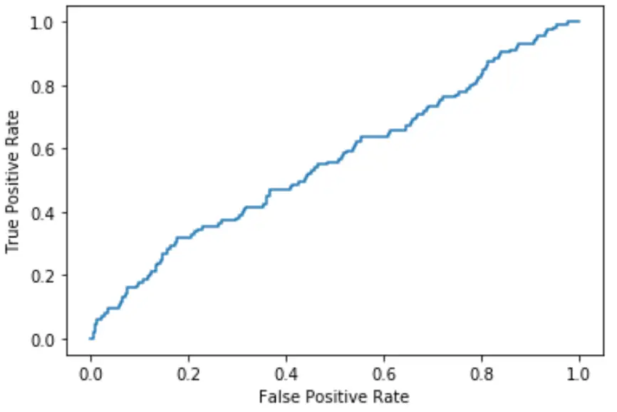
곡선이 플롯의 왼쪽 상단 모서리에 가까울수록 모델이 데이터를 범주로 더 잘 분류할 수 있습니다.
위 그래프에서 볼 수 있듯이 이 로지스틱 회귀 모델은 데이터를 카테고리로 정렬하는 작업이 매우 좋지 않습니다.
이를 정량화하기 위해 곡선 아래에 있는 플롯의 양을 알려주는 AUC(곡선 아래 영역)를 계산할 수 있습니다.
AUC가 1에 가까울수록 모델이 더 좋습니다. AUC가 0.5인 모델은 무작위 분류를 수행하는 모델보다 나을 것이 없습니다.
4단계: AUC 계산
다음 코드를 사용하여 모델의 AUC를 계산하고 이를 ROC 플롯의 오른쪽 하단에 표시할 수 있습니다.
 #define metrics
y_pred_proba = log_regression. predict_proba (X_test)[::,1]
fpr, tpr, _ = metrics. roc_curve (y_test, y_pred_proba)
auc = metrics. roc_auc_score (y_test, y_pred_proba)

#create ROC curve
plt. plot (fpr,tpr,label=" AUC= "+str(auc))
plt. ylabel (' True Positive Rate ')
plt. xlabel (' False Positive Rate ')
plt. legend (loc=4)
plt. show ()
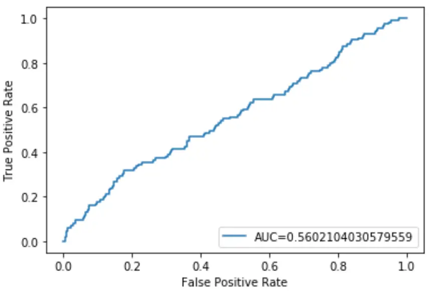
이 로지스틱 회귀 모델의 AUC는 0.5602 로 나타났습니다. 이 수치는 0.5에 가깝기 때문에 모델이 데이터를 제대로 분류하지 못하고 있음을 확인시켜 줍니다.
관련 항목: Python에서 여러 ROC 곡선을 그리는 방법
저자 소개
벤자민 앤더슨
안녕하세요. 저는 통계학 교수를 퇴직하고 전임 통계 교사로 변신한 벤자민입니다. 통계 분야의 광범위한 경험과 전문 지식을 바탕으로 Statorials를 통해 학생들에게 힘을 실어주기 위해 지식을 공유하고 싶습니다. 더 알아보기