Python의 곡선 피팅(예제 포함)
종종 Python의 데이터 세트에 곡선을 맞추고 싶을 수도 있습니다.
다음 단계별 예제 에서는 numpy.polyfit() 함수를 사용하여 Python에서 데이터에 곡선을 맞추는 방법과 데이터에 가장 적합한 곡선을 결정하는 방법을 설명합니다.
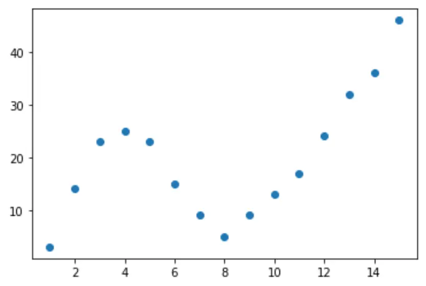
1단계: 데이터 생성 및 시각화
먼저 가짜 데이터 세트를 만든 다음 산점도를 만들어 데이터를 시각화해 보겠습니다.
 import pandas as pd
import matplotlib. pyplot as plt

#createDataFrame
df = pd. DataFrame ({' x ': [1, 2, 3, 4, 5, 6, 7, 8, 9, 10, 11, 12, 13, 14, 15],
                   ' y ': [3, 14, 23, 25, 23, 15, 9, 5, 9, 13, 17, 24, 32, 36, 46]})

#create scatterplot of x vs. y
plt. scatter (df. x , df. y )
2단계: 여러 곡선 조정
그런 다음 여러 다항식 회귀 모델을 데이터에 맞추고 동일한 플롯에서 각 모델의 곡선을 시각화해 보겠습니다.
 import numpy as np

#fit polynomial models up to degree 5
model1 = np. poly1d (np. polyfit (df. x , df. y , 1))
model2 = np. poly1d (np. polyfit (df. x , df. y , 2))
model3 = np. poly1d (np. polyfit (df. x , df. y , 3))
model4 = np. poly1d (np. polyfit (df. x , df. y , 4))
model5 = np. poly1d (np. polyfit (df. x , df. y , 5))

#create scatterplot
polyline = np. linspace (1, 15, 50)
plt. scatter (df. x , df. y )

#add fitted polynomial lines to scatterplot
plt. plot (polyline, model1(polyline), color=' green ')
plt. plot (polyline, model2(polyline), color=' red ')
plt. plot (polyline, model3(polyline), color=' purple ')
plt. plot (polyline, model4(polyline), color=' blue ')
plt. plot (polyline, model5(polyline), color=' orange ')
plt. show ()
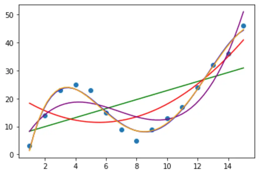
어떤 곡선이 데이터에 가장 잘 맞는지 결정하려면 각 모델의 조정된 R 제곱을 보면 됩니다.
이 값은 예측 변수의 수에 맞게 조정된 모델의 예측 변수로 설명할 수 있는 반응 변수의 변동 비율을 알려줍니다.
 #define function to calculate adjusted r-squared
def adjR(x, y, degree):
    results = {}
    coeffs = np. polyfit (x, y, degree)
    p = np. poly1d (coeffs)
    yhat = p(x)
    ybar = np. sum (y)/len(y)
    ssreg = np. sum ((yhat-ybar)**2)
    sstot = np. sum ((y - ybar)**2)
    results[' r_squared '] = 1- (((1-(ssreg/sstot))*(len(y)-1))/(len(y)-degree-1))

    return results

#calculated adjusted R-squared of each model
adjR(df. x , df. y , 1)
adjR(df. x , df. y , 2)
adjR(df. x , df. y , 3)
adjR(df. x , df. y , 4)
adjR(df. x , df. y , 5)

{'r_squared': 0.3144819}
{'r_squared': 0.5186706}
{'r_squared': 0.7842864}
{'r_squared': 0.9590276}
{'r_squared': 0.9549709}
결과에서 조정된 R-제곱이 가장 높은 모델은 조정된 R-제곱이 0.959 인 4차 다항식임을 알 수 있습니다.
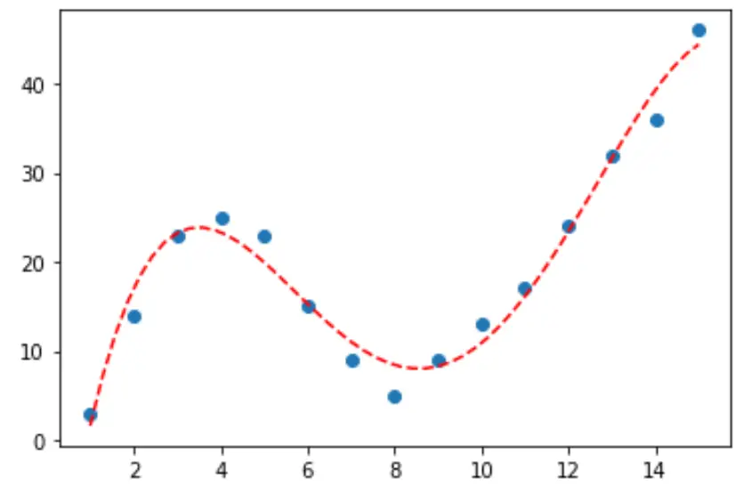
3단계: 최종 곡선 시각화
마지막으로 4차 다항식 모델의 곡선을 사용하여 산점도를 만들 수 있습니다.
 #fit fourth-degree polynomial
model4 = np. poly1d (np. polyfit (df. x , df. y , 4))

#define scatterplot
polyline = np. linspace (1, 15, 50)
plt. scatter (df. x , df. y )

#add fitted polynomial curve to scatterplot
plt. plot (polyline, model4(polyline), ' -- ', color=' red ')
plt. show ()
print() 함수를 사용하여 이 줄에 대한 방정식을 얻을 수도 있습니다.
 print (model4)

          4 3 2
-0.01924x + 0.7081x - 8.365x + 35.82x - 26.52
곡선의 방정식은 다음과 같습니다.
y = -0.01924x 4 + 0.7081x 3 – 8.365x 2 + 35.82x – 26.52
이 방정식을 사용하여 모델의 예측 변수를 기반으로 응답 변수 의 값을 예측할 수 있습니다. 예를 들어 x = 4이면 y = 23.32 라고 예측합니다.
y = -0.0192(4) 4 + 0.7081(4) 3 – 8.365(4) 2 + 35.82(4) – 26.52 = 23.32
추가 리소스
저자 소개
벤자민 앤더슨
안녕하세요. 저는 통계학 교수를 퇴직하고 전임 통계 교사로 변신한 벤자민입니다. 통계 분야의 광범위한 경험과 전문 지식을 바탕으로 Statorials를 통해 학생들에게 힘을 실어주기 위해 지식을 공유하고 싶습니다. 더 알아보기