R에서 최적의 선을 그리는 방법(예제 포함)
다음 방법 중 하나를 사용하여 R에 가장 적합한 선을 그릴 수 있습니다.
방법 1: R 베이스에 가장 잘 맞는 선 그리기
 #create scatter plot of x vs. y
plot(x, y)

#add line of best fit to scatter plot
abline(lm(y ~ x))
방법 2: ggplot2에 가장 적합한 선을 그립니다.
 library (ggplot2)

#create scatter plot with line of best fit
ggplot(df, aes (x=x, y=y)) +
    geom_point() +
    geom_smooth(method=lm, se= FALSE )
다음 예에서는 각 방법을 실제로 사용하는 방법을 보여줍니다.
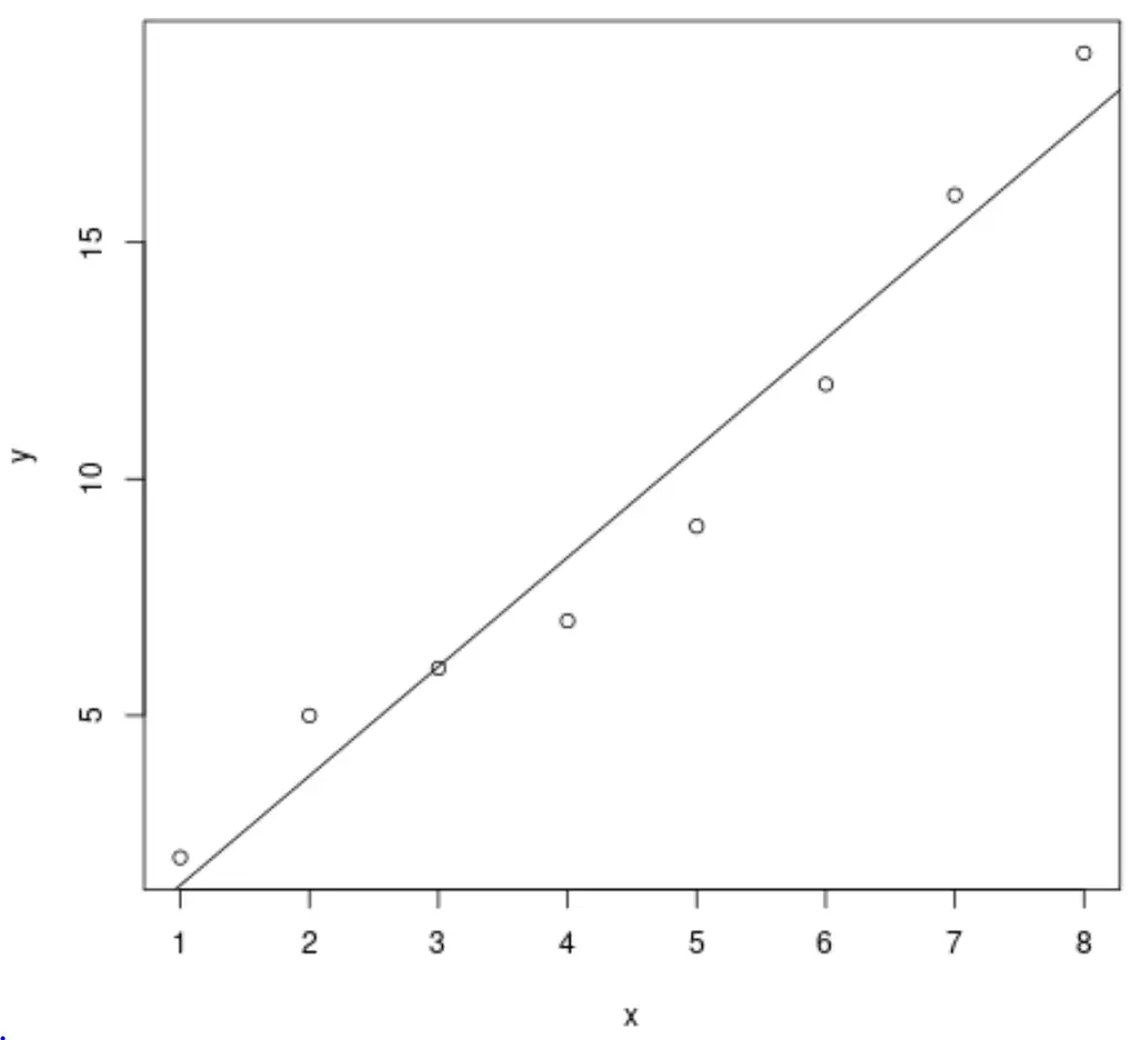
예 1: R 베이스에 가장 잘 맞는 선 그리기
다음 코드는 R 기준을 사용하여 단순 선형 회귀 모델에 가장 적합한 선을 그리는 방법을 보여줍니다.
 #define data
x <- c(1, 2, 3, 4, 5, 6, 7, 8)
y <- c(2, 5, 6, 7, 9, 12, 16, 19)

#create scatter plot of x vs. y
plot(x, y)

#add line of best fit to scatter plot
abline(lm(y ~ x))
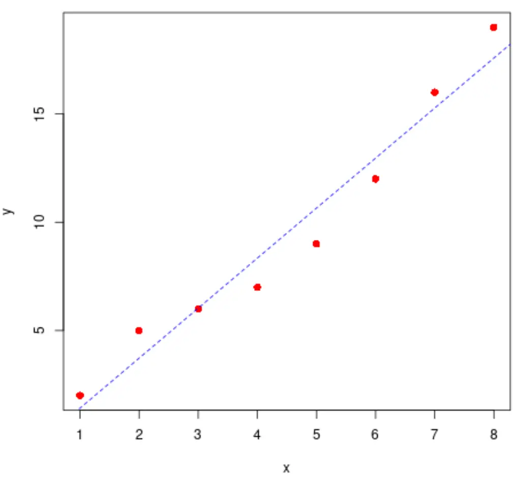
주저하지 말고 점과 선의 스타일도 수정하세요.
 #define data
x <- c(1, 2, 3, 4, 5, 6, 7, 8)
y <- c(2, 5, 6, 7, 9, 12, 16, 19)

#create scatter plot of x vs. y
plot(x, y, pch= 16 , col=' red ', cex= 1.2 )

#add line of best fit to scatter plot
abline(lm(y ~ x), col=' blue ', lty=' dashed ')
다음 코드를 사용하여 가장 적합한 선을 빠르게 계산할 수도 있습니다.
 #find regression model coefficients
summary(lm(y ~ x))$coefficients

              Estimate Std. Error t value Pr(>|t|)
(Intercept) -0.8928571 1.0047365 -0.888648 4.084029e-01
x 2.3095238 0.1989675 11.607544 2.461303e-05
가장 잘 맞는 선은 y = -0.89 + 2.31x 입니다.
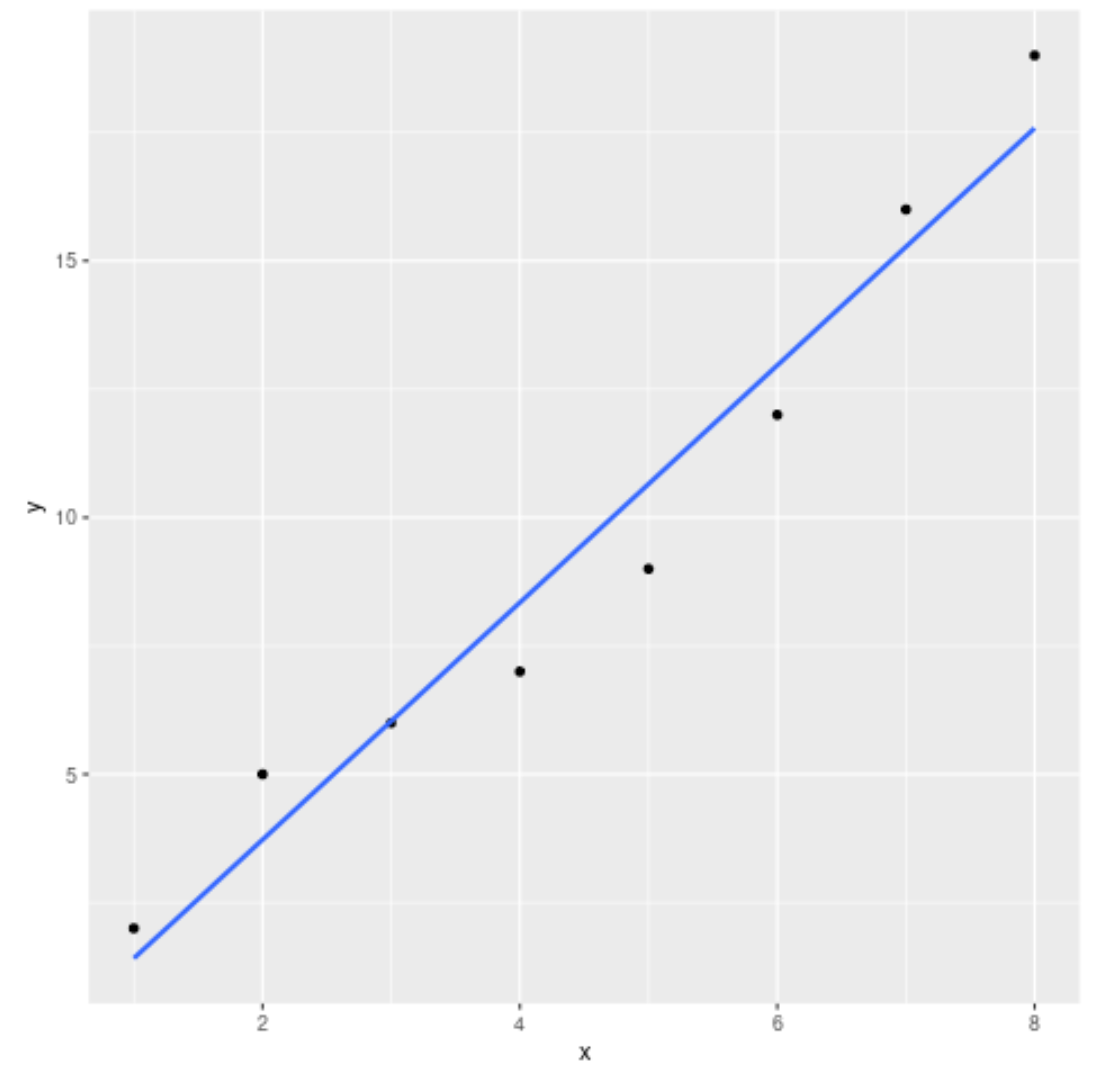
예 2: ggplot2에서 가장 적합한 선 그리기
다음 코드는 ggplot2 데이터 시각화 패키지를 사용하여 단순 선형 회귀 모델에 가장 적합한 선을 그리는 방법을 보여줍니다.
 library (ggplot2)

#define data
df <- data. frame (x=c(1, 2, 3, 4, 5, 6, 7, 8),
y=c(2, 5, 6, 7, 9, 12, 16, 19))

#create scatter plot with line of best fit
ggplot(df, aes (x=x, y=y)) +
    geom_point() +
    geom_smooth(method=lm, se= FALSE )
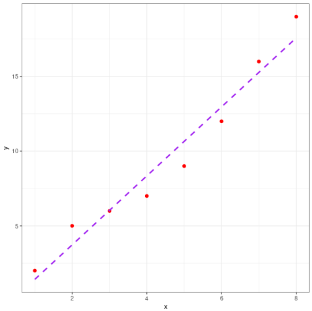
플롯의 미학도 자유롭게 변경해 보세요.
 library (ggplot2)

#define data
df <- data. frame (x=c(1, 2, 3, 4, 5, 6, 7, 8),
y=c(2, 5, 6, 7, 9, 12, 16, 19))

#create scatter plot with line of best fit
ggplot(df, aes (x=x, y=y)) +
    geom_point(col=' red ', size= 2 ) +
    geom_smooth(method=lm, se= FALSE , col=' purple ', linetype=' dashed ') +
    theme_bw()
추가 리소스
다음 튜토리얼에서는 R에서 다른 일반적인 작업을 수행하는 방법을 설명합니다.
R에서 단순 선형 회귀를 수행하는 방법
R에서 다중 선형 회귀를 수행하는 방법
R에서 회귀 출력을 해석하는 방법
저자 소개
벤자민 앤더슨
안녕하세요. 저는 통계학 교수를 퇴직하고 전임 통계 교사로 변신한 벤자민입니다. 통계 분야의 광범위한 경험과 전문 지식을 바탕으로 Statorials를 통해 학생들에게 힘을 실어주기 위해 지식을 공유하고 싶습니다. 더 알아보기