Ggplot2의 geom_hline에 레이블을 추가하는 방법
다음 기본 구문을 사용하여 ggplot2의 수평선에 레이블을 추가할 수 있습니다.
+ annotate(" text ", x= 9 , y= 20 , label=" Here is my text ")
다음 예에서는 이 구문을 실제로 사용하는 방법을 보여줍니다.
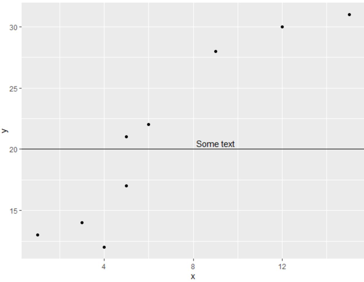
예시 1: geom_hline에 라벨 추가
다음 코드는 ggplot2의 수평선에 레이블을 추가하는 방법을 보여줍니다.
 library (ggplot2)

#create data frame
df <- data. frame (x=c(1, 3, 3, 4, 5, 5, 6, 9, 12, 15),
                 y=c(13, 14, 14, 12, 17, 21, 22, 28, 30, 31))

#create scatterplot with horizontal line at y=20
ggplot(df, aes(x=x, y=y)) +
geom_point() +
  geom_hline(yintercept= 20 ) +
  annotate("text", x= 9 , y= 20.5 , label=" Some text ")
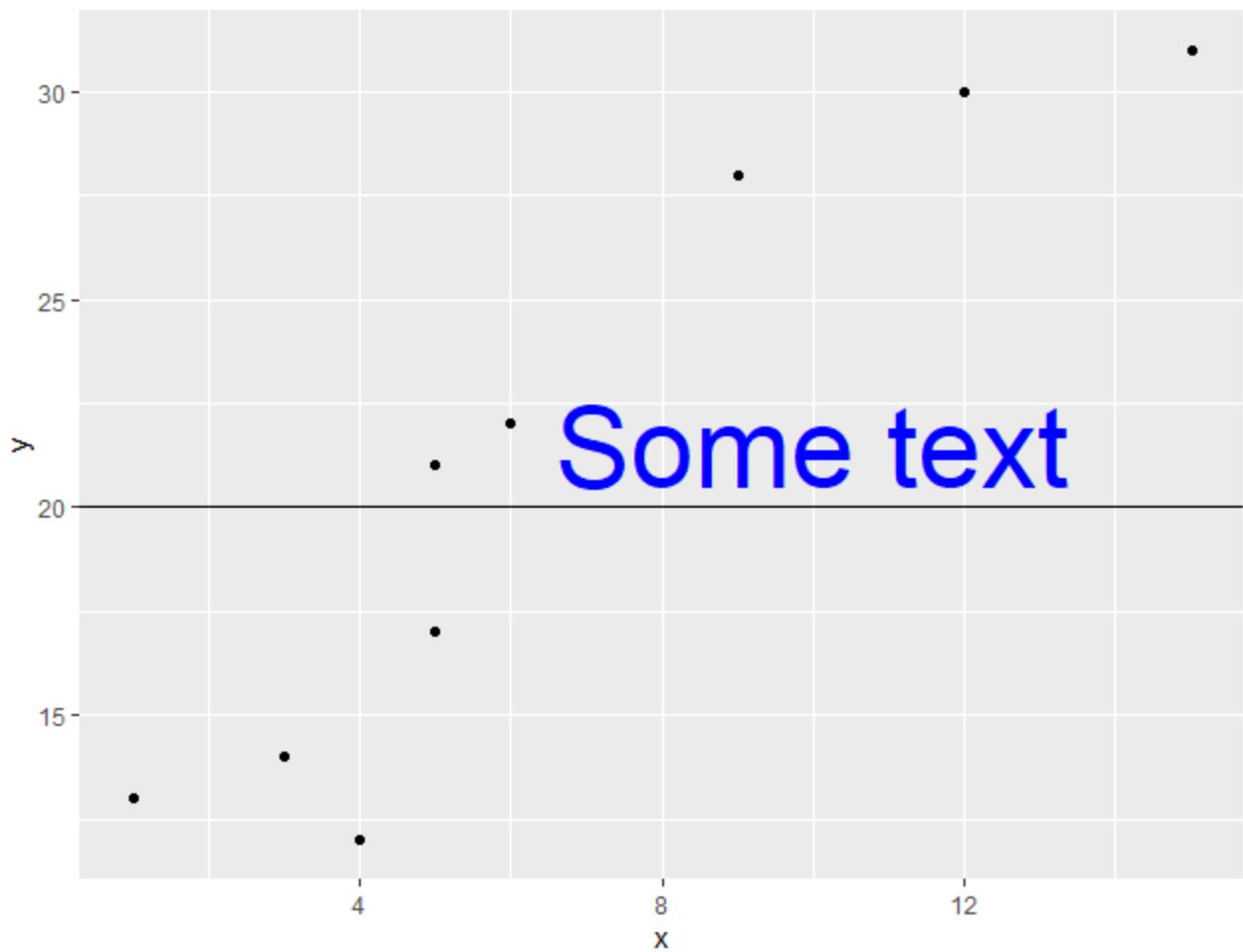
예 2: geom_hline에 사용자 정의 라벨 추가
다음 코드는 크기 및 색상 인수를 사용하여 ggplot2의 수평선에 사용자 정의 크기 및 색상이 포함된 레이블을 추가하는 방법을 보여줍니다.
 library (ggplot2)

#create data frame
df <- data. frame (x=c(1, 3, 3, 4, 5, 5, 6, 9, 12, 15),
                 y=c(13, 14, 14, 12, 17, 21, 22, 28, 30, 31))

#create scatterplot with horizontal line at y=20
ggplot(df, aes(x=x, y=y)) +
geom_point() +
  geom_hline(yintercept= 20 ) +
  annotate("text", x= 10 , y= 21.5 , label=" Some text ", size= 15 , color=" blue ")
예시 3: geom_hline에 여러 라벨 추가
다음 코드는 annotate() 함수를 여러 번 사용하여 ggplot2의 수평선에 여러 레이블을 추가하는 방법을 보여줍니다.
 library (ggplot2)

#create data frame
df <- data. frame (x=c(1, 3, 3, 4, 5, 5, 6, 9, 12, 15),
                 y=c(13, 14, 14, 12, 17, 21, 22, 28, 30, 31))

#create scatterplot with horizontal line at y=10
ggplot(df, aes(x=x, y=y)) +
geom_point() +
  geom_hline(yintercept= 20 ) +
  annotate("text", x= 10 , y= 19 , label=" Some text ", size= 15 , color=" blue ") +
  annotate("text", x= 10 , y= 21 , label=" More text ", size= 9 , color=" red ")
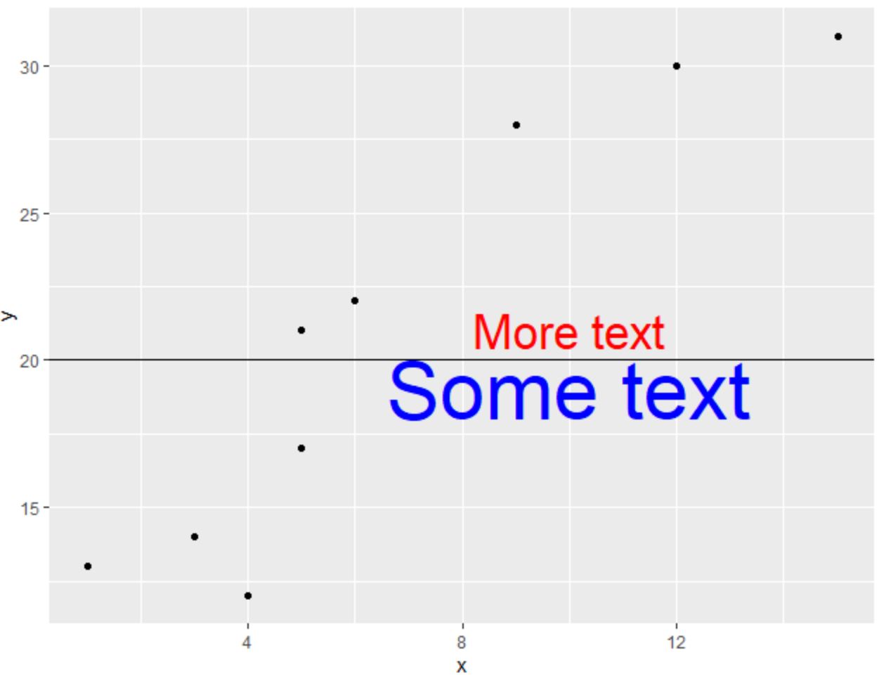
플롯에 원하는 만큼 많은 레이블을 추가하려는 만큼 annotate() 함수를 자유롭게 사용하십시오.
추가 리소스
다음 튜토리얼에서는 ggplot2에서 다른 일반적인 작업을 수행하는 방법을 설명합니다.
ggplot2의 geom_vline에 라벨을 추가하는 방법
ggplot2에서 플롯에 평균선을 추가하는 방법
ggplot2에서 선 색상을 변경하는 방법
저자 소개
벤자민 앤더슨
안녕하세요. 저는 통계학 교수를 퇴직하고 전임 통계 교사로 변신한 벤자민입니다. 통계 분야의 광범위한 경험과 전문 지식을 바탕으로 Statorials를 통해 학생들에게 힘을 실어주기 위해 지식을 공유하고 싶습니다. 더 알아보기