Ggplot2의 히스토그램에 백분율을 표시하는 방법
다음 기본 구문을 사용하여 ggplot2에서 히스토그램의 y축에 백분율을 표시할 수 있습니다.
 library (ggplot2)
library (scales)

#create histogram with percentages
ggplot(data, aes (x = factor (team))) +
  geom_bar( aes (y = (..count..)/ sum (..count..))) +
  scale_y_continuous(labels=percent)
다음 예에서는 이 구문을 실제로 사용하는 방법을 보여줍니다.
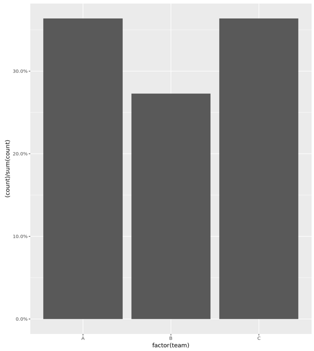
예 1: 백분율이 포함된 기본 히스토그램
다음 코드는 Y축에 백분율이 표시된 범주형 변수에 대한 히스토그램을 만드는 방법을 보여줍니다.
 library (ggplot2)
library (scales)

#define data frame
data <- data. frame (team = c('A', 'A', 'A', 'A', 'B', 'B', 'B', 'C', 'C', 'C', 'C') ,
                   points = c(77, 79, 93, 85, 89, 99, 90, 80, 68, 91, 92))

#create histogram with percentages
ggplot(data, aes (x = factor (team))) +
  geom_bar( aes (y = (..count..)/ sum (..count..))) +
  scale_y_continuous(labels=percent)
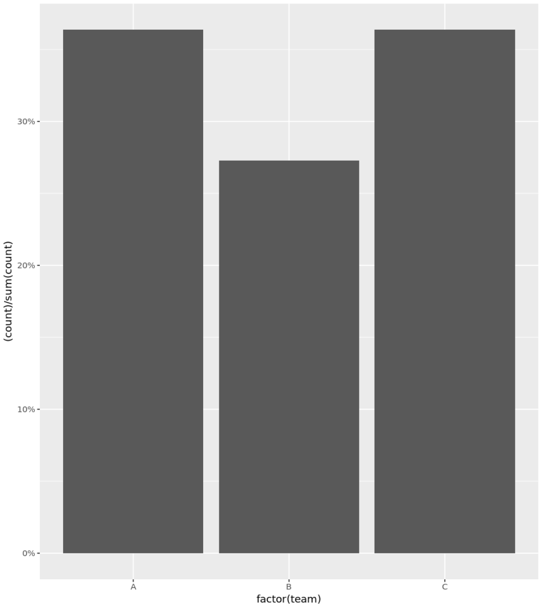
예 2: 백분율이 포함된 히스토그램(소수점 제거)
정밀도 인수를 사용하여 y축에 정수만 백분율로 표시할 수도 있습니다.
 library (ggplot2)
library (scales)

#define data frame
data <- data. frame (team = c('A', 'A', 'A', 'A', 'B', 'B', 'B', 'C', 'C', 'C', 'C') ,
                   points = c(77, 79, 93, 85, 89, 99, 90, 80, 68, 91, 92))

#create histogram with percentages
ggplot(data, aes (x = factor (team))) +
  geom_bar( aes (y = (..count..)/ sum (..count..))) +
  scale_y_continuous(labels = scales :: percent_format(accuracy = 1L ))
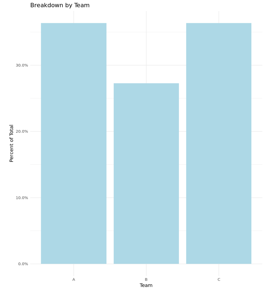
예 3: 백분율이 포함된 사용자 정의 히스토그램
다음 코드는 Y축에 백분율이 표시되고 사용자 정의 제목, 축 레이블 및 색상이 포함된 히스토그램을 만드는 방법을 보여줍니다.
 library (ggplot2)
library (scales)

#define data frame
data <- data. frame (team = c('A', 'A', 'A', 'A', 'B', 'B', 'B', 'C', 'C', 'C', 'C') ,
                   points = c(77, 79, 93, 85, 89, 99, 90, 80, 68, 91, 92))

#create histogram with percentages and custom aesthetics
ggplot(data, aes (x = factor (team))) +
  geom_bar( aes (y = (..count..)/ sum (..count..)), fill = ' lightblue ') +
  scale_y_continuous(labels=percent) +
  labs(title = ' Breakdown by Team ', x = ' Team ', y = ' Percent of Total ') +
  theme_minimal()
관련 항목: 최고의 ggplot2 테마에 대한 완전한 가이드
추가 리소스
다음 튜토리얼에서는 R에서 히스토그램을 사용하여 다른 일반적인 작업을 수행하는 방법을 설명합니다.
R의 히스토그램에서 빈 수를 변경하는 방법
R에서 여러 히스토그램을 그리는 방법
R에서 상대 빈도 히스토그램을 만드는 방법
저자 소개
벤자민 앤더슨
안녕하세요. 저는 통계학 교수를 퇴직하고 전임 통계 교사로 변신한 벤자민입니다. 통계 분야의 광범위한 경험과 전문 지식을 바탕으로 Statorials를 통해 학생들에게 힘을 실어주기 위해 지식을 공유하고 싶습니다. 더 알아보기