Ggplot2에서 두 줄을 그리는 방법(예제 포함)
다음 기본 구문을 사용하여 ggplot2를 사용하여 그래프에 두 개의 선을 그릴 수 있습니다.
 ggplot(df, aes (x = x_variable)) +
  geom_line( aes (y=line1, color=' line1 ')) +
  geom_line( aes (y=line2, color=' line2 '))
다음 예에서는 이 구문을 실제로 사용하는 방법을 보여줍니다.
예 1: ggplot2에 두 줄이 있는 기본 플롯
R에 다음과 같은 데이터 프레임이 있다고 가정합니다.
 #create data frame
df <- data. frame (day = c(1, 2, 3, 4, 5, 6, 7, 8, 9, 10),
                 sales = c(8, 8, 7, 6, 7, 8, 9, 12, 14, 18),
                 customers = c(4, 6, 6, 4, 6, 7, 8, 9, 12, 13))

#view first six rows of data frame
head(df)

  day sales customers
1 1 8 4
2 2 8 6
3 3 7 6
4 4 6 4
5 5 7 6
6 6 8 7
다음 코드는 이 10일 기간 동안 총 매출과 고객을 나타내는 두 줄이 있는 ggplot2의 기본 플롯을 만드는 방법을 보여줍니다.
 library (ggplot2)

#create plot with two lines
ggplot(df, aes (x = day)) +
  geom_line( aes (y=sales, color=' sales ')) +
  geom_line( aes (y=customers, color=' customers '))
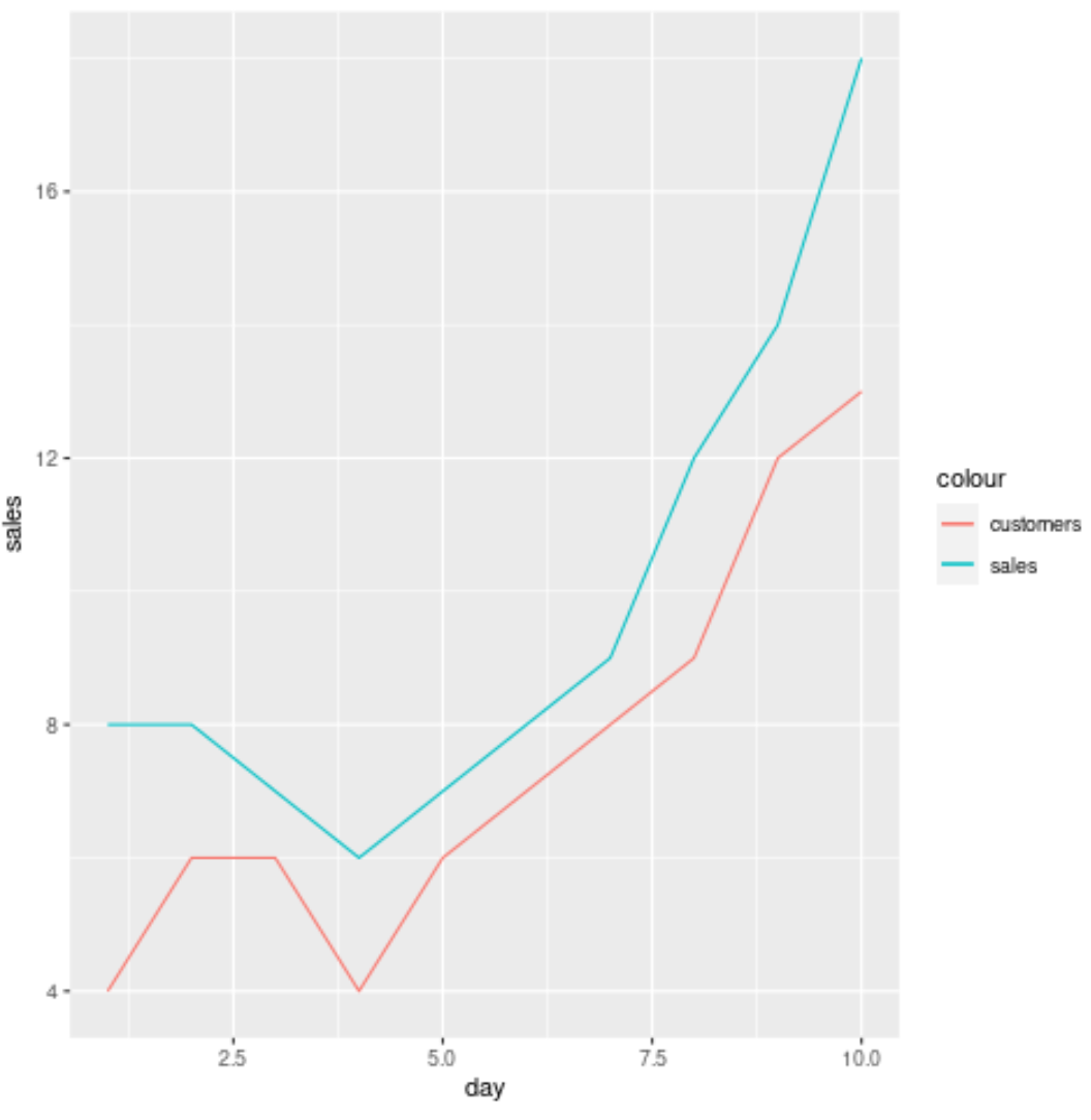
x축은 날짜를 표시하고 y축은 일일 매출 및 고객 가치를 표시합니다.
예 2: ggplot2에 두 줄이 있는 사용자 정의 플롯
다음 코드는 사용자 정의 제목, 레이블, 색상, 선 두께 및 테마를 사용하여 이전 예제와 동일한 플롯을 만드는 방법을 보여줍니다.
 library (ggplot2)

ggplot(df, aes (x = day)) +
  geom_line( aes (y=sales, color=' sales '), lwd= 2 ) +
  geom_line( aes (y = customers, color = ' customers '), lwd= 2 ) +
  scale_color_manual(' Metric ', values=c(' red ', ' steelblue ')) +
  labs(title = ' Sales & Customers by Day ', x = ' Day ', y = ' Amount ') +
  theme_minimal()
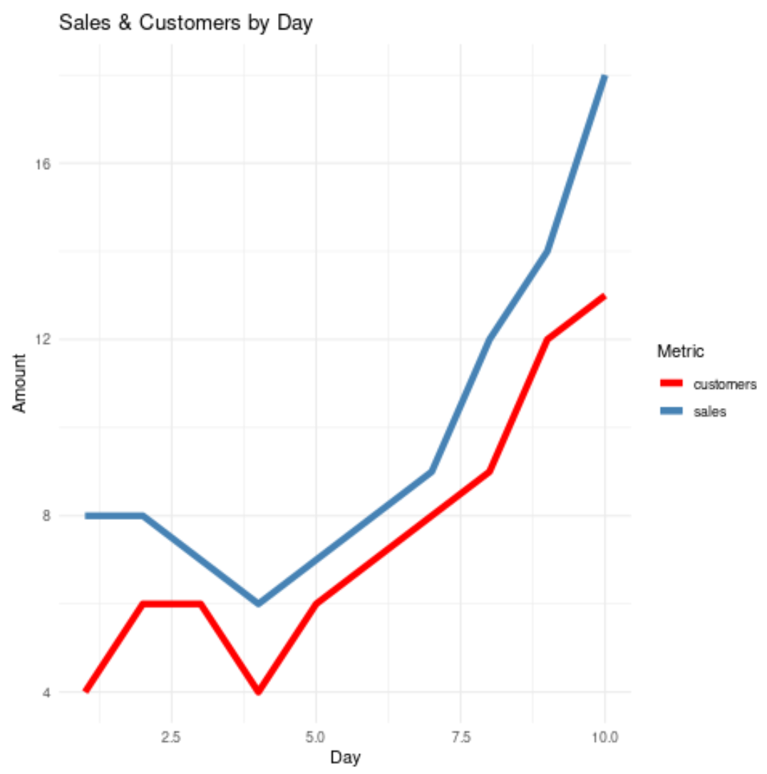
이 플롯에는 theme_minimal()을 사용하기로 선택했지만 플롯에 사용할 수 있는 테마는 다양합니다. ggplot2 테마의 전체 목록은 이 가이드를 참조하세요.
추가 리소스
다음 튜토리얼에서는 ggplot2의 라인을 사용하여 다른 일반적인 플로팅 기능을 수행하는 방법을 설명합니다.
ggplot2에서 범례 제목을 변경하는 방법
ggplot2를 사용하여 플롯에 수평선을 추가하는 방법
ggplot2에서 선 두께를 조정하는 방법
저자 소개
벤자민 앤더슨
안녕하세요. 저는 통계학 교수를 퇴직하고 전임 통계 교사로 변신한 벤자민입니다. 통계 분야의 광범위한 경험과 전문 지식을 바탕으로 Statorials를 통해 학생들에게 힘을 실어주기 위해 지식을 공유하고 싶습니다. 더 알아보기