Ggplot2에서 화살표를 그리는 방법(예제 포함)
다음 기본 구문을 사용하여 ggplot2의 플롯에 화살표를 그릴 수 있습니다.
 library (ggplot2)

ggplot(df, aes(x=x, y=y)) +
  geom_point() +
  geom_segment(aes(x= 5 , y= 6 , xend= 8 , yend= 9 ), arrow = arrow(length=unit( 0.5 , ' cm ')))
geom_segment() 함수에서 각 인수가 수행하는 작업은 다음과 같습니다.
- x : 시작할 x 값
- y : 시작할 y 값
- xend : 끝날 x 값
- 엔드 : 끝날 y 값
- arrow : 화살표 끝의 길이
다음 예제에서는 실제로 ggplot2를 사용하여 화살표를 그리는 방법을 보여줍니다.
예: ggplot2에서 화살표 그리기
다양한 농구 선수들이 득점한 점수와 리바운드 수에 대한 정보가 포함된 다음과 같은 데이터베이스가 있다고 가정해 보겠습니다.
 #create data frame
df <- data. frame (points=c(3, 3, 5, 6, 7, 8, 9, 9, 8, 5),
                 rebounds=c(2, 6, 5, 5, 8, 5, 9, 9, 8, 6))

#view data frame
df

   rebound points
1 3 2
2 3 6
3 5 5
4 6 5
5 7 8
6 8 5
7 9 9
8 9 9
9 8 8
10 5 6
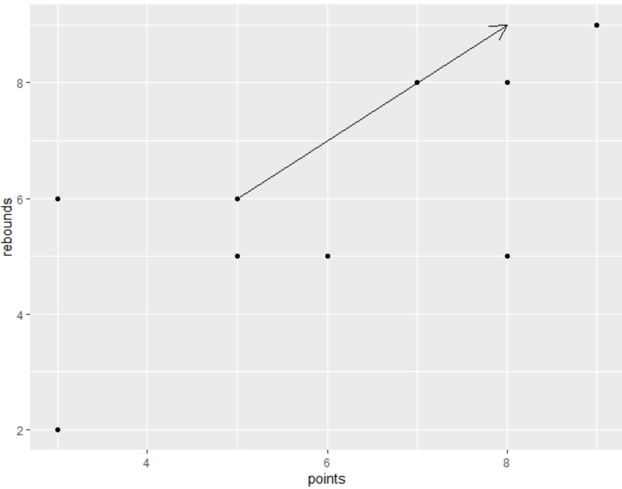
다음 구문을 사용하여 ggplot2에서 산점도를 만들고 플롯의 특정 위치에 화살표를 추가할 수 있습니다.
 library (ggplot2)

#create scatterplot and add arrow
ggplot(df, aes(x=points, y=rebounds)) +
  geom_point() +
  geom_segment(aes(x= 5 , y= 6 , xend= 8 , yend= 9 ), arrow = arrow(length=unit( .5 , ' cm ')))
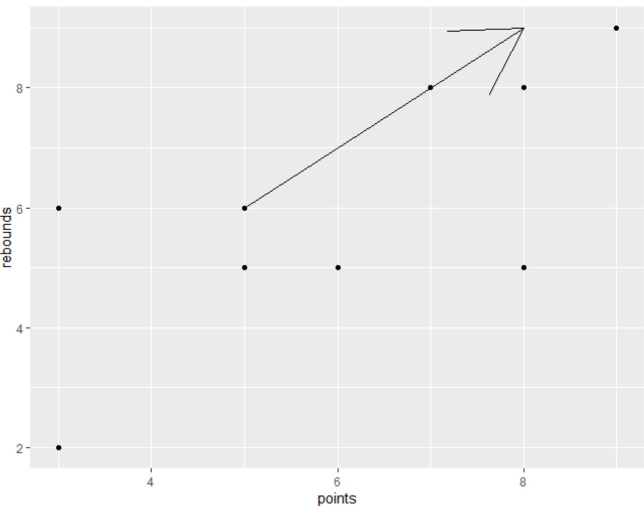
화살촉의 크기를 늘리거나 줄이려면 arrow() 함수의 값을 자유롭게 변경하세요.
예를 들어 다음 코드는 크기를 늘리는 방법을 보여줍니다.
 library (ggplot2)

#create scatterplot and add arrow with increased arrow head size
ggplot(df, aes(x=points, y=rebounds)) +
  geom_point() +
  geom_segment(aes(x= 5 , y= 6 , xend= 8 , yend= 9 ), arrow = arrow(length=unit( 2 , ' cm ')))
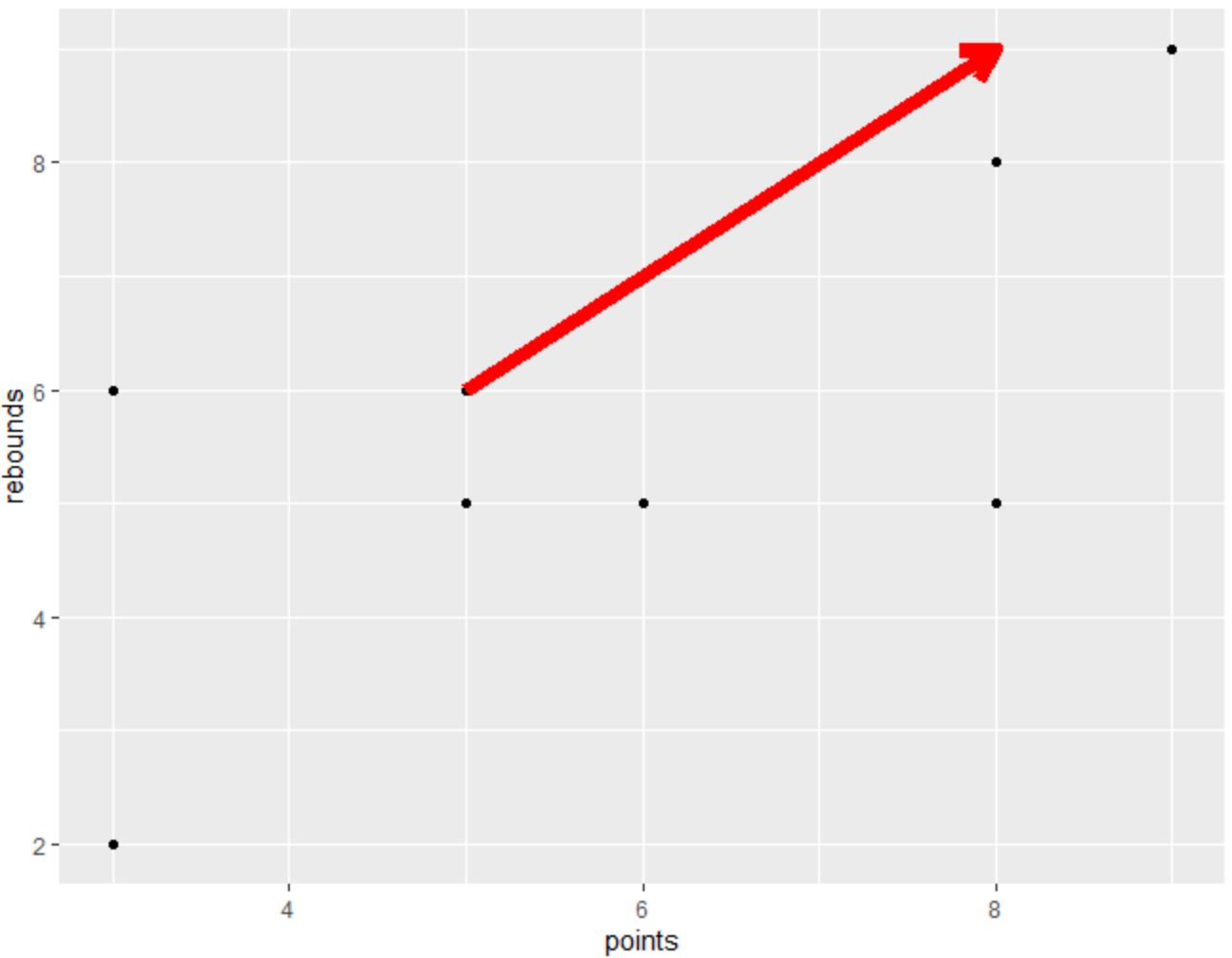
color 및 lwd 인수를 사용하여 화살표의 색상과 선 너비를 각각 변경할 수도 있습니다.
 library (ggplot2)

#create scatterplot and add customized arrow
ggplot(df, aes(x=points, y=rebounds)) +
  geom_point() +
  geom_segment(aes(x= 5 , y= 6 , xend= 8 , yend= 9 ), arrow = arrow(length=unit( .5 , ' cm ')),
               color=' red ', lwd= 3 )
원하는 대로 정확하게 보이는 화살표를 만들기 위해 geom_segment() 함수의 다양한 인수를 자유롭게 사용해 보세요.
추가 리소스
다음 튜토리얼에서는 ggplot2에서 다른 일반적인 작업을 수행하는 방법을 설명합니다.
ggplot2에서 눈금선을 제거하는 방법
ggplot2에서 영역을 음영 처리하는 방법
ggplot2에서 X축 레이블을 변경하는 방법
저자 소개
벤자민 앤더슨
안녕하세요. 저는 통계학 교수를 퇴직하고 전임 통계 교사로 변신한 벤자민입니다. 통계 분야의 광범위한 경험과 전문 지식을 바탕으로 Statorials를 통해 학생들에게 힘을 실어주기 위해 지식을 공유하고 싶습니다. 더 알아보기