두 개의 y축을 사용하여 matplotlib 플롯을 만드는 방법
두 개의 y축이 있는 Matplotlib 플롯을 생성하는 가장 쉬운 방법은 Twinx() 함수를 사용하는 것입니다.
다음 예에서는 이 기능을 실제로 사용하는 방법을 보여줍니다.
예: 두 개의 Y축이 있는 Matplotlib 플롯 생성
다음 두 개의 팬더 DataFrame이 있다고 가정해 보겠습니다.
 import pandas as pd

#createDataFrames
df1 = pd. DataFrame ({' year ': [1, 2, 3, 4, 5, 6, 7, 8, 9, 10],
                    ' sales ': [14, 16, 19, 22, 24, 25, 24, 24, 27, 30]})

df2 = pd. DataFrame ({' year ': [1, 2, 3, 4, 5, 6, 7, 8, 9, 10],
                    ' leads ': [4, 4, 4, 5, 4, 5, 7, 8, 5, 3]})
두 DataFrame은 1부터 10까지의 범위인 “연도” 변수를 공유하지만, 첫 번째 DataFrame은 매년 총 매출을 표시하고 두 번째 DataFrame은 매년 총 리드를 표시합니다.
다음 코드를 사용하여 두 개의 Y 축이 있는 차트에 판매 및 리드를 표시하는 Matplotlib 플롯을 만들 수 있습니다.
 import matplotlib. pyplot as plt

#define colors to use
col1 = ' steelblue '
col2 = ' red '

#define subplots
fig,ax = plt. subplots ()

#add first line to plot
ax. plot (df1. year , df1. sales , color=col1)

#add x-axis label
ax. set_xlabel (' Year ', fontsize= 14 )

#add y-axis label
ax. set_ylabel (' Sales ', color=col1, fontsize= 16 )

#define second y-axis that shares x-axis with current plot
ax2 = ax. twinx ()

#add second line to plot
ax2. plot (df2. year , df2. leads , color=col2)

#add second y-axis label
ax2. set_ylabel (' Leads ', color=col2, fontsize= 16 )
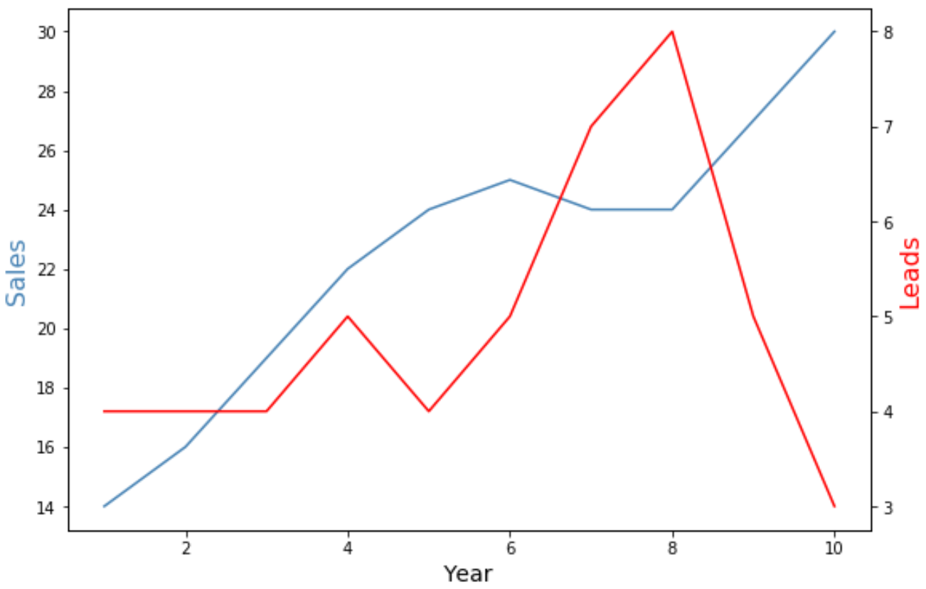
차트 왼쪽의 y축은 연간 총 매출을 표시하고 차트 오른쪽의 y축은 연간 총 리드를 표시합니다.
그래프의 파란색 선은 연간 총 매출을 나타내고 빨간색 선은 연간 총 리드를 나타냅니다.
차트의 선 모양을 변경하려면 마커 와 선 너비 인수를 자유롭게 사용하세요.
 import matplotlib. pyplot as plt

#define colors to use
col1 = ' steelblue '
col2 = ' red '

#define subplots
fig,ax = plt. subplots ()

#add first line to plot
ax. plot (df1. year , df1. sales , color=col1, marker=' o ', linewidth= 3 )

#add x-axis label
ax. set_xlabel (' Year ', fontsize= 14 )

#add y-axis label
ax. set_ylabel (' Sales ', color=col1, fontsize= 16 )

#define second y-axis that shares x-axis with current plot
ax2 = ax. twinx ()

#add second line to plot
ax2. plot (df2. year , df2. leads , color=col2, marker=' o ', linewidth= 3 )

#add second y-axis label
ax2. set_ylabel (' Leads ', color=col2, fontsize= 16 )
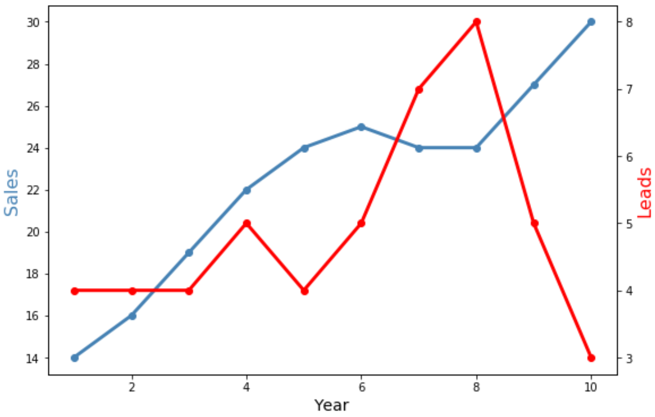
이제 두 줄 모두 더 넓어졌으며 개별 데이터 포인트를 표시하는 “o” 표시가 포함되어 있습니다.
추가 리소스
다음 튜토리얼에서는 Matplotlib에서 다른 일반적인 작업을 수행하는 방법을 설명합니다.
Matplotlib에서 축 레이블 위치를 조정하는 방법
Matplotlib에서 축 범위를 설정하는 방법
Matplotlib에서 X축 값을 설정하는 방법
저자 소개
벤자민 앤더슨
안녕하세요. 저는 통계학 교수를 퇴직하고 전임 통계 교사로 변신한 벤자민입니다. 통계 분야의 광범위한 경험과 전문 지식을 바탕으로 Statorials를 통해 학생들에게 힘을 실어주기 위해 지식을 공유하고 싶습니다. 더 알아보기