Matplotlib에서 시계열을 그리는 방법(예제 포함)
다음 구문을 사용하여 Matplotlib에서 시계열을 그릴 수 있습니다.
 import matplotlib. pyplot as plt

plt. plot (df. x , df. y )
이는 변수 x가 datetime.datetime() 클래스에 속한다고 가정합니다.
다음 예제에서는 이 구문을 사용하여 Python에서 시계열 데이터를 그리는 방법을 보여줍니다.
예 1: Matplotlib에서 기본 시계열 플롯
다음 코드는 연속 12일 동안 기업의 총 매출을 보여주는 시계열을 Matplotlib에 표시하는 방법을 보여줍니다.
 import matplotlib. pyplot as plt
import datetime
import numpy as np
import pandas as pd

#define data
df = pd. DataFrame ({' date ': np. array ([datetime. datetime (2020, 1, i+1)
for i in range(12)]),
                   ' sales ': [3, 4, 4, 7, 8, 9, 14, 17, 12, 8, 8, 13]})

#plot time series
plt. plot (df. date , df. sales , linewidth= 3 )
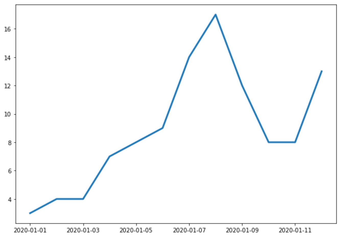
X축은 날짜를 나타내고 Y축은 각 날짜의 총 판매량을 나타냅니다.
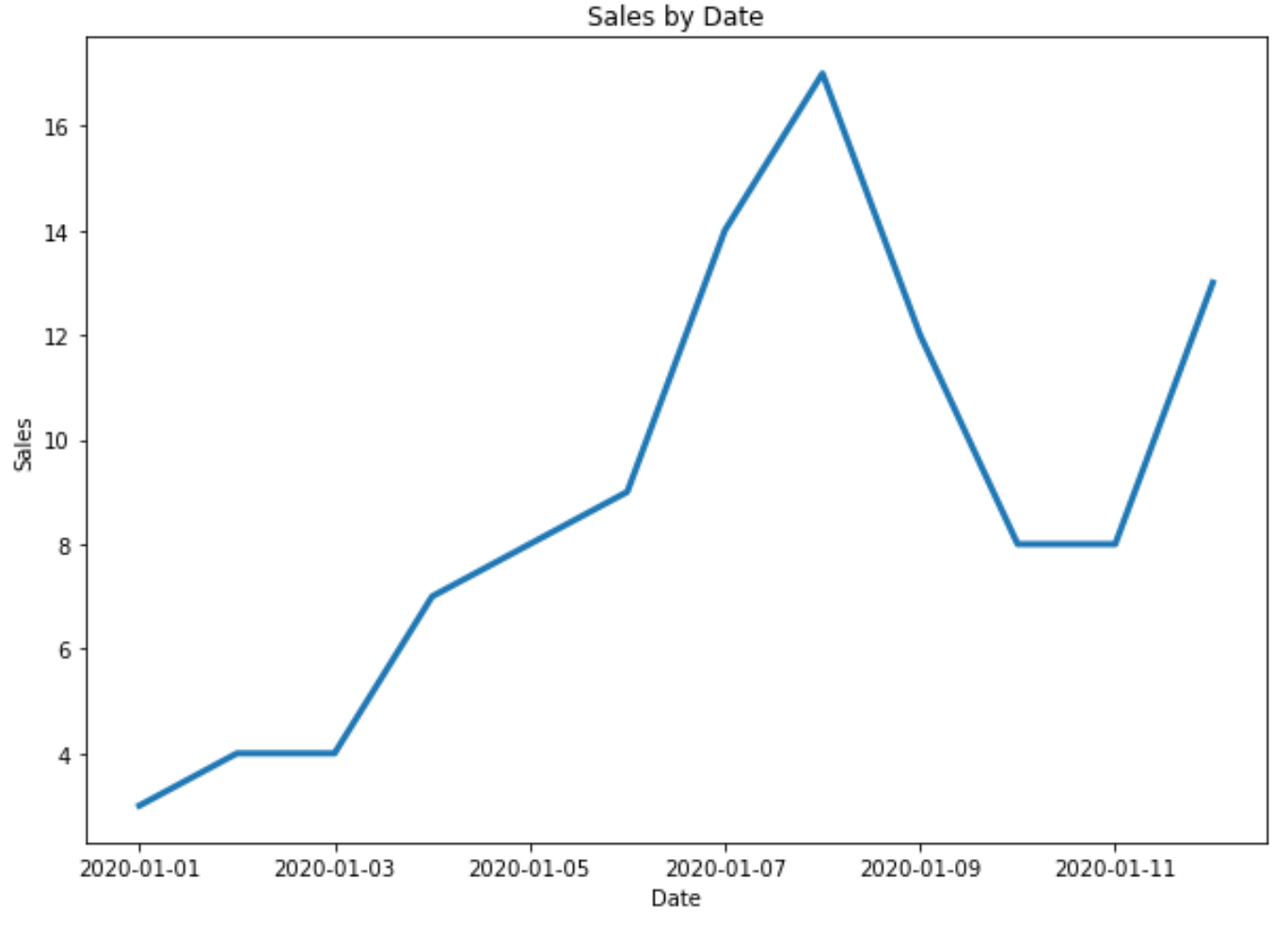
예 2: 제목 및 축 레이블 사용자 정의
다음 코드를 사용하여 플롯에 제목과 축 레이블을 추가할 수 있습니다.
 import matplotlib. pyplot as plt
import datetime
import numpy as np
import pandas as pd

#define data
df = pd. DataFrame ({' date ': np. array ([datetime. datetime (2020, 1, i+1)
for i in range(12)]),
                   ' sales ': [3, 4, 4, 7, 8, 9, 14, 17, 12, 8, 8, 13]})

#plot time series
plt. plot (df. date , df. sales , linewidth= 3 )

#add title and axis labels
plt. title (' Sales by Date ')
plt. xlabel (' Date ')
plt. ylabel (' Sales ')
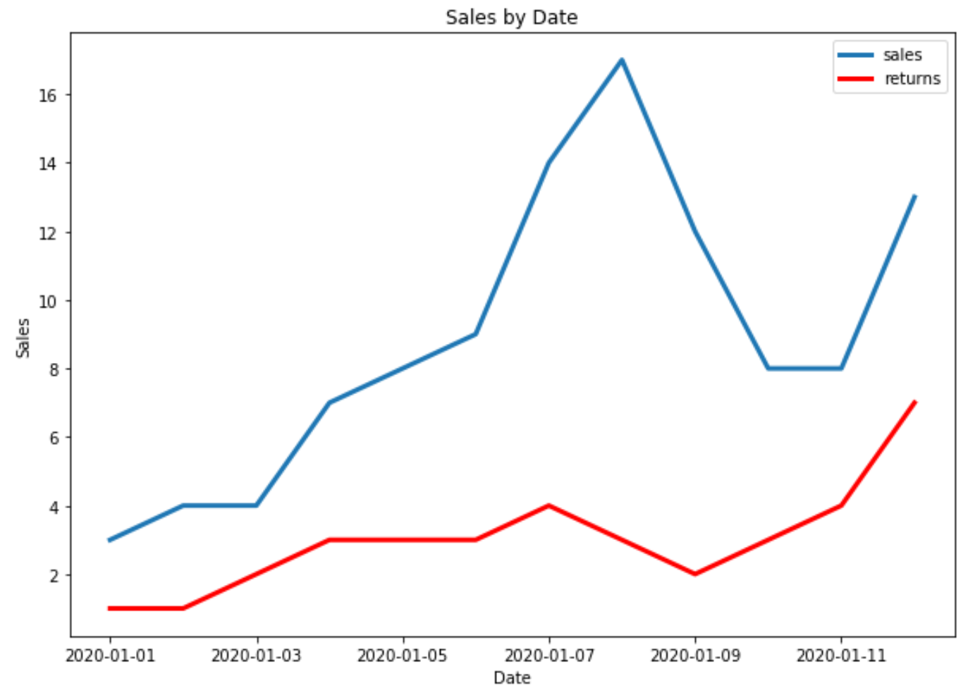
예 3: Matplotlib에서 여러 시계열 플롯
다음 코드는 Matplotlib의 단일 플롯에 여러 시계열을 그리는 방법을 보여줍니다.
 import matplotlib. pyplot as plt
import datetime
import numpy as np
import pandas as pd

#define data
df = pd. DataFrame ({' date ': np. array ([datetime. datetime (2020, 1, i+1)
                                     for i in range(12)]),
                   ' sales ': [3, 4, 4, 7, 8, 9, 14, 17, 12, 8, 8, 13]})

df2 = pd. DataFrame ({' date ': np. array ([datetime. datetime (2020, 1, i+1)
                                      for i in range(12)]),
                   ' returns ': [1, 1, 2, 3, 3, 3, 4, 3, 2, 3, 4, 7]})

#plot both time series
plt. plot ( df.date , df.sales , label=' sales ', linewidth= 3 )
plt. plot ( df2.date , df2.returns , color=' red ', label=' returns ', linewidth= 3 )

#add title and axis labels
plt. title (' Sales by Date ')
plt. xlabel (' Date ')
plt. ylabel (' Sales ')

#add legend
plt. legend ()

#displayplot
plt. show ()
추가 리소스
저자 소개
벤자민 앤더슨
안녕하세요. 저는 통계학 교수를 퇴직하고 전임 통계 교사로 변신한 벤자민입니다. 통계 분야의 광범위한 경험과 전문 지식을 바탕으로 Statorials를 통해 학생들에게 힘을 실어주기 위해 지식을 공유하고 싶습니다. 더 알아보기