Matplotlib 컬러바의 위치를 조정하는 방법
색상 막대는 Matplotlib 차트의 측면을 따라 내려가며 차트에 표시되는 색상에 대한 범례 역할을 하는 막대입니다.
Matplotlib는 기본적으로 차트 오른쪽에 색상 막대를 표시하지만 Matplotlib AxesGrid 툴킷 의 기능을 사용하여 이를 쉽게 변경할 수 있습니다.
이 튜토리얼에서는 이러한 기능을 실제로 사용하는 방법에 대한 몇 가지 예를 보여줍니다.
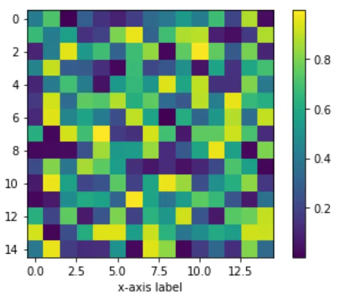
예시 1: 차트 오른쪽에 컬러바 배치
다음 코드는 Matplotlib 차트를 생성하는 방법과 차트 오른쪽에 색상 막대를 배치하는 방법을 보여줍니다.
 import numpy as np
import matplotlib.pyplot as plt
from mpl_toolkits.axes_grid1 import make_axes_locatable

#make this example reproducible
np.random.seed(1)

#create chart
fig, ax = plt. subplots ()
im = ax. imshow (np.random.rand(15,15))
ax. set_xlabel (' x-axis label ')

#add color bar
fig. colorbar (im)

plt. show ()
예 2: 그래프 아래에 색상 막대 배치
다음 코드는 Matplotlib 차트 아래에 색상 막대를 배치하는 방법을 보여줍니다.
 import numpy as np
import matplotlib.pyplot as plt
from mpl_toolkits.axes_grid1 import make_axes_locatable

#make this example reproducible
np.random.seed(1)

#create chart
fig, ax = plt. subplots ()
im = ax. imshow (np.random.rand(15,15))
ax. set_xlabel (' x-axis label ')

#add color bar below chart
divider = make_axes_locatable (ax)
cax = divider. new_vertical (size=' 5% ', pad=0.6, pack_start= True )
fig. add_axes (cax)
fig. colorbar (im, cax=cax, orientation=' horizontal ')

plt. show ()
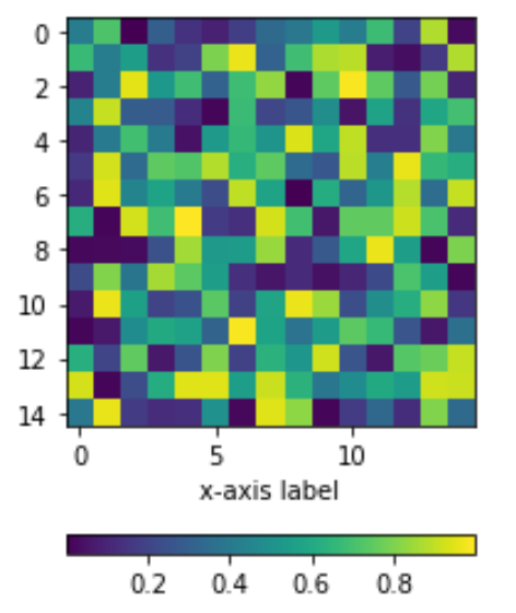
pad 인수는 차트의 x축과 색상 막대 사이에 패딩을 생성합니다. 패드 값이 높을수록 색상 막대가 x축에서 멀어집니다.
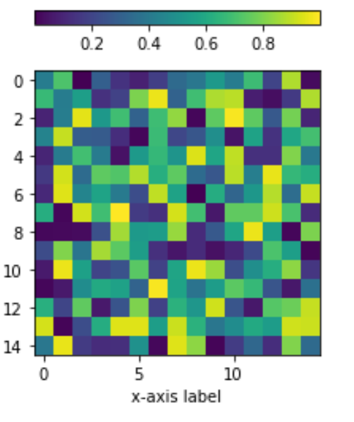
예 3: 차트 위에 색상 막대 배치
다음 코드는 Matplotlib 차트 위에 색상 막대를 배치하는 방법을 보여줍니다.
 import numpy as np
import matplotlib.pyplot as plt
from mpl_toolkits.axes_grid1 import make_axes_locatable

#make this example reproducible
np.random.seed(1)

#create chart
fig, ax = plt. subplots ()
im = ax. imshow (np.random.rand(15,15))
ax. set_xlabel (' x-axis label ')

#add color bar below chart
divider = make_axes_locatable (ax)
cax = divider. new_vertical (size=' 5% ', pad=0.4)
fig. add_axes (cax)
fig. colorbar (im, cax=cax, orientation=' horizontal ')

plt. show ()
여기에서 더 많은 Matplotlib 튜토리얼을 찾을 수 있습니다.
저자 소개
벤자민 앤더슨
안녕하세요. 저는 통계학 교수를 퇴직하고 전임 통계 교사로 변신한 벤자민입니다. 통계 분야의 광범위한 경험과 전문 지식을 바탕으로 Statorials를 통해 학생들에게 힘을 실어주기 위해 지식을 공유하고 싶습니다. 더 알아보기