Matplotlib의 산점도에 범례를 추가하는 방법
다음 구문을 사용하여 Matplotlib의 산점도에 범례를 추가할 수 있습니다.
 import matplotlib. pyplot as plt
from matplotlib. colors import ListedColormap

#define values, classes, and colors to map
values = [0, 0, 1, 2, 2, 2]
classes = [' A ', ' B ', ' C ']
colors = ListedColormap([' red ', ' blue ', ' purple '])

#create scatterplot
scatter = plt. scatter (x, y, c=values, cmap=colors)

#add legend
plt. legend ( * scatter.legend_elements ())
다음 예에서는 이 구문을 실제로 사용하는 방법을 보여줍니다.
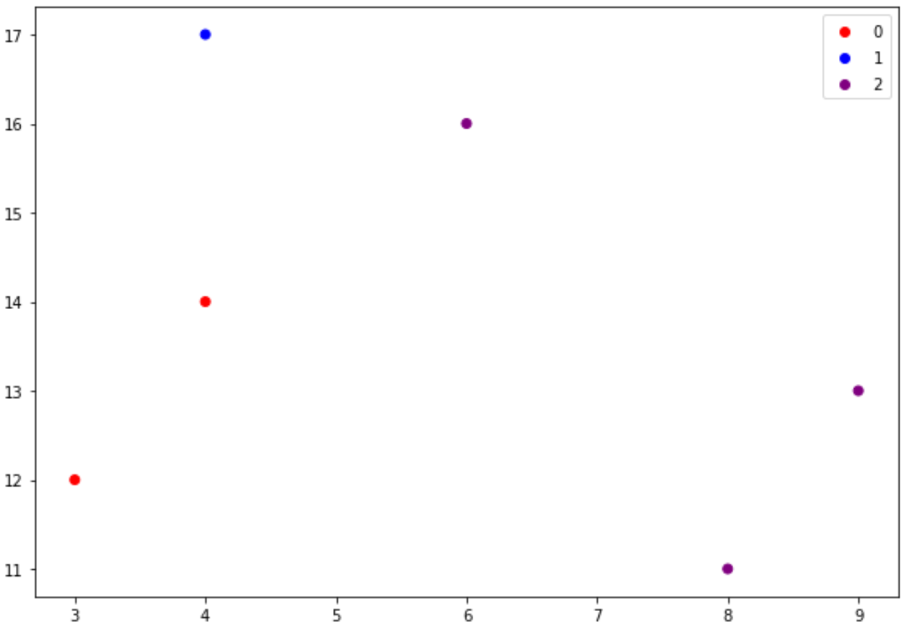
예 1: 값이 포함된 산점도 범례
다음 예에서는 범례에 값이 표시되는 산점도를 만드는 방법을 보여줍니다.
 import matplotlib. pyplot as plt
from matplotlib. colors import ListedColormap

#define data
x = [3, 4, 4, 6, 8, 9]
y = [12, 14, 17, 16, 11, 13]

#define values, classes, and colors to map
values = [0, 0, 1, 2, 2, 2]
classes = [' A ', ' B ', ' C ']
colors = ListedColormap([' red ', ' blue ', ' purple '])

#create scatterplot
scatter = plt. scatter (x, y, c=values, cmap=colors)

#add legend with values
plt. legend ( * scatter.legend_elements ())
예제 2: 클래스가 포함된 산점도 범례
다음 예에서는 범례에 클래스 이름이 표시되는 분산형 차트를 만드는 방법을 보여줍니다.
 import matplotlib. pyplot as plt
from matplotlib. colors import ListedColormap

#define data
x = [3, 4, 4, 6, 8, 9]
y = [12, 14, 17, 16, 11, 13]

#define values, classes, and colors to map
values = [0, 0, 1, 2, 2, 2]
classes = [' A ', ' B ', ' C ']
colors = ListedColormap([' red ', ' blue ', ' purple '])

#create scatterplot
scatter = plt. scatter (x, y, c=values, cmap=colors)

#add legend with class names
plt. legend (handles=scatter. legend_elements ()[ 0 ], labels=classes)
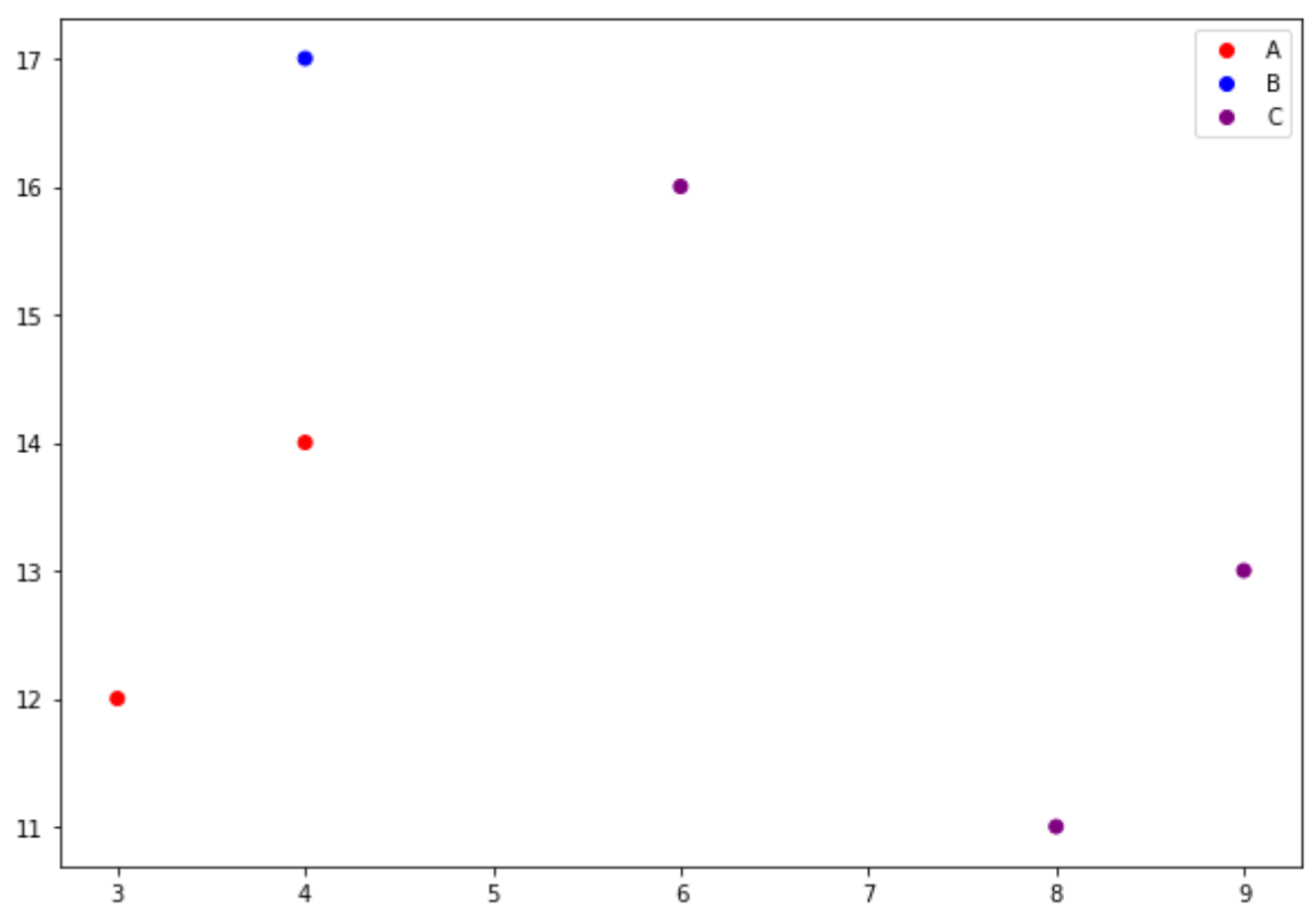
이 범례에는 우리가 지정한 값(0, 1, 2)이 아닌 우리가 지정한 클래스 이름(A, B, C)이 표시됩니다.
추가 리소스
Matplotlib에서 플롯 크기를 늘리는 방법
Matplotlib에서 제목 위치를 조정하는 방법
Matplotlib에서 축 범위를 설정하는 방법
저자 소개
벤자민 앤더슨
안녕하세요. 저는 통계학 교수를 퇴직하고 전임 통계 교사로 변신한 벤자민입니다. 통계 분야의 광범위한 경험과 전문 지식을 바탕으로 Statorials를 통해 학생들에게 힘을 실어주기 위해 지식을 공유하고 싶습니다. 더 알아보기