Matplotlib에서 특정 날짜에 수직선을 추가하는 방법
axvline() 함수를 datetime() 함수와 함께 사용하여 Matplotlib의 특정 날짜에 수직선을 추가할 수 있습니다.
 import datetime
import matplotlib. pyplot as plt

plt. axvline ( datetime.datetime (2023, 1, 5))
이 특정 예는 Matplotlib 플롯의 x축에 2023년 1월 5일 에 수직선을 추가합니다.
다음 예에서는 실제로 이 구문을 사용하는 방법을 보여줍니다.
예: Matplotlib의 특정 날짜에 수직선 추가
회사에서 연속 8일 동안 발생한 총 매출에 대한 정보가 포함된 다음과 같은 pandas DataFrame이 있다고 가정합니다.
 import datetime
import numpy as np
import pandas as pd

#createDataFrame
df = pd. DataFrame ({' date ': np. array ([datetime. datetime (2020, 1, i+1)
for i in range(8)]),
                   ' sales ': [3, 4, 4, 7, 8, 9, 14, 17]})

#view DataFrame
print (df)

        dirty date
0 2023-01-01 3
1 2023-01-02 4
2 2023-01-03 4
3 2023-01-04 7
4 2023-01-05 8
5 2023-01-06 9
6 2023-01-07 14
7 2023-01-08 17
다음 코드를 사용하여 일별 매출 차트를 만들고 x축의 2023년 1월 5일 날짜에 수직선을 추가할 수 있습니다.
 import matplotlib. pyplot as plt

#plot sales by date
plt. plot_date ( df.date , df.sales )

#rotate x-axis ticks 45 degrees and right-aline
plt. xticks (rotation=45, ha=' right ')

#add vertical line at 1/5/2023
plt. axvline ( datetime.datetime (2023, 1, 5))
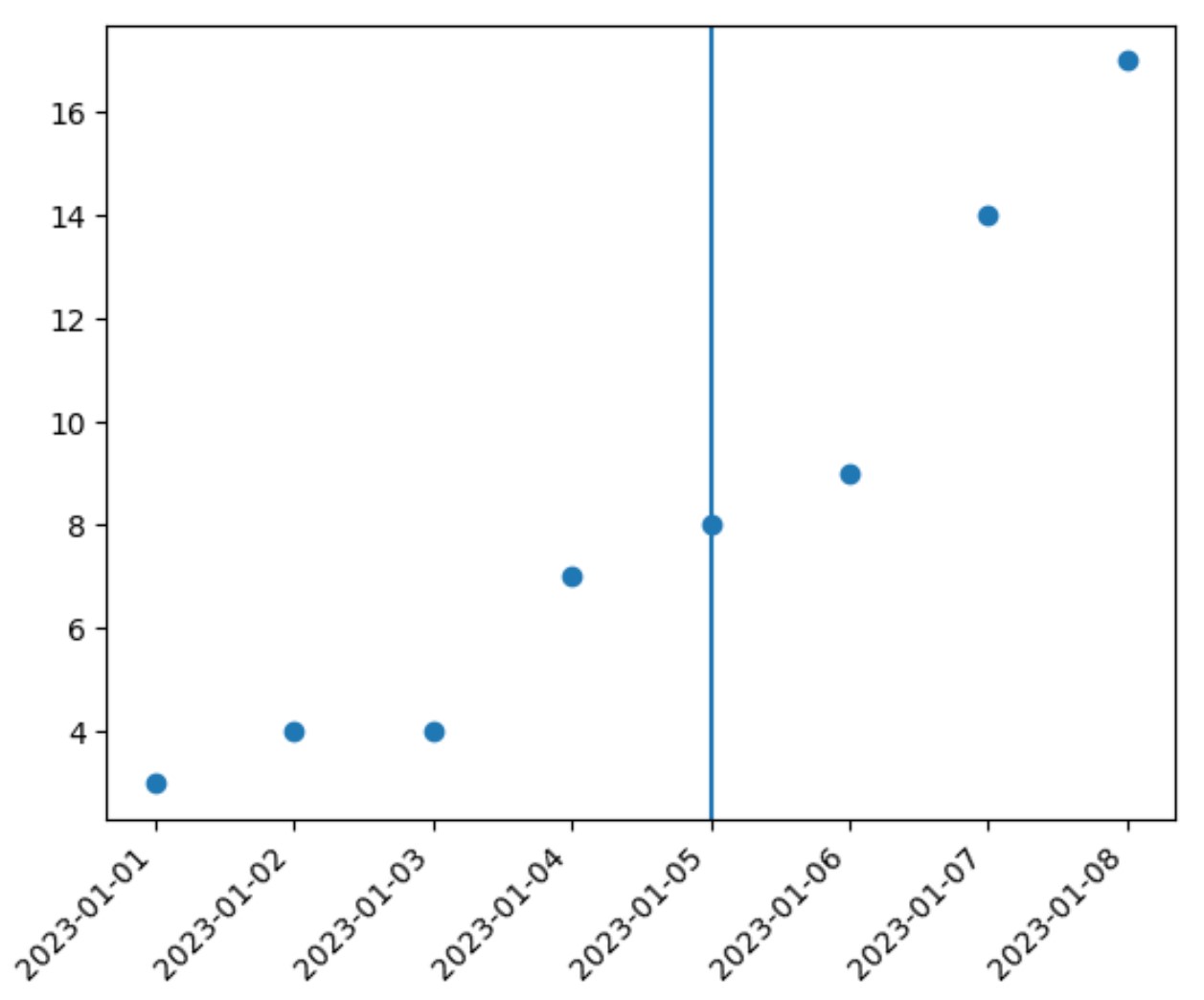
x축의 날짜 2023년 1월 5일 플롯에 수직선이 추가되었습니다.
또한 color , linewidth 및 linestyle 인수를 사용하여 선의 모양을 사용자 정의할 수 있습니다.
 import matplotlib. pyplot as plt

#plot sales by date
plt. plot_date ( df.date , df.sales )

#rotate x-axis ticks 45 degrees and right-aline
plt. xticks (rotation=45, ha=' right ')

#add customized vertical line at 1/5/2023
plt. axvline (datetime. datetime (2023, 1, 5), color=' red ', linewidth= 3 , linestyle=' -- ')
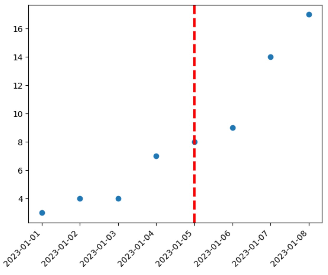
이제 수직선이 빨간색으로 표시되고 이전 예보다 약간 넓어지며 점선으로 표시됩니다.
수직선의 모양을 자유롭게 변경하여 원하는 모양을 만드세요.
추가 리소스
다음 튜토리얼에서는 Matplotlib에서 다른 일반적인 작업을 수행하는 방법을 설명합니다.
Matplotlib에서 플롯에 평균선을 추가하는 방법
Matplotlib에 추세선을 추가하는 방법
Matplotlib에서 수평선을 그리는 방법
저자 소개
벤자민 앤더슨
안녕하세요. 저는 통계학 교수를 퇴직하고 전임 통계 교사로 변신한 벤자민입니다. 통계 분야의 광범위한 경험과 전문 지식을 바탕으로 Statorials를 통해 학생들에게 힘을 실어주기 위해 지식을 공유하고 싶습니다. 더 알아보기