Lm() 결과를 r로 플롯하는 방법
다음 방법을 사용하여 R에서 lm() 함수의 결과를 플롯할 수 있습니다.
방법 1: lm()을 플롯하면 기본 R이 생성됩니다.
 #create scatterplot
plot(y ~ x, data=data)

#add fitted regression line to scatterplot
abline(fit)
방법 2: lm()을 플롯하면 ggplot2가 생성됩니다.
 library (ggplot2)

#create scatterplot with fitted regression line
ggplot(data, aes (x = x, y = y)) +
  geom_point() +
  stat_smooth(method = " lm ")
다음 예에서는 R에 내장된 mtcars 데이터세트를 사용하여 실제로 각 방법을 사용하는 방법을 보여줍니다.
예 1: 플롯 lm() 결과는 기본 R입니다.
다음 코드는 기본 R에서 lm() 함수의 결과를 플롯하는 방법을 보여줍니다.
 #fit regression model
fit <- lm(mpg ~ wt, data=mtcars)

#create scatterplot
plot(mpg ~ wt, data=mtcars)

#add fitted regression line to scatterplot
abline(fit)
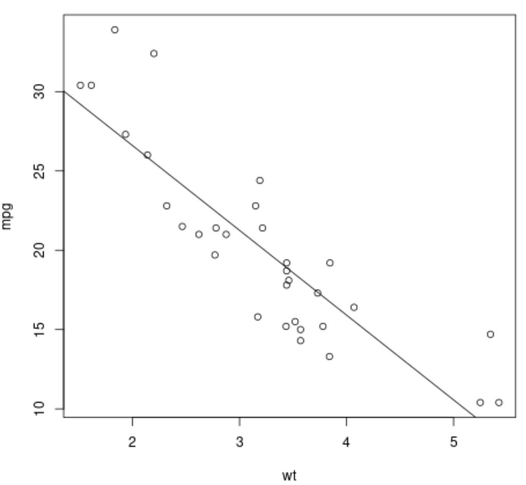
그래프의 점은 원시 데이터 값을 나타내고 직선 대각선은 적합 회귀선을 나타냅니다.
예 2: lm() 결과를 ggplot2로 플롯합니다.
다음 코드는 ggplot2 데이터 시각화 패키지를 사용하여 lm() 함수의 결과를 플롯하는 방법을 보여줍니다.
 library (ggplot2)

#fit regression model
fit <- lm(mpg ~ wt, data=mtcars)

#create scatterplot with fitted regression line
ggplot(mtcars, aes (x = x, y = y)) +
  geom_point() +
  stat_smooth(method = " lm ")
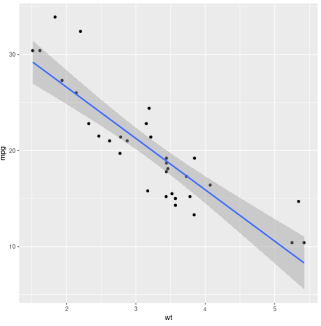
파란색 선은 적합 회귀선을 나타내고 회색 띠는 95% 신뢰 구간의 한계를 나타냅니다.
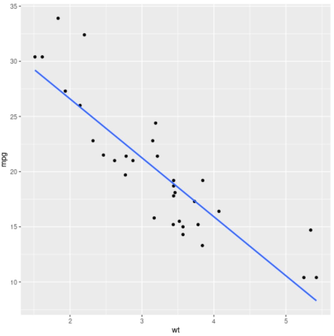
신뢰 구간 한계를 제거하려면 stat_smooth() 인수에 se=FALSE를 사용하면 됩니다.
 library (ggplot2)

#fit regression model
fit <- lm(mpg ~ wt, data=mtcars)

#create scatterplot with fitted regression line
ggplot(mtcars, aes (x = x, y = y)) +
  geom_point() +
  stat_smooth(method = “ lm ”, se= FALSE )
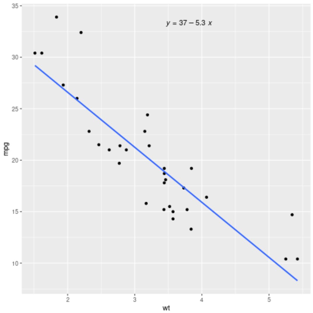
ggpubr 패키지의 stat_regline_equation() 함수를 사용하여 그래프 내부에 적합한 회귀 방정식을 추가할 수도 있습니다.
 library (ggplot2)
library (ggpubr)

#fit regression model
fit <- lm(mpg ~ wt, data=mtcars)

#create scatterplot with fitted regression line
ggplot(mtcars, aes (x = x, y = y)) +
  geom_point() +
  stat_smooth(method = “ lm ”, se= FALSE ) +
  stat_regline_equation(label.x.npc = “ center ”)
추가 리소스
다음 튜토리얼에서는 R에서 다른 일반적인 작업을 수행하는 방법을 설명합니다.
저자 소개
벤자민 앤더슨
안녕하세요. 저는 통계학 교수를 퇴직하고 전임 통계 교사로 변신한 벤자민입니다. 통계 분야의 광범위한 경험과 전문 지식을 바탕으로 Statorials를 통해 학생들에게 힘을 실어주기 위해 지식을 공유하고 싶습니다. 더 알아보기