R에서 로지스틱 회귀 곡선을 그리는 방법
종종 R에서 적합한 로지스틱 회귀 모델의 곡선을 플롯하고 싶을 수도 있습니다.
다행히도 이 작업은 매우 쉬우며 이 튜토리얼에서는 기본 R과 ggplot2 모두에서 이를 수행하는 방법을 설명합니다.
예: R을 기준으로 로지스틱 회귀 곡선 그리기
다음 코드는 R에 내장된 mtcars 데이터 세트의 변수를 사용하여 로지스틱 회귀 모델을 피팅하는 방법과 로지스틱 회귀 곡선을 그리는 방법을 보여줍니다.
 #fit logistic regression model
model <- glm(vs ~ hp, data=mtcars, family=binomial)

#define new data frame that contains predictor variable
newdata <- data. frame (hp=seq(min(mtcars$hp), max(mtcars$hp),len= 500 ))

#use fitted model to predict values of vs
newdata$vs = predict(model, newdata, type=" response ")

#plot logistic regression curve
plot(vs ~hp, data=mtcars, col=" steelblue ")
lines(vs ~ hp, newdata, lwd= 2 )
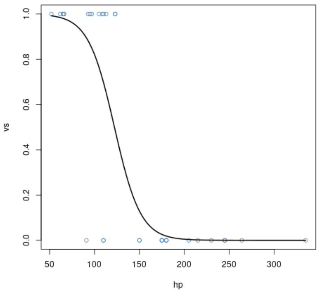
x축은 예측 변수 hp 의 값을 표시하고 y축은 응답 변수 am 의 예측 확률을 표시합니다.
우리는 예측 변수 hp 의 값이 높을수록 응답 변수의 확률이 1 과 같을 확률이 낮다는 것을 분명히 알 수 있습니다.
예: ggplot2에서 로지스틱 회귀 곡선 그리기
다음 코드는 동일한 로지스틱 회귀 모델을 피팅하는 방법과 ggplot2 데이터 시각화 라이브러리를 사용하여 로지스틱 회귀 곡선을 그리는 방법을 보여줍니다.
 library (ggplot2)

#plot logistic regression curve
ggplot(mtcars, aes (x=hp, y=vs)) +
  geom_point(alpha=.5) +
  stat_smooth(method=" glm ", se=FALSE, method. args = list(family=binomial))
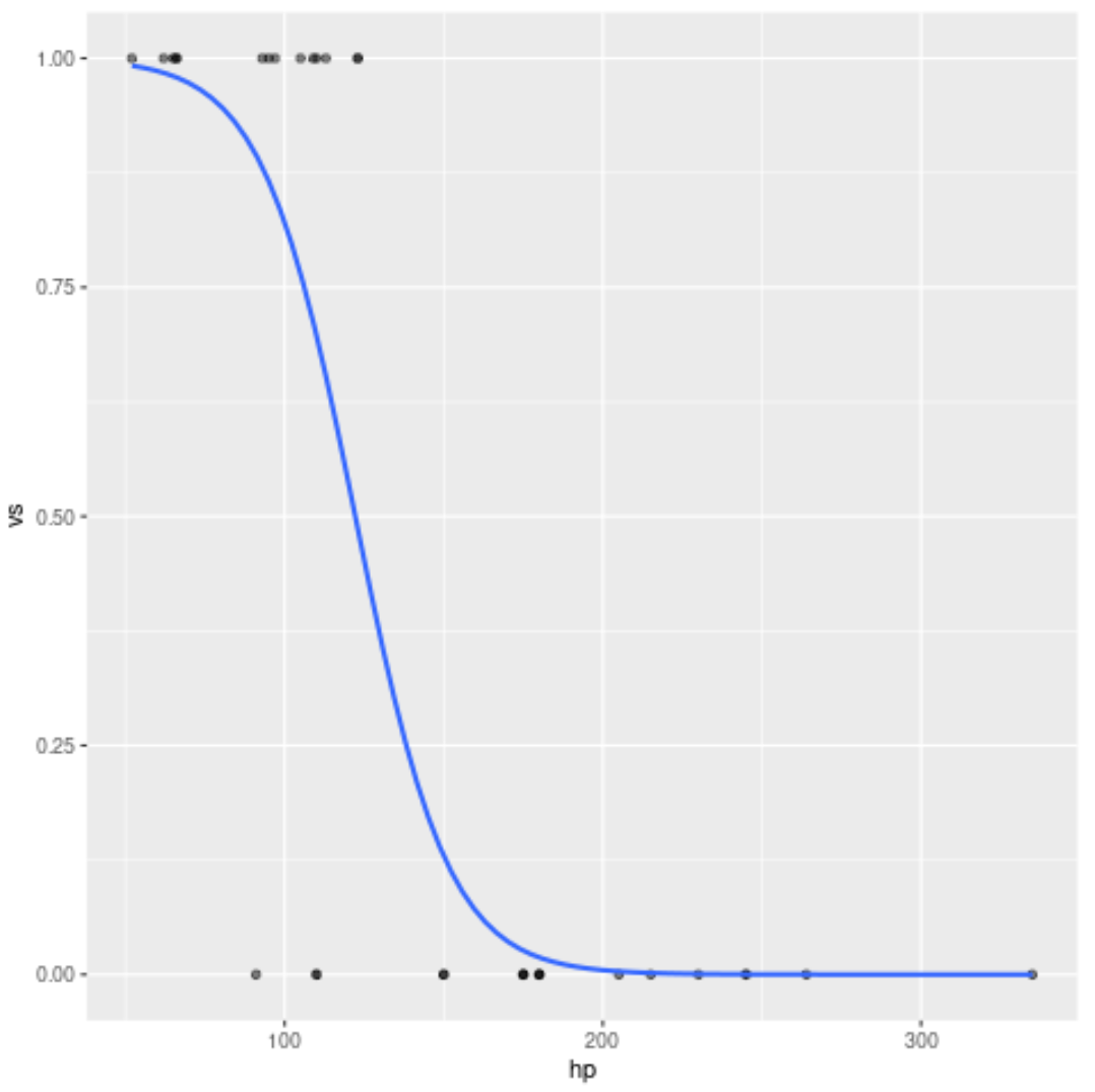
이는 R 베이스를 사용하여 이전 예에서 생성된 곡선과 정확히 동일합니다.
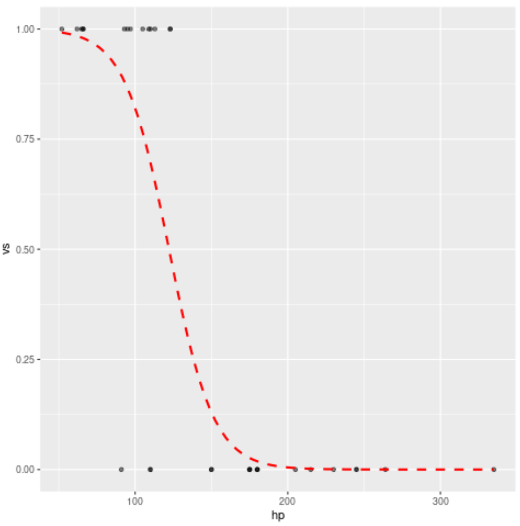
곡선의 스타일도 자유롭게 변경해 보세요. 예를 들어, 곡선을 빨간색 점선으로 바꿀 수 있습니다.
 library (ggplot2)

#plot logistic regression curve
ggplot(mtcars, aes (x=hp, y=vs)) +
  geom_point(alpha=.5) +
  stat_smooth(method=" glm ", se=FALSE, method. args = list(family=binomial),
              col=" red ", lty= 2 )
추가 리소스
로지스틱 회귀 소개
R에서 로지스틱 회귀를 수행하는 방법(단계별)
Python에서 로지스틱 회귀를 수행하는 방법(단계별)
R에서 seq 함수를 사용하는 방법
저자 소개
벤자민 앤더슨
안녕하세요. 저는 통계학 교수를 퇴직하고 전임 통계 교사로 변신한 벤자민입니다. 통계 분야의 광범위한 경험과 전문 지식을 바탕으로 Statorials를 통해 학생들에게 힘을 실어주기 위해 지식을 공유하고 싶습니다. 더 알아보기